dhtowng
Supporter
- 9,704
- 19,947
- Joined
- May 22, 2010
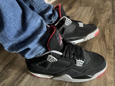
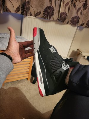
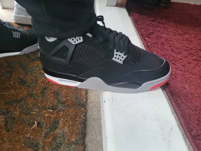
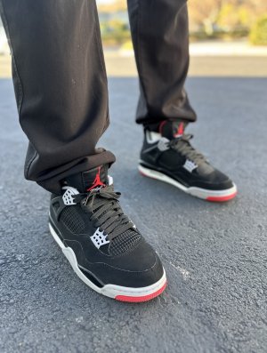
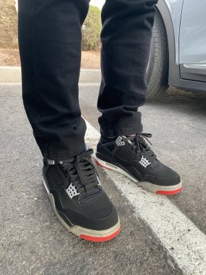
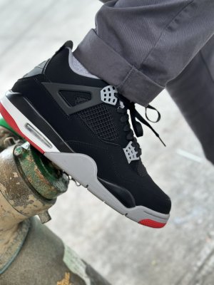
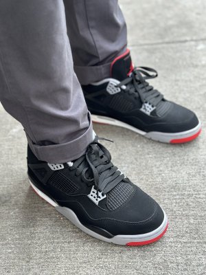
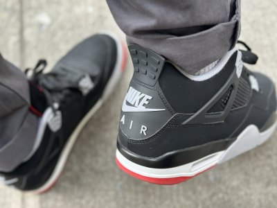
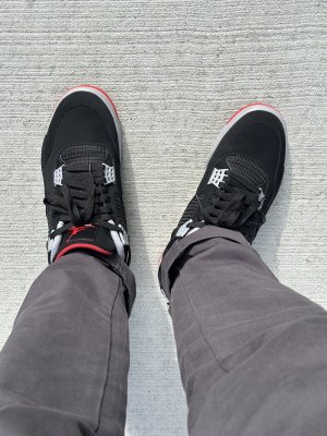
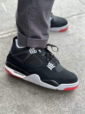
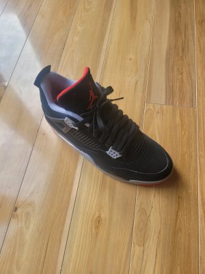
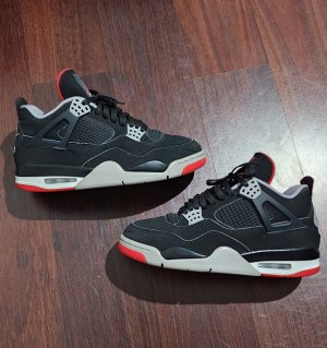
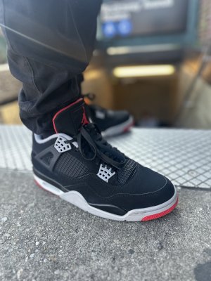
Seriously wouldn’t recommend fraying  . If anything coloring the edges someway would seem more practical. Wouldn’t want to damage the shoes in any by fraying. Colored pencil, steady hand and patients guys. Don’t take a knife or any sharp object to these. I’m begging you lol.
. If anything coloring the edges someway would seem more practical. Wouldn’t want to damage the shoes in any by fraying. Colored pencil, steady hand and patients guys. Don’t take a knife or any sharp object to these. I’m begging you lol.