My Final for Graphic Design 1

spincv

Banned
1,046
10
Joined
Apr 18, 2009
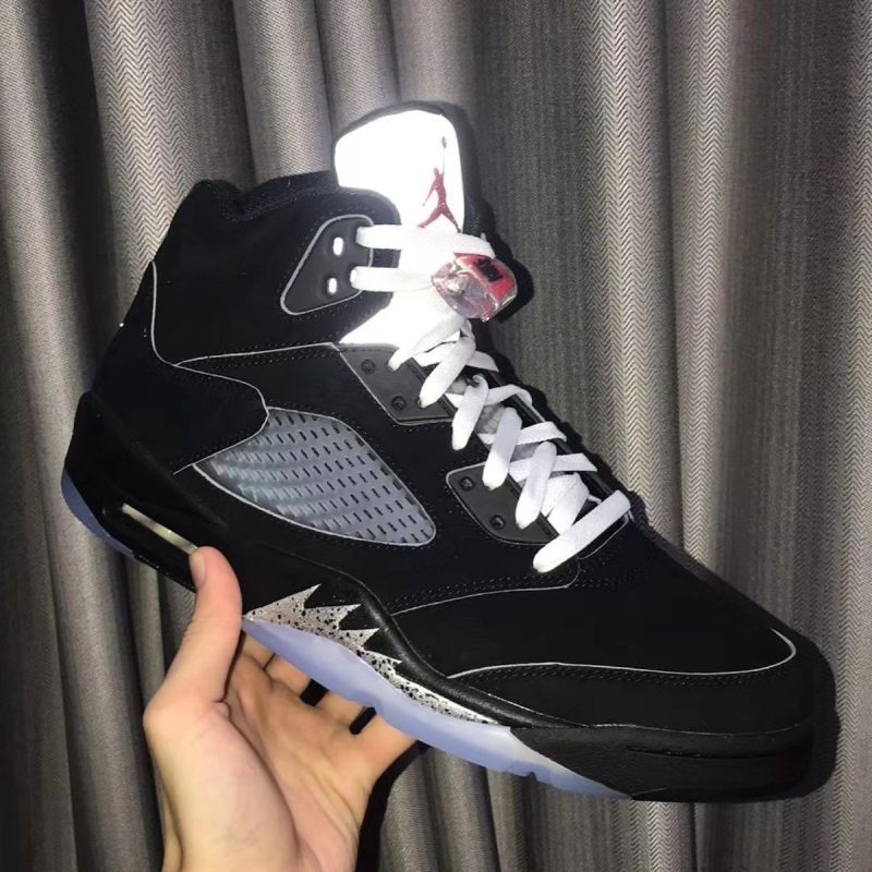
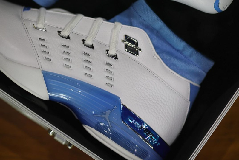
If you guys remember earlier in the month I was asking for pictures on Jordan and what not but I am finally done with the book. I have to turnit in tomorrow and I felt like I should show it on NT first.  Tell mewhat you think. You cant see the body of the text since i had to zoom out so you can see the whole layout.


Spoiler [+]
For being done and turning it it tomorrow
 
Looks very nice. I'm loving the layout and the arrangement of the pictures. very nice
 
Pros:

I really like the layout. The framing of the pictures really compliment the large headlines and add balance to the page.

Cons:

From what I see, your pictures look really pixelated. I'm not 100% certain so disregard if that isn't the case, but it seems like you didn't use hi res pictures when making this and it shows in the picture quality.


All in all, its a great assignment. Good job.
 
So I had this little review typed out for you and then Yuku raped me, so it's gone. But here's the gist of it:

1) It looks solid! Great job on creating an identity for the catalog/booklet.

2) I recently met Mig Reyes (a senior designer at Threadless, does their website, etc.) and he told me that if you don't know anything about typography, you're #%+*$+.
That being said, the face you chose really works with the identity you've established and you've done a good job with the consistency and following the rules.

3) Make sure all your photos are at 300 dpi. In ID, make sure you do an Overprint Preview, Pixel Preview, and make sure you have a full bleed on any photos hitting the edge of the layout. There's nothing worse than going to print and realizing that you forgot that ONE photo.

4)


If you're going to right-align "WHY I SUCCEED" and the paragraph above, they need to hit the same grid/guide line. Does that make sense?

Same on pages 7/8.

5) On the first official page 1, "FLIGHT" seems to be behind the photo. To keep with consistency, I'd bring to front.

6) "Love" on "For the Love of Sneakers" looks strange capitalized to me ("to me" being the key phrase there). There's a couple ways to approach that.
i. To keep with the identity, capitalize the whole phrase since it's a title.
ii. Make the whole phrase lowercase
iii. Make the phrase sentence case (i.e. For the love of)
iv. Leave that *@@! the way it is


A lot of the students I know in Fundamentals of Graphic Design or Intro to GD or whatever you want to call it are using terrible typefaces and have no established identity in their projects. It's nice to see someone that's thought it through. Good job-- it's good for a portfolio piece.
 
Way to break up the grid....but honestly none of that would fly in a real book/magazine (unless it is a indie zine of some sorts). College students really tend to get really creative in school (as you should), but as a mass produced product with other articles in it, there is no way this could fly. I am ok with tilting photos but tilting text is not a good look. I know most the readers out there can read text at an angle but it still creates issues nonetheless. Also there is some tad subtle tracking issues with like the word "success" but nothing that I would really trip about and the cover seems to be downplayed a bit and would have even liked some of the images to be used instead of the logo. It gets kind of redundant when it was used for the cover and the TOC and then later at the end.

Still great job for graphic design 1 class. At least you didn't go all font crazy and using something off freefont. Just my 2 cents on a little critique on your project. Overall well executed but could be pushed a little more.
 
pimp.gif
 
Originally Posted by NikeAirsNCrispyTees

So I had this little review typed out for you and then Yuku raped me, so it's gone. But here's the gist of it:

1) It looks solid! Great job on creating an identity for the catalog/booklet.

2) I recently met Mig Reyes (a senior designer at Threadless, does their website, etc.) and he told me that if you don't know anything about typography, you're #%+*$+.
That being said, the face you chose really works with the identity you've established and you've done a good job with the consistency and following the rules.

3) Make sure all your photos are at 300 dpi. In ID, make sure you do an Overprint Preview, Pixel Preview, and make sure you have a full bleed on any photos hitting the edge of the layout. There's nothing worse than going to print and realizing that you forgot that ONE photo.

4)


If you're going to right-align "WHY I SUCCEED" and the paragraph above, they need to hit the same grid/guide line. Does that make sense?

Same on pages 7/8.

5) On the first official page 1, "FLIGHT" seems to be behind the photo. To keep with consistency, I'd bring to front.

6) "Love" on "For the Love of Sneakers" looks strange capitalized to me ("to me" being the key phrase there). There's a couple ways to approach that.
i. To keep with the identity, capitalize the whole phrase since it's a title.
ii. Make the whole phrase lowercase
iii. Make the phrase sentence case (i.e. For the love of)
iv. Leave that *@@! the way it is


A lot of the students I know in Fundamentals of Graphic Design or Intro to GD or whatever you want to call it are using terrible typefaces and have no established identity in their projects. It's nice to see someone that's thought it through. Good job-- it's good for a portfolio piece.
I really appreciate this, All my pics are hi res its just that the screen shot looks crappy. For the WHY I SUCCEED it was aligned at first but when i printed it and cut my book it the above paragraph got a little cut off so i wanted to move the whole thing.
But thanks everyone this is really making me look forward to tomorrow.
 
Originally Posted by Mr Fongstarr

Way to break up the grid....but honestly none of that would fly in a real book/magazine (unless it is a indie zine of some sorts). College students really tend to get really creative in school (as you should), but as a mass produced product with other articles in it, there is no way this could fly. I am ok with tilting photos but tilting text is not a good look. I know most the readers out there can read text at an angle but it still creates issues nonetheless. Also there is some tad subtle tracking issues with like the word "success" but nothing that I would really trip about and the cover seems to be downplayed a bit and would have even liked some of the images to be used instead of the logo. It gets kind of redundant when it was used for the cover and the TOC and then later at the end.

Still great job for graphic design 1 class. At least you didn't go all font crazy and using something off freefont. Just my 2 cents on a little critique on your project. Overall well executed but could be pushed a little more.
Co-sign and not cosign

the tilting titles would work but the body text would not fly. But remember he is doing this for CLASS, not some company with a million different BS guidelines for you to follow. So for class if they professor didn't give you any rules for text than I say the tilting body text works. I agree that the cover seems to have taken a backseat, OP you should try to change it up a bit. The "For the love of" is off you should correct that also the "06" in the contents seems a bit off as well.

Good job for your 1st Graph class. Damn I wished in my class we could have done a short book. I had to do a 40 page book complete with actual text
sick.gif
smh.gif


-The Juice
 
Originally Posted by Mr Fongstarr

Way to break up the grid....but honestly none of that would fly in a real book/magazine (unless it is a indie zine of some sorts). College students really tend to get really creative in school (as you should), but as a mass produced product with other articles in it, there is no way this could fly. I am ok with tilting photos but tilting text is not a good look. I know most the readers out there can read text at an angle but it still creates issues nonetheless. Also there is some tad subtle tracking issues with like the word "success" but nothing that I would really trip about and the cover seems to be downplayed a bit and would have even liked some of the images to be used instead of the logo. It gets kind of redundant when it was used for the cover and the TOC and then later at the end.

Still great job for graphic design 1 class. At least you didn't go all font crazy and using something off freefont. Just my 2 cents on a little critique on your project. Overall well executed but could be pushed a little more.

I think for a short booklet like this and the little amount of text it's not all that bad tilting the grid like that. I suppose it depends on what the text says, but for a post-modern design like that it's not all that bad. If it was a lookbook or a catalog I'd agree.

I guess unless we had all the project details then no one can really make a call on this.
 
- i like the jumpman logo for the contents and colophon page
- i like the simplicity of the layout; it's clear.
- i agree about the cover page being a little downplayed though
- the "6" in "06" in the table of contents is a little crooked
- i like the tilted titles
- i do kinda prefer the body text not tilted ... what bothers me a bit is that all the body text is tilted except for page 10 (not counting the quote on page 2)


overall, i do like it and you did a great job.
 
Originally Posted by romedadude

It's dope, can you put in PDF format so we can look at it's original size?
I have no problem doing that... how do I?
 
Originally Posted by spincv

Originally Posted by romedadude

It's dope, can you put in PDF format so we can look at it's original size?
I have no problem doing that... how do I?


Export.....then there should be a PDF option. Don't think it is a good idea to post in that size on here though.
 
nice job broham

if you wanna be anal about it you can fix the text by rasterizing the layer first then rotating it...but you wont be able to edit it...so keep a copy...

there should be an easier way to do this....but thats how i do it lol
 
Back
Top Bottom