- 43,567
- 27,873
- Joined
- Jan 30, 2002
Follow along with the video below to see how to install our site as a web app on your home screen.

Note: this_feature_currently_requires_accessing_site_using_safari
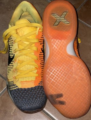
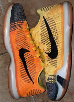
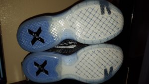
This. Every Elite IX high was beautiful in my eyes except the Showtimes (ugly as hell) and the NRG pairs (too plain) while the Xs have not been horrible, just kinda "tolerable" ...I think the lows aside from the Mambacurials are weak as hell. Really hoping Tinker comes with something dope, not feeling his recent Jordan work all that much. :\x highs aren't awful, their just not a visual work of art like the 9 highs, I find myself not being able to get excited about the sequel that's not really half as good

? Looks dope, but they lost me again with that tongue logo
Agreed. I think that on the 9's the upper piece from the ankle up looked better built. The upper shroud piece from the ankle up on the X looks flimsy and kinda cheap to me.x highs aren't awful, their just not a visual work of art like the 9 highs, I find myself not being able to get excited about the sequel that's not really half as good
Definitely! But I also wish they all were lows, not into the highs this season.Reds shoulda been lows

Imo, it depends on the cw and depends on personal preference. I actually bought the m10 year of the horse for casual wear, but couldn't keep them because of a major defect in the outsole where there was a giant bubble near the toe box. Those still has the best true full grain leather I've seen on Jordan's in a long time. I also bought the xmas M11, but those I'm still using them on court. They look awesome tho even if you use them casually. I only have the mambacurial X and still using those indoor as well. I dunno if I'd be wearing them casually afterwards tho.
Did they really put that commander eagle on this again

Repped and copped, thanks. Use Promo Code LKS15N53 for 10% off
 ). I rep Kobe and Nike but I feel they really dropped the ball with the X.
 This is the color blocking that should have been done from the start instead of asym.
that is the colorblocking we get. I like the asymmetrical look of the IDs like the IXs or even a solid 1 color upper as opposed to the random toe colors. All black and those PEs would be dope.oh my bad, I thought you just meant you wanted the toe to be a completely different color than the rest of the shoe like the lows.@MF Gooze
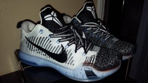
I don't understand. None of the highs have that colorblocking where the toebox, mid section, and heel are 3 different colors.
Nike Kobe 10 Eliterelease date on those please??

I guess I disagree. I have a lot of IX highs - I think I am only missing the Superhero, Showtime, Victory, and Perspective. So, I must like them. BUT, I think the IX looks more complicated than the X because it was Nike's first attempt at this very high, low profile silo. There are other shoes as high, but they have more collar padding, and more traditional basketball shoe cues. I think the X is a refinement of the IX's - they took away instead of adding - the shoe looks sleeker, more considered - it's an evolution of the IX. I think the fail on the X high is not the silo, it's just unimaginative FK. Lacking the ankle collar/heel counter overlay which was used to carry a graphic on the IX quite often in addition to more variation in the FK even on relatively single color versions, the X seems plain. But I absolutely think its a better silo - looks and feel - it's just the second iteration and not as groundbreaking, and generally not as visually interesting.x highs aren't awful, their just not a visual work of art like the 9 highs, I find myself not being able to get excited about the sequel that's not really half as good
I guess I disagree. I have a lot of IX highs - I think I am only missing the Superhero, Showtime, Victory, and Perspective. So, I must like them. BUT, I think the IX looks more complicated than the X because it was Nike's first attempt at this very high, low profile silo. There are other shoes as high, but they have more collar padding, and more traditional basketball shoe cues. I think the X is a refinement of the IX's - they took away instead of adding - the shoe looks sleeker, more considered - it's an evolution of the IX. I think the fail on the X high is not the silo, it's just unimaginative FK. Lacking the ankle collar/heel counter overlay which was used to carry a graphic on the IX quite often in addition to more variation in the FK even on relatively single color versions, the X seems plain. But I absolutely think its a better silo - looks and feel - it's just the second iteration and not as groundbreaking, and generally not as visually interesting.