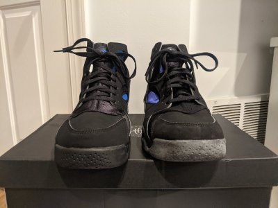
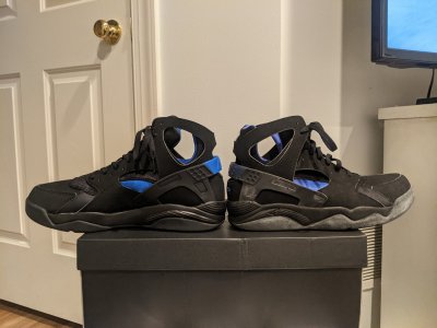
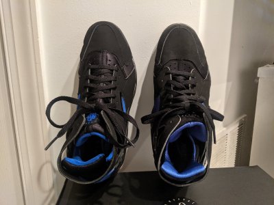
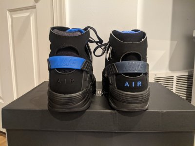
AIR J XIII
Supporter
- 6,575
- 12,965
- Joined
- Nov 11, 2002
Follow along with the video below to see how to install our site as a web app on your home screen.

Note: this_feature_currently_requires_accessing_site_using_safari

Still better than that last garbage retro. Still off, though.These get worse and worse the more pics I see.
Gonna have to see these in the flesh to make a final decision.
 . Now the self praising looks even worse.
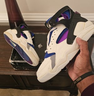
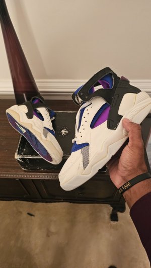
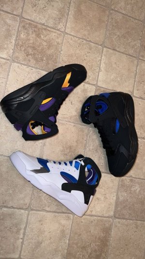
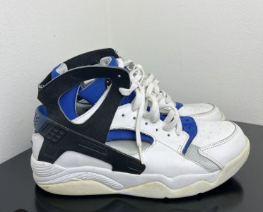
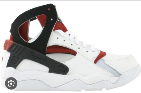
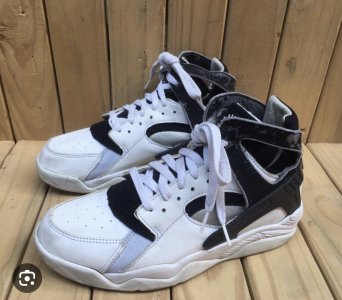
Side by side they aren’t close at all
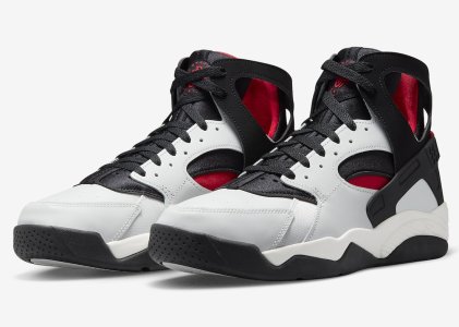
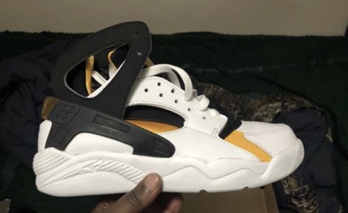
I hate the toe box. Looks too narrow with an awkward V shape. What were they thinking.
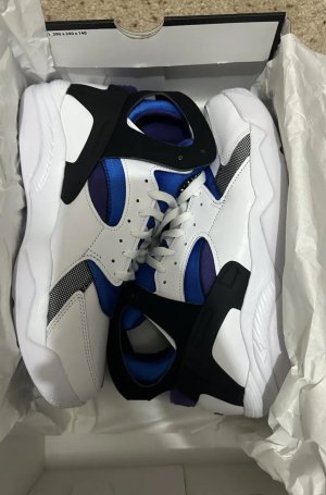
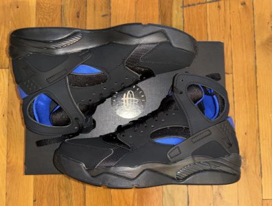
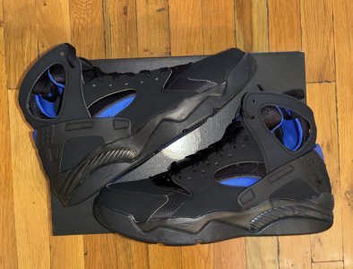
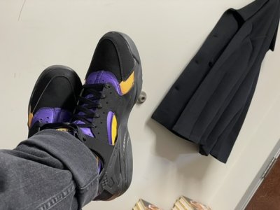
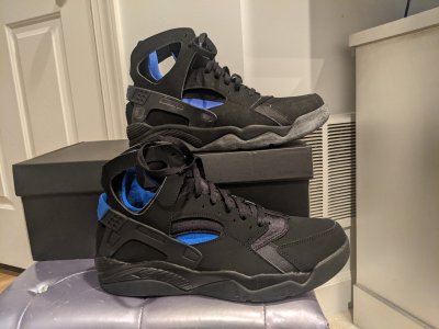
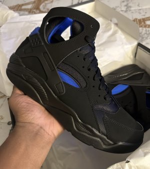
I cannot get past how bad this purple is. It's damn near blue on blue.
I hate the toe box. Looks too narrow with an awkward V shape. What were they thinking.


 in for a pair of the Kobe’s still.
I really want to know who the hell was in charge of “colors” on this shoe.
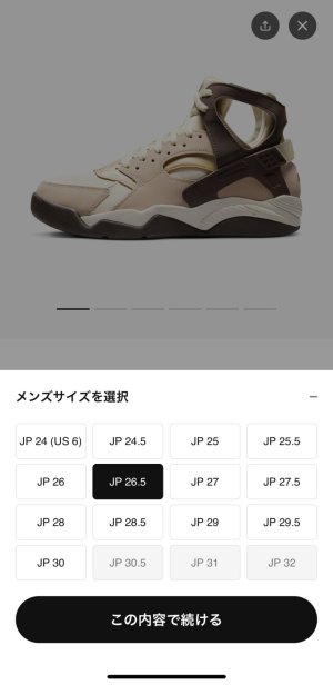
Modern lasts are much lower in the forefoot. It actually makes shoes fit much better for performance. But I think Nike should create their own lasts for retro sneakers. But they haven’t and likely won’t.Why can’t they just make shoes slope downward at the front ??? Why does that seem so incredibly difficult for them ? Lol
Yeah, I can’t believe the guy in charge of this actually called himself a designer. His job was just to copy and couldn’t even do that.Pretty sure dude listed it in that IG post where he was blowing himself over the great job they did. He @'ed the entire team and there was one listed as the color guy.
Modern lasts are much lower in the forefoot. It actually makes shoes fit much better for performance. But I think Nike should create their own lasts for retro sneakers. But they haven’t and likely won’t.
This guy?Pretty sure dude listed it in that IG post where he was blowing himself over the great job they did. He @'ed the entire team and there was one listed as the color guy.