- 49,029
- 61,330
KingFoam that pic a few pages back is the chick in the Rose case?
Yup
Follow along with the video below to see how to install our site as a web app on your home screen.
Note: This feature may not be available in some browsers.
KingFoam that pic a few pages back is the chick in the Rose case?
You sent it?
They better not have this D Rose case on Law and Order SVU


Heard its quiet for both of them tonight, unless something chnagedWall is playing for Washington tonight.
Any word if Rose/Noah are?
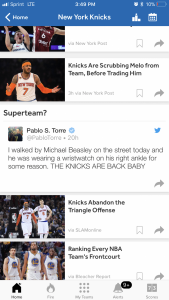
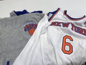
Knicks legit needa revamp their logo, their unis, and incorporate an alternative color again like they did with black back in the 90s/early 00s. Also, change royal blue to navy blue and orange and Throw some silver or gray in there too.
And of course, this one that never made the YouTube video
Jesus, Trautwig looks like his teeth going to fall out before halftime. See a dentist dude

 ESPN is trolling man