- 3,636
- 609
- Joined
- Jun 15, 2009
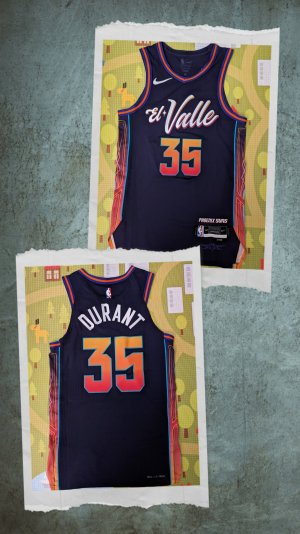
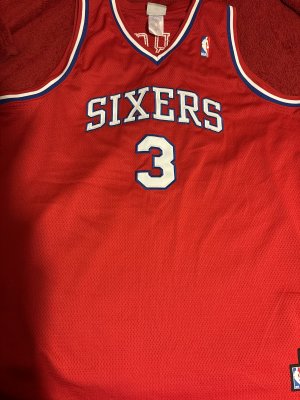
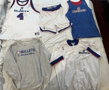
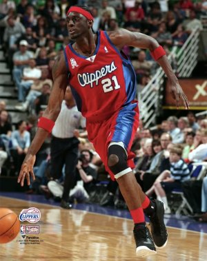
Surprised they look good
Follow along with the video below to see how to install our site as a web app on your home screen.

Note: this_feature_currently_requires_accessing_site_using_safari

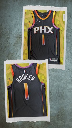
At least that's accurate though, right, the "shiny" screening?
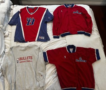
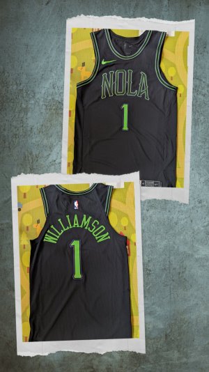
 ...and the hawks too
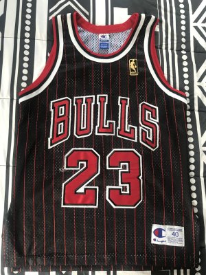
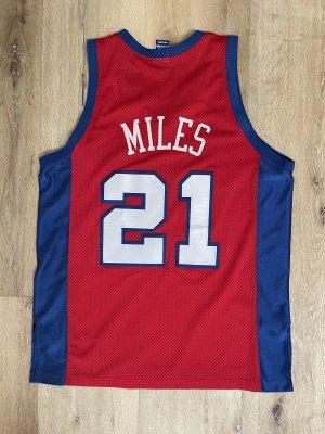
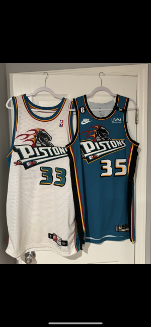
Thanks man. Single layer twill for everything.

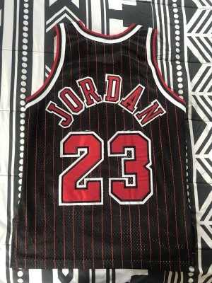
jersey is dope!
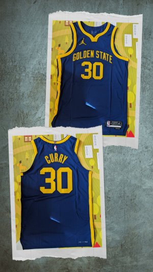
Chef Curry
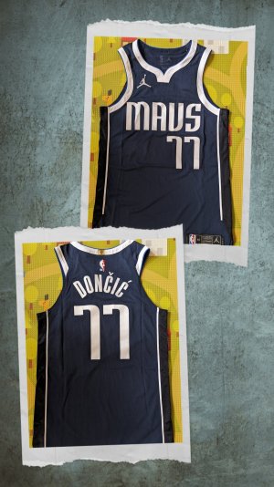
New Bucks Jerseys
Home
Away
love the colors on the side, didnt understand why they dropped the red but love the blue
Do these look like college jerseys to anyone else?
I'm mixed on them. Remind me too much of the Hornets onesDo these look like college jerseys to anyone else?
No word of any looming MN sales ?
Do these look like college jerseys to anyone else?