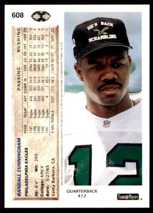
- Jul 22, 2012
- 6,316
- 14,424

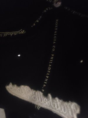
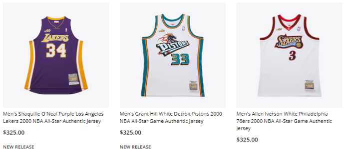
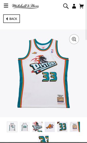
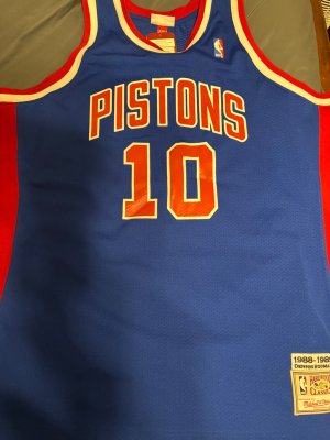
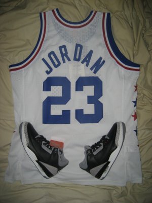
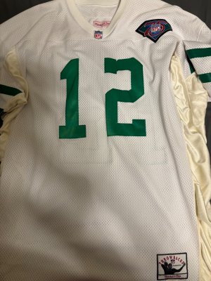
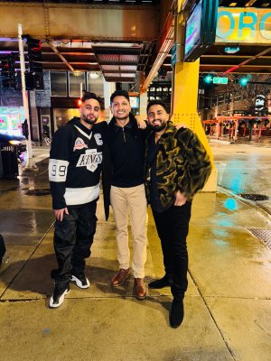
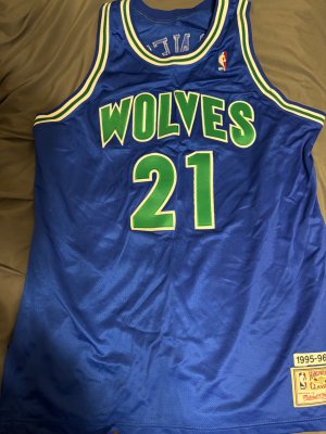
#1 why would you advertise a product you can't see
#2 who tf is wearing a button up over a jersey lol
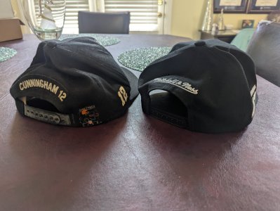
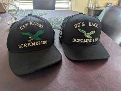
Lol, Mitchell and Ness is trippin’.
Follow along with the video below to see how to install our site as a web app on your home screen.
Note: This feature may not be available in some browsers.
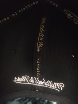
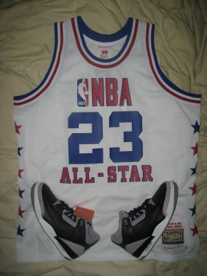
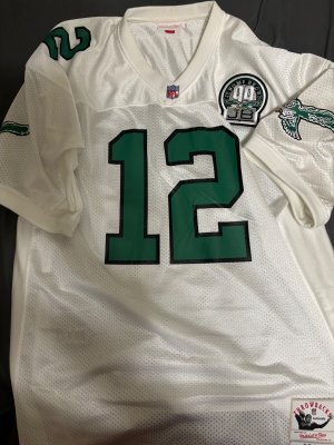
#1 why would you advertise a product you can't see
#2 who tf is wearing a button up over a jersey lol
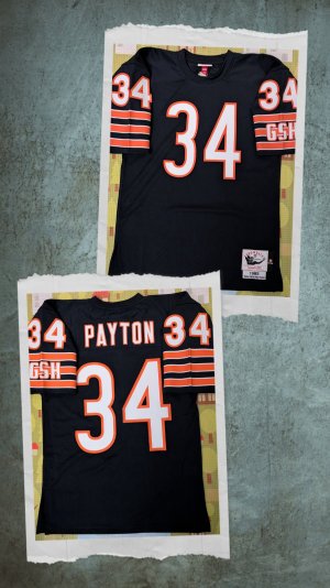
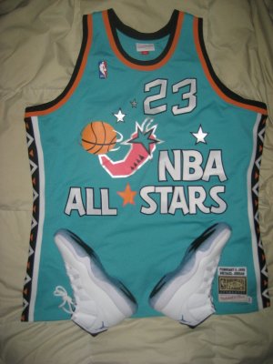
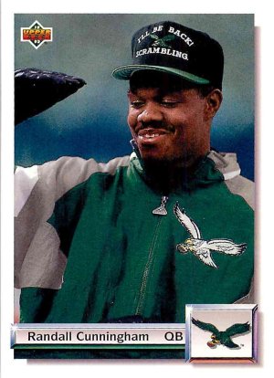
always thought the design of the wide shoulder jerseys wierd since you have to have a very specific physical frame to make it work (lean and skinny) so i like the thin shoulder designs more...
but most of the iverson peak performance has been in the wide shoulder version so.... meh.....
maybe he’s trying to combine two eras of Jay-Z Jersey and button up at the same time
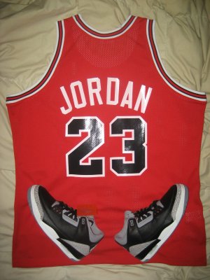
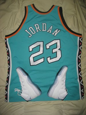
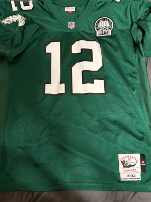
#1 why would you advertise a product you can't see
#2 who tf is wearing a button up over a jersey lol

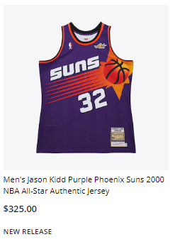
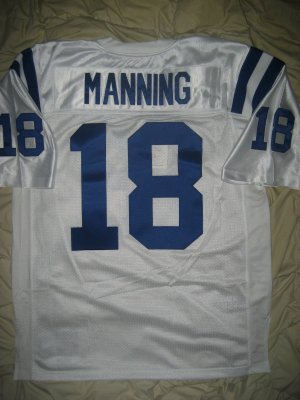
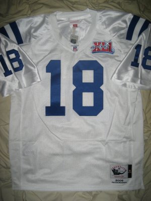
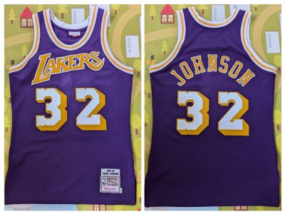
I’m sure you can find this jersey for $150 maybe less on eBayExcluded

What did you getQuick heads up. You can call the flagship store and do phone orders for the more recent release stuff that’s excluded on the website. I just ordered the two things I want, got the 40% off and no tax which was an added bonus.
What did you get


Get it while it's hot, $100 off
USA Basketball Mitchell & Ness x Just Don Authentic Shorts - Navy
Channel your inner champion with these USA Basketball Authentic Shorts from the Mitchell & Ness x Just Don collaboration. The lightweight mesh fabric allows for enhanced breathability, keeping you cool and comfortable whether you're shooting hoops or running errands. Two side pockets and two...www.fanatics.com