- 8,799
- 10,386
- Joined
- Apr 23, 2015
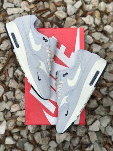
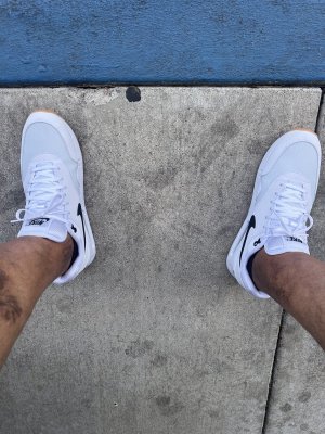
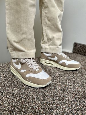
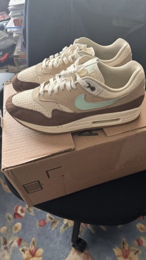
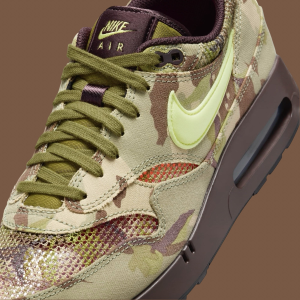
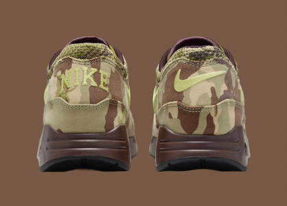
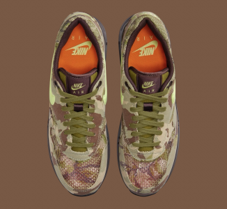
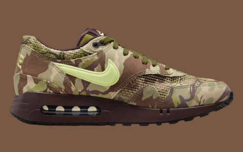
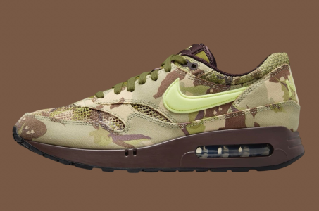
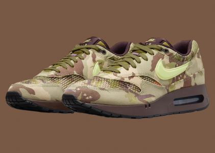
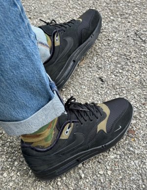
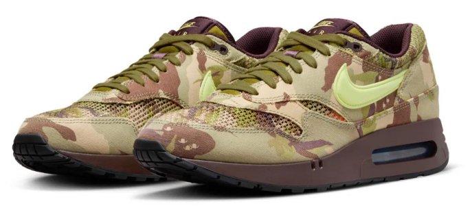
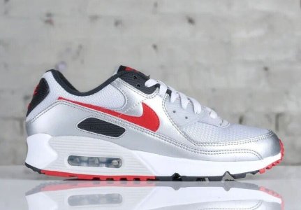
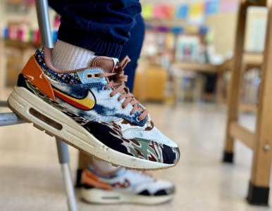
Dont get me wrong though, Id take those Size joints over these 10x over
I dont love them but I definitely dont hate them either
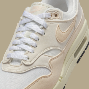
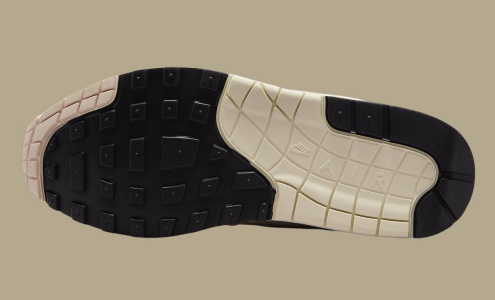
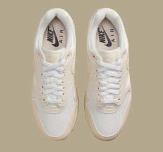
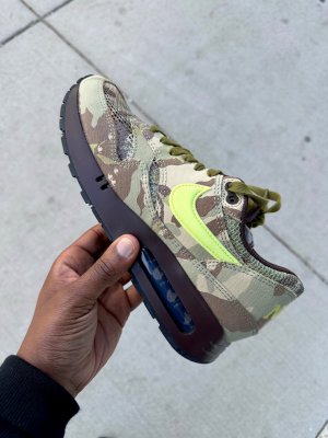
These shoes are kind of like a new album from a band youve been waiting on. Rarely does it match up to your expectations from what youve heard from the albums before because most artists hate repeating themselves, then sure enough the new sound starts to become familiar and it becomes another favorite after the confusion wears off. And thats why I appreciate them. Because this artist took a chance to do something different from his past work in order to grow and move forward. I have a feeling theyll look incredible once theyre a little dirty and beat up.
Last edited:


 (i don't like, but i share)
 [url=https://imgur.com/KMaj2d8]

