**..:The Official Jewelry Thread Vol. 11: You get a Jesus piece! You get a Jesus piece! Everybody gets a Jesus piece:..**

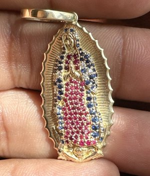
Originally Posted by michael32

Originally Posted by Hyperstrike 2007

Originally Posted by Frank Mucus

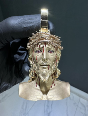
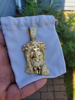
I like the new one better than the old one cause the face is free of stones. Whenever I see stones on a depiction of someone's face it just reminds me of pimples. If that new one had a crown like that it would look pretty nice too, plus I like the little details like the hair strands and the cross.


COSIGN

A halo would do that peace some serious justice
Good point, Im gonna get em to put a halo on that!

Damn, ya'll better let me get a chain or something, with this and the Bender suggestion
laugh.gif
 
Originally Posted by Rjwco

^^ my pics are coming high quality now^
lax's recent quality work is born and molded outta da sheer fire of hate and punishment from NT's jewelry thread
laugh.gif
pimp.gif


good work fams.
 
Yea I didnt wanna be the one to stone face him for that but it had to be done. Yellow will always be poppin.

Edit: Stop while your ahead. And if you got all these color combos show me yellow gold, with yellow stones for the hair and a white crown.
 
Lax, lemme see that GLC version and a brolic version compared to these smaller ones you posted. That silver/ruby one looks better than the rose/ruby one.
 
Originally Posted by AllenIversonFan01

Edit: Stop while your ahead. And if you got all these color combos show me yellow gold, with yellow stones for the hair and a white crown.
nerd.gif
 
Pretty sure those aint the ones he made... Setting is horrible compared to the other Jesus pieces
 
nah im pretty sure those are still his. the other ones he posted are monotone so it hides the settings a bit more. the stones in these are more prominent so itshows the settings.
thats my theory. either way this dude still doesnt wanna answer my question about the black jesus.
 
The stone setting is definitely too spaced out, looks like some connect the dots type stuff.

Not to d-ride IF&co but the setting they do is so tight and so much better than these last few pieces shown, it doesnt even compare.
 
Originally Posted by oo206oo

The stone setting is definitely too spaced out, looks like some connect the dots type stuff.

Not to d-ride IF&co but the setting they do is so tight and so much better than these last few pieces shown, it doesnt even compare.


People dont understand, I can think of a handfull of diamond setters that are doing things as well and IF..........is the setting horrible? no but are theygreat? no, it just is what it is.....even my guy back in the day couldnt mess with Bens people, I have an eye for it i can tell right away if something is setgood or not, i made and set one of my old joints and was it good? ehhh it was okay but ill be real i wassnt very good but atleast i learned how its done
 
Those Red Jesus Heads look like they were dipped in Red Kool-Aid Crystals. Great idea but you really need better results. Kepp grinding on that concept.
 
that pic of the white gold/violet Jesus pendant is just photoshopped right? lol
it's the same exact pic as the red one
 
Back
Top Bottom