The Official Photography Thread - Vol. 3

Originally Posted by KASUAL111


can you guys tell me which one would be better? canon 7d or nikon d300s? i'm upgrading from a d40. i don't have that much invested in glass, so switching to canon wouldn't be too much of a loss when buying new glass. i wish i could go full frame tho.

also, if i did switch to canon. what lens should i be looking into?
Canon 7D. That's the camera that made me switch, but then I ended up going FF. It's cheaper, and better. The specs speak for themselves, really. As far as glass, depends on how much you want to spend and what kind of shooting you're doing.
 
I know i can just google and compare on my own.. but anyone with knowledge just give a few examples of price differences for similar lenses between Nikon and Canon?
 
The price difference makes ya wanna jump ship a bit... but I doubt that will happen because I'm nowhere near being able to purchase any lens near either of those prices...

I haven't posted pics in a while.. these are from this past spring..
4344867543_3e10104912_b.jpg


4344869167_7aac95c2de_b.jpg
 
Blizzard of 2010.
4342397718_3e128830ac.jpg

4339398046_c6cccc4fdb.jpg

4344623285_7391e12e24.jpg

4334383536_5d4153498f.jpg

4333640073_e29befb4ac.jpg


and a school project. Supposed to be an ad for ray-bans, showing that anyone can wear them. "One style fits all."
4332743530_725a1453c3.jpg
4332004065_8ef61045a9.jpg
4332004837_b079201e61.jpg


Bigger sizes on blog. C&C?
 
With the release of those new lens i hope that will drop the price of the 14-24mm. That lens is so dope. There is nothing out there touching that lens.
 
Originally Posted by termanology27

and a school project. Supposed to be an ad for ray-bans, showing that anyone can wear them. "One style fits all."
4332743530_725a1453c3.jpg
4332004065_8ef61045a9.jpg
4332004837_b079201e61.jpg


Bigger sizes on blog. C&C?

Is that "one size fits all," as in "fits all personalities, or in a literal sense. As a designer, I see three similarly sized heads (although clearly different representations of people) and I'm not entirely sure that portrays your message 100%. I'm just nitpicking, though. Great exposure and composition on all three.

Something I noticed in the larger versions is that the "tape" above each middle shot looks like a smudge. I'm guessing you made the tape shape, colored it black, and then used Overlay to impose it on them. I would've used white instead of black and used Soft Light or even just Normal and then reduced the opacity of the shape/layer. Overall, though, you really captured the statement in a creative way that gets the point across without text/copy.
  
 
Originally Posted by TwoSickJays

With the release of those new lens i hope that will drop the price of the 14-24mm. That lens is so dope. There is nothing out there touching that lens.

As far as Nikon's line is concerned, I'd say the 14-24 and their 70-200 f/2.8 are definitely their strongest prime zooms. I'd even venture to say that the Nikkor glass on the 70-200 has a gentler bokeh than Canon's model, but with the release of the 70-200mm f/2.8L IS USM II releasing soon, we'll have to see. I think they quoted 14 elements in 11 groups-- should be interesting. As far as all lenses ever, I'd say the best lens ever is easily the Canon 85mm f/1.2L. Since I'm shooting FF, I'll probably just go for the 70-200 f/2.8 (mark I) next so I have a decent zoom, and then the 85L is next, and then probably the 24-70L to cover a wider end.
  
 
To put things in a simple perspective...Nikon rules zooms while Canon rules primes. Canon's L zooms are no slouch though.
 
Interesting Nikon glass releases...  I wish the 16-35 f/4 was f/2.8...  At least it has VR to it...  But to be completely honest, you really don't need VR at those focal lengths...  Nonetheless, I'm sure they'll be useful with the f/4 aperture...

Anyhoo...  Some contributions from the Flickr vault...

4295254883_ecbfa40544_b.jpg


4307254104_4da0b0a0b7_b.jpg


4309813586_21892a0187_b.jpg


And my new glass acquisition shot the following...
4326818802_f55f15ce47_b.jpg


4330577429_723071e2c8_b.jpg


Sorry about the flare and CA on the front element...  High contrast from the front element towards the sun tends to do that...  Anyhoo...  More to come...

- airbutchie
happy.gif
 
i read from couple places that canon 70-200 f4 IS is the sharpest zoom out
 
Butchie......that moon shot is dope.

That Nikkor 14-24mm seriously is the only other lens that I really want from Nikon. The only thing wrong is it isn't an all around walking lens which I am more used to at the moment. That thing wouldn't get me into any place if I had that on.
 
Originally Posted by NikeAirsNCrispyTees

termanology27 wrote:

and a school project. Supposed to be an ad for ray-bans, showing that anyone can wear them. "One style fits all."
4332743530_725a1453c3.jpg
4332004065_8ef61045a9.jpg
4332004837_b079201e61.jpg


Bigger sizes on blog. C&C?

Is that "one size fits all," as in "fits all personalities, or in a literal sense. As a designer, I see three similarly sized heads (although clearly different representations of people) and I'm not entirely sure that portrays your message 100%. I'm just nitpicking, though. Great exposure and composition on all three.

Something I noticed in the larger versions is that the "tape" above each middle shot looks like a smudge. I'm guessing you made the tape shape, colored it black, and then used Overlay to impose it on them. I would've used white instead of black and used Soft Light or even just Normal and then reduced the opacity of the shape/layer. Overall, though, you really captured the statement in a creative way that gets the point across without text/copy.


I am actually not mad at this campaign attempt. The message is pretty clear in the sense that these glasses are made for all types of people no matter the person. I think what remains is just the remaining text layout and even the tag line if that is implemented. Overall as a set, it looks pretty good but the only thing I can see that may be a problem is how this is presented. Like is this going to be in a magazine layout and if so, is it like one ad per magazine or are all three going to be in there.....like 3 pages back to back? I think as a set, it works effectively but if one was left alone, I can see people having a problem trying to figure out what is wrong in here. As a billboard though, it would be nice cause you can stack all 3 images side by side. Anyways...something that was just jogging my brain.


dave-chappelle-1.jpg


And iPhone shot of Dave Chappelle. I know it is a bad photo but I had no where else to post this.
 
Originally Posted by Mr Fongstarr

Originally Posted by NikeAirsNCrispyTees

termanology27 wrote:

and a school project. Supposed to be an ad for ray-bans, showing that anyone can wear them. "One style fits all."


Bigger sizes on blog. C&C?

Is that "one size fits all," as in "fits all personalities, or in a literal sense. As a designer, I see three similarly sized heads (although clearly different representations of people) and I'm not entirely sure that portrays your message 100%. I'm just nitpicking, though. Great exposure and composition on all three.

Something I noticed in the larger versions is that the "tape" above each middle shot looks like a smudge. I'm guessing you made the tape shape, colored it black, and then used Overlay to impose it on them. I would've used white instead of black and used Soft Light or even just Normal and then reduced the opacity of the shape/layer. Overall, though, you really captured the statement in a creative way that gets the point across without text/copy.


I am actually not mad at this campaign attempt. The message is pretty clear in the sense that these glasses are made for all types of people no matter the person. I think what remains is just the remaining text layout and even the tag line if that is implemented. Overall as a set, it looks pretty good but the only thing I can see that may be a problem is how this is presented. Like is this going to be in a magazine layout and if so, is it like one ad per magazine or are all three going to be in there.....like 3 pages back to back? I think as a set, it works effectively but if one was left alone, I can see people having a problem trying to figure out what is wrong in here. As a billboard though, it would be nice cause you can stack all 3 images side by side. Anyways...something that was just jogging my brain.


Thanks.
I wanted it to show that they fit all personalities. Diversity. I wanted to make it look like they were torn and taped together. I still have the psd so i'll go back and try the tape that way. I also made different versions on each where they have the ray-ban logo & text on it. I don't think they're magazine ready yet, seeing that I still have some stuff to work on. Seeing it as a billboard or in a magazine would be crazy though haha.
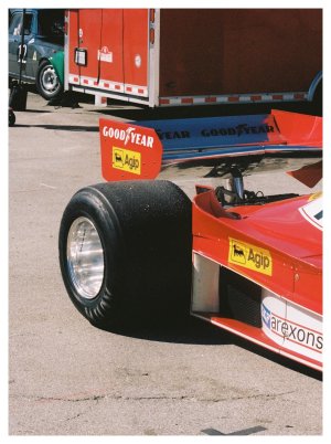
 
^^^Dude....not sure if you do or not but check out Communications Arts magazine for inspiration. I was actually reading their current issue yesterday and they have some real good stuff on both the photography and design side.
 
nice lokiD40! I didn't think there were any lomo heads in here. I'm into lomograpghy too!
 
Back
Top Bottom