- Jul 14, 2003
- 7,949
- 5,122
Follow along with the video below to see how to install our site as a web app on your home screen.
Note: This feature may not be available in some browsers.

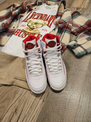
That extra price on the toebox is so unnecessaryMaison Château Rouge x Air Jordan 2 “United Youth National”

AlwaysI feel like they (JB) feel like they have to go "extra" on the 2. To me its a simple design and should be presented in its original form. I would like to think the Off Whites and a few of these newer pics are gonna lead to the Originals coming back. I mean my daughters favorite shoe in my collection is my 2. She 17. They have a chance. lol.
I'm really liking these. My main issue with 2s has always just been the boxy az toe shape and profile (which isn't how they were originally, but all the Retros have criminally done IMO), and that rubber/plastic wrap around heel counter thing. All of these newer releases seem to be fixing the shape/profile issue, and these along with the other upcoming 2s that I love (the Unions) have removed that heel counter, more akin to the Decon 2s, which I think makes them look so much better.Maison Château Rouge x Air Jordan 2 “United Youth National”
Always
Those new black low - ruined by the elephant print
Anniversary - ruined by that random grey on the toebox
White/concord - ruined by the elephant print
Union - great colorway, dislike that patch on the tongue.
Naw literally go back to the drawing board w/ these…. The twos are so simple, can we get few simple releases first then you can butcher them w/ these collaborations????Maison Château Rouge x Air Jordan 2 “United Youth National”
Thanks for sharing this. I’ve admittedly NEVER been into 2s (just one day want an AS CLOSE TO OG AS POSSIBLE LOOKING Chicago 2 Highs, as that’s the pair MJ won his first Dunk Contest here in Seattle), but other than the toe shape and profile (which I prefer on the OGs, and was one of the main reasons why I’ve never been into Retro 2s), I never realized some of the other glaring changes that are so obvious in side by side pics like this. Especially the side panel with lining/piping. Never realized it stops at like the second to last eyelet on the OGs (like the 11th perforated holes) but has been changed to go damn near all the way to the toe now (like the 15-16th perforated hole). That’s super glaring, and IMO look much on the OGs. The rubber/plastic heel counter thing (which I’m not a fan of either way) is bigger (and better I think) on the OGs too. And the collar being straighter on the OGs looks so much better IMO.A quick refresher on what JB has done to the 2.
Kids today don't realize what we've been through, and why this is half the reason the 2 gets its hate.


Great post comparison! It’s like whoever was in charge of the retros made them from a faded memory instead of ACTUALLY LOOKING at the 2. The retros are just an abomination. Especially the low. The low is literally another shoe with cues from the AJ II lmaoA quick refresher on what JB has done to the 2.
Kids today don't realize what we've been through, and why this is half the reason the 2 gets its hate.
Still holding up like champs, damn i miss those. Hope they bring them back in similar if not better quality.