2019 All Star Black Infrared Air Jordan 6

Where do you prefer the lace lock?


  • Total voters
    469
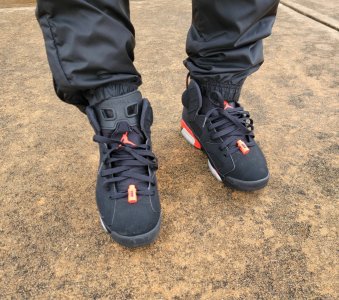
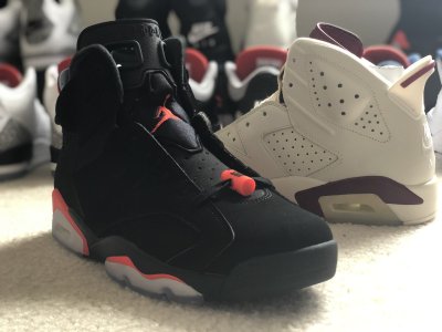
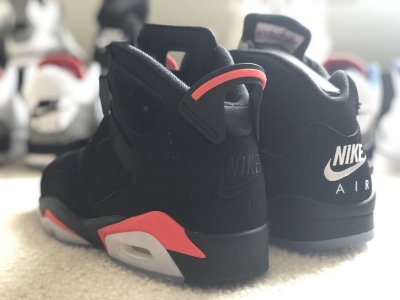
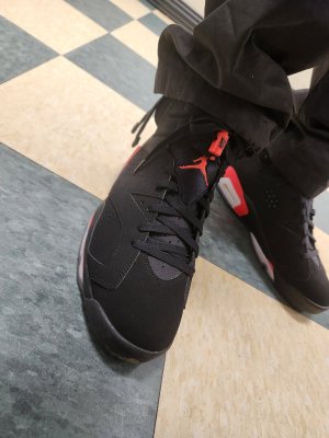
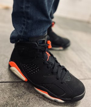
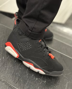
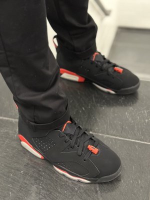
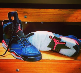
You don't have the Strong Contrast that some of the other pairs have that can be seen from the side in any light, but most likely have the general contrast which can be seen in strong light usually from the back on mostly all pairs!

(People are going to hate this, but it is what it is. There are Levels to this Heel Contrast Game. They are not all manufactured the same. Whether it's a flaw or not, to me it's a Cherished Accident! I would prefer the Stronger accident on all mine!) :D

Yup it is what it is...

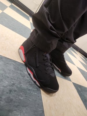
I bought 4, 1 was strong, 1 was medium, 2 were weak... the 2 weak/non-existent became stockX food on RD.

But as I stated before, the contrast heel was 1/3 of what I was specifically looking for on this release. My prerogative and that is the only "period" in the discussion.

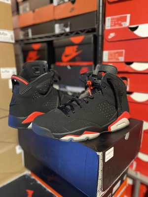
At Nike Lenox on the morning of the release, I saw an older cat have them pull 3 size 13's before he found one and checked out... When he found the right one, it was easily apparent... he didn't have to flip it around from side to side to try and "catch it in the right light". Just open each box and glance...
 
Saw most of the clothes they released for these today at Footaction. TERRIBLE. The 90s nylon shorts had potential but the infrared on the shorts doesn’t match the shoes. That weird Jordan 6 tongue-looking logo on ALL of the clothes is just ugly.

How come it seems the more popular the retro color (11 concord, 5 grape, 6 infrared, etc) the worse the JB clothes are?

Like I’m fully expecting Jordan to put out black/red loafs of bread on shirts and shorts with the black/red 11s dropping this year. I mean they did put a bunch of grapes (5s) on a shirt and a goat’s head on stuff for these recent Concords.
The only way I would ever by matching gear with a retro Jordan is if they bring back the big head player shirts, o the championship tees. Beyond that it all looks terrible. Don't ever wanna be the guy looking like a Champs mannequin.
 
Saw most of the clothes they released for these today at Footaction. TERRIBLE. The 90s nylon shorts had potential but the infrared on the shorts doesn’t match the shoes. That weird Jordan 6 tongue-looking logo on ALL of the clothes is just ugly.

How come it seems the more popular the retro color (11 concord, 5 grape, 6 infrared, etc) the worse the JB clothes are?

Like I’m fully expecting Jordan to put out black/red loafs of bread on shirts and shorts with the black/red 11s dropping this year. I mean they did put a bunch of grapes (5s) on a shirt and a goat’s head on stuff for these recent Concords.

You doing it wrong if you looking forward to any type of JB clothing. Hasn't been good since the late 80's/early 90's. Like dude said above who wants to look like Champs mannequin?? :lol::lol: Respect and shouts to Dalitso tho.
 
rocking them today at work... and surprisingly pretty comfortable compared to 2014... will be rocking more often
20190222_080912.jpg
 
Its not just the lighting. My pair has one with, one without. I checked several different angles with all the natural lighting and then some. I am well aware that the "leathery" look was not going to be there on this release. To say "ALL" pairs have it, is not a true statement. 98% of people that have this shoe could give a damn I know. But there is a small percent of people that do notice this difference. No foolin. Still, I am very happy with my pair knowing at the same time that the QC is not what it SHOULD be.
if you worried this much about heel contrast, don't even want to know how picky you are with women
 
rocking them today at work... and surprisingly pretty comfortable compared to 2014... will be rocking more often
20190222_080912.jpg

This may start a new debate but..

Tuck that tongue in :sick:

I always thought the 6’s tongue when “stuck” sticking out like that makes the shoe look sloppy.
 
I buy more than 1 pair of x item that I like because i read a quote by Mark Zuckerburg where he said the reason why he always wears a grey shirt and jeans because it’s less time he has to waste deciding on what to wear for the day.

Oh yeah, the Playoff/All-Star VI is dope.

You must be young, Einstein was doing that a long time ago
 
Got my pairs in. I do not see any true contrast heel. If anything it’s just the way you view the suede upper. The left shoe lateral side for example is slightly lighter than the material underneath. So does the lateral side have contrast on this shoe? Lol

9C72CD2C-6460-4B48-AEC3-7C1512B8041B.jpeg
 
Got my pairs in. I do not see any true contrast heel. If anything it’s just the way you view the suede upper. The left shoe lateral side for example is slightly lighter than the material underneath. So does the lateral side have contrast on this shoe? Lol

9C72CD2C-6460-4B48-AEC3-7C1512B8041B.jpeg

I been saying this in this thread. The "3" or whatever we're calling that part on the side is the same material as the "contrast" heel. The "3" is contrast too....of course depending on the lighting.
 
Got my pairs in. I do not see any true contrast heel. If anything it’s just the way you view the suede upper. The left shoe lateral side for example is slightly lighter than the material underneath. So does the lateral side have contrast on this shoe? Lol

9C72CD2C-6460-4B48-AEC3-7C1512B8041B.jpeg

No. Not the contrast in question at least. When you get a chance can you post the side and rear profile of both your shoes?
 
Local champs had a restock this morning. Was the only customer so was able to cop two pairs in my size with the best quality and contrast.

About sizing, these def run a half size big. The pairs I copped on RD were in my tts 10.5 and my feet were swimming.

329B24FE-CA0B-4B93-9890-7623858E6B19.jpeg AD1F408F-9938-46D8-8302-0E0D5F14F9CE.jpeg
 
Back
Top Bottom