- 315
- 222
- Joined
- Dec 15, 2003
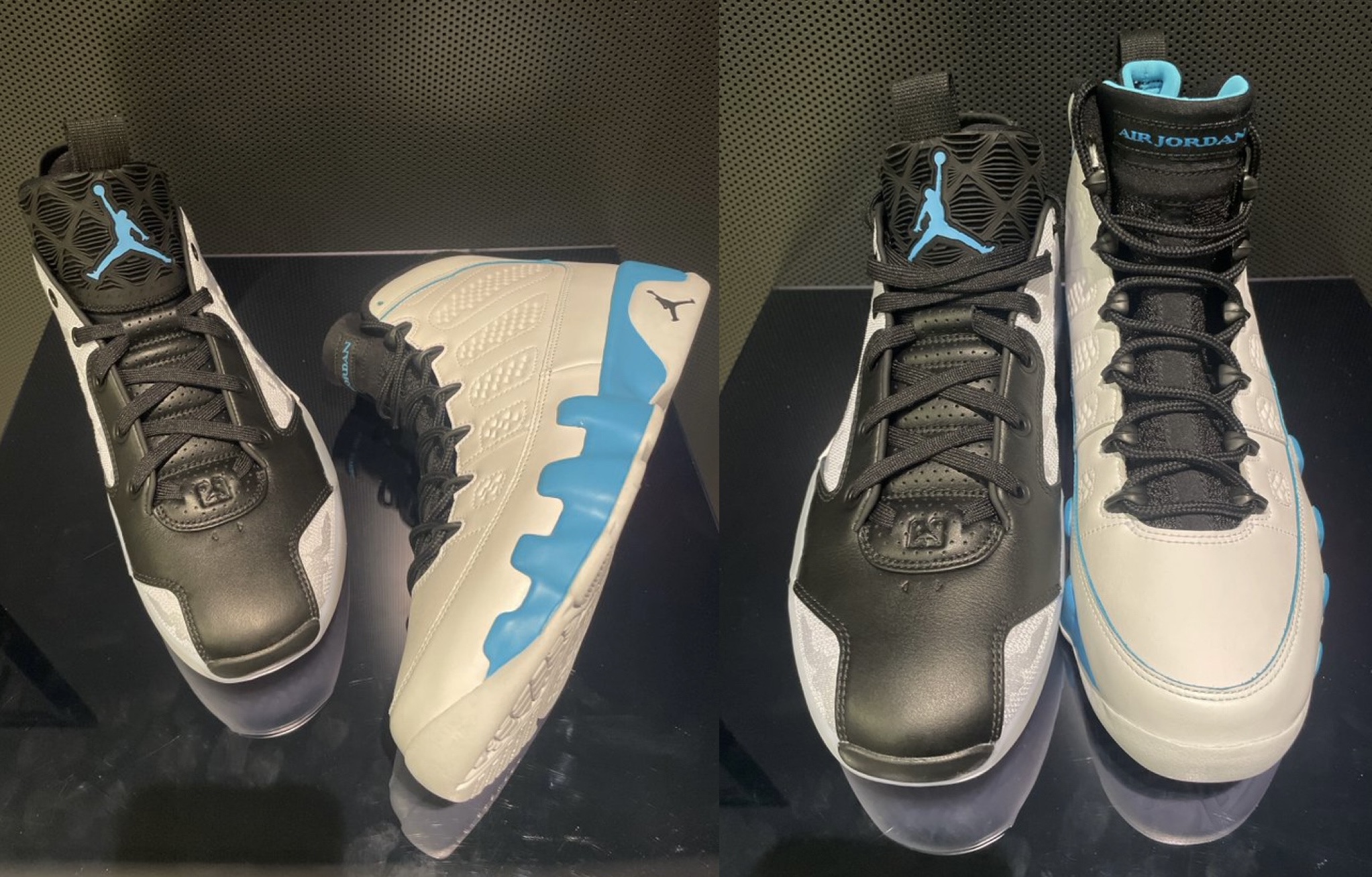
Are you referring to the 3s, 4s? I look at those as more 5/8 than lows. What others are you thinking of straight up low tops?If this is the only one you aren’t buying due to the cut of the shoe, then I wonder what you think the cut of pretty much every Air Jordan is. They are almost all about this same height.