- 7,299
- 9,719
- Joined
- Sep 21, 2012
They need a big *** jumpman on the back
Not the tongue
Not the tongue
Follow along with the video below to see how to install our site as a web app on your home screen.

Note: this_feature_currently_requires_accessing_site_using_safari
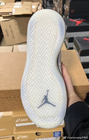
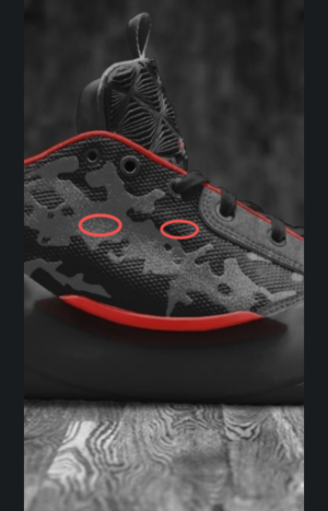
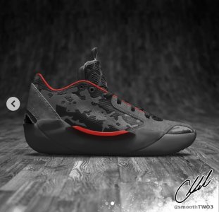
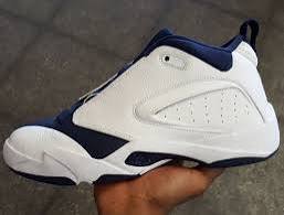
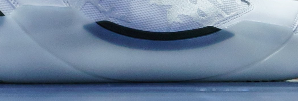
Going back to this, I think if this rubber componentVisually, I don't like the chunkiness of the midsole area, it detracts from the sleekness of the clean look they were going for, though I'm sure they're gonna be great for on-court. As for the basicness of the colorways, I'll withhold judgment until I see em in person to see if they have the premium feel a 61 yo Michael Jordan wanted to achieve.
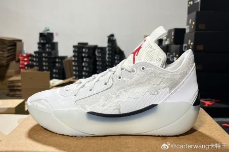
My first thought. And view from the top of the toe box looks like the 38. The whole "29 painted patina influence" seems dumb when that design was done on the Zion 3.I like em! Major Zion 3 influence though
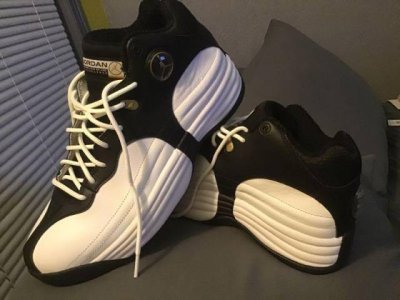
Hate the tongue pull tab. No point to them, the tongue is already a pull tabI like the philosophy: the supposedly premium materials, the cushioning tech, the low or 5/8ths height.
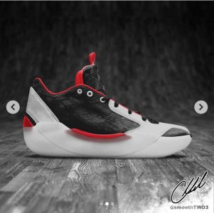
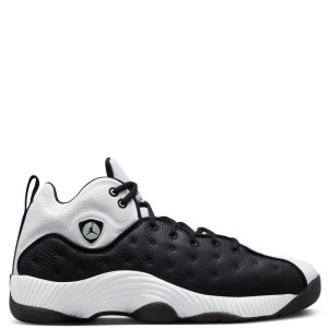
But the way these look is … underwhelming. I just don’t dig this design language or the design language loads of modern Jordan shoes are using. These don’t look bad, and the colorway with the black side and white toe is my favorite of what’s been shown.
But that pattern on the side is meh. And cotdamn, back to pull loops on top of the tongues?
The JB designers just have a different eye than I do in terms of what I might think looks amazing.
Almost certainly a pass for me, unfortunately.


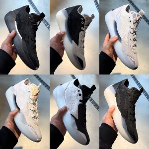
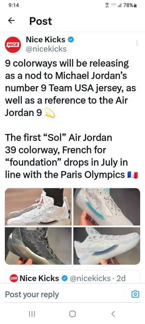
Looks like this is 6 of the 9 pair that are releasing.
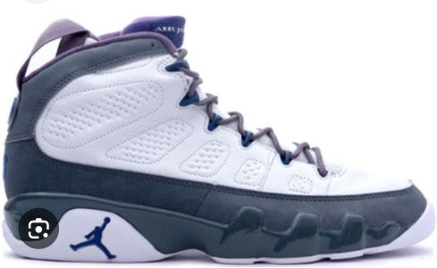
Def a playoff and white red in there.
Easy to cut off with an Xacto knife, though.I'll say it again: Those effing pull-loops on the tongue. I really thought after the 38 that we were finally done with this stupid played-out design element
All black pair and the all white with the red jumpman are my favorites of those six.Looks like this is 6 of the 9 pair that are releasing.
Def a playoff and white red in there.
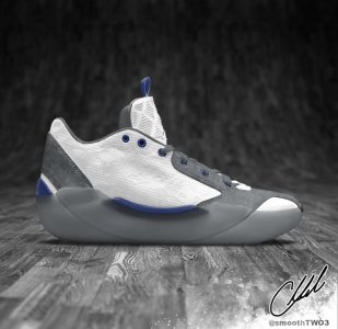
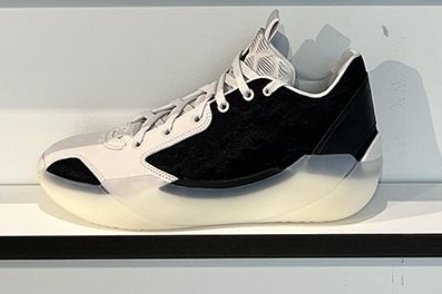
Really like the colorways on the top right and on the bottom middleLooks like this is 6 of the 9 pair that are releasing.
Def a playoff and white red in there.