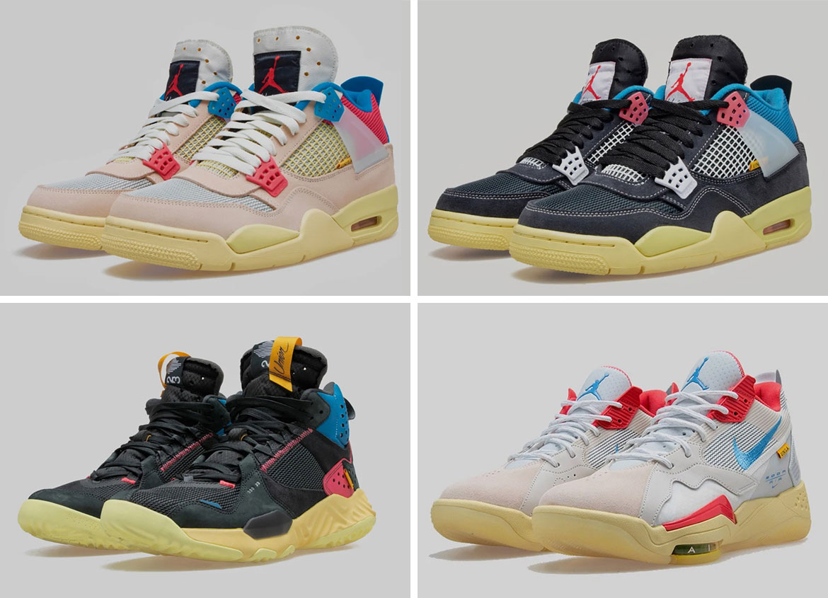
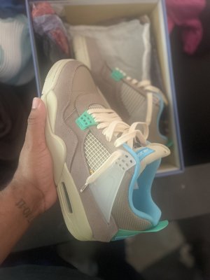
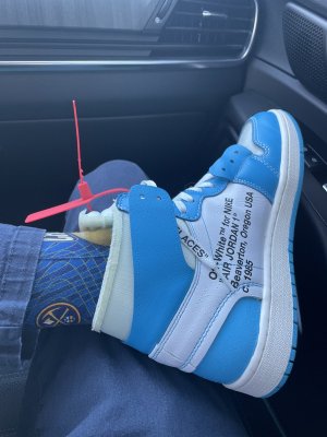
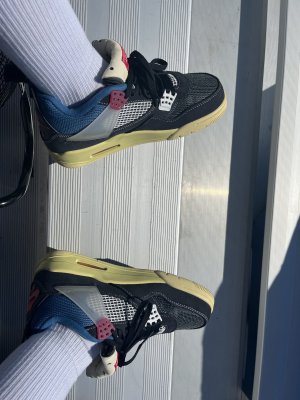
I don’t agree. Collabs used to mostly be just different colors and a logo. Retro Plus sneakers are also just different colors of existing models. Off-Whites have pretty unique materials, the writing on the medial side, the quotation marks, the zip tie, oversized swooshes, unique boxes, unique insoles. There’s a whole theme. Considering there’s only so much you can do with well established models, I’d argue Virgil did a GREAT job on his collabs. I believe a lot of the details of his sneakers aren’t captured very well in pictures because of their color. The Off-White 4s looked pretty plain/boring in pics, but in person they’re absolutely beautiful.
I’ll also give Virgil credit for using a few models that weren’t currently hyped, and making them extremely desirable. In particular, his first Presto was a masterpiece. The blazers also stands out to me, to a lesser extent since blazers weren’t AS forgotten as prestos.