dhtowng
Supporter
- May 22, 2010
- 10,015
- 21,120
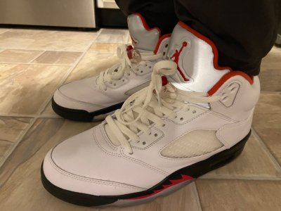
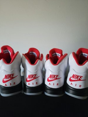
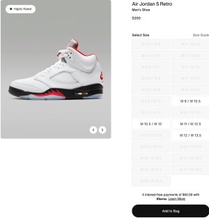
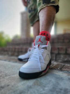
You nailed it.The 3m tongue Fire Red is perfection. It’s clean and gets straight to the point of the shoe. The teeth. That red accent against the black midsole just pops. Not only is the midsole black, the toe is too which hides the toe stitching on the front of the shoe. A clean look. The white upper then just accentuates the teeth by not introducing any colors until you get to the ankle collar. That’s accentuated in red highlighting the asymmetrical collar. Once you top it with the reflective tongue it’s perfect. Even the lines of the shoe are perfect. This color blocking is perfect. Any colors can be used with the black midsole and all white upper and it works every time. (Concord pair coming up proves this)
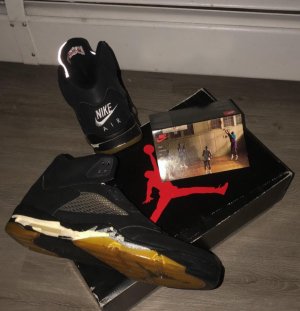
You can’t say that about the black tongue. It’s too busy. Now the focus isn’t the teeth. Is it the number 23? Is it the eye sore stitching on the toe since it’s now visible? Is it the black tongue which just looks too visually heavy? Perhaps it’s the black eyelet at the top by the tongue. There is just too many elements competing for attention and it’s visually confusing. It just doesn’t work… for me.
Simple is better.


