- Sep 5, 2000
- 3,701
- 7,805
October 7 for the Tatum PEs apparently. Hopefully Nike Canada gets them this time around.
Follow along with the video below to see how to install our site as a web app on your home screen.
Note: This feature may not be available in some browsers.

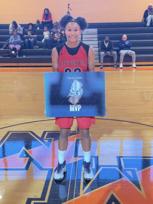
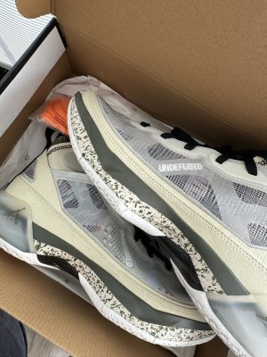
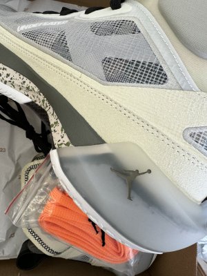
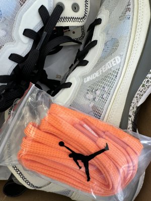
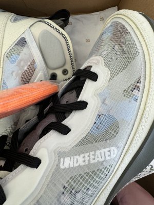
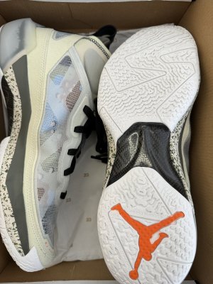
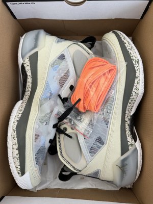
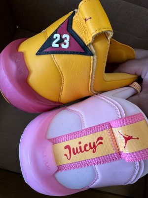
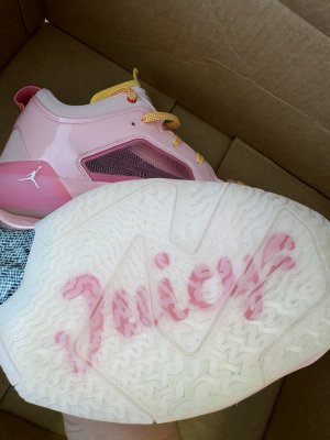
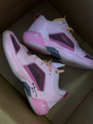
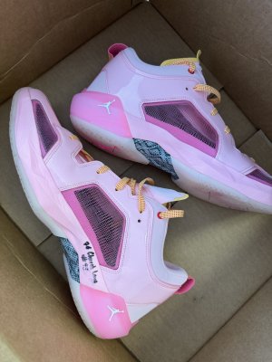
I believe that’s the WNBA logo on there.I don’t like the colors, but what really disturbs me is having the privilege of wearing the newest J’s not even released to the public yet with Nike logo socks that got a bootleg looking And 1 logo silhouette figure on it. I know half of y’all finna @ me over this but please don’t @ me I’m just a grumpy old head
I believe that’s the WNBA logo on there.
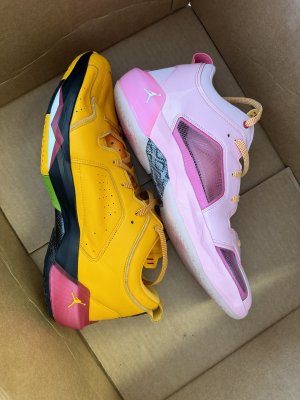
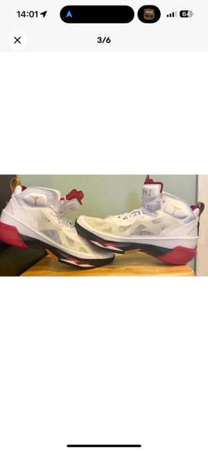
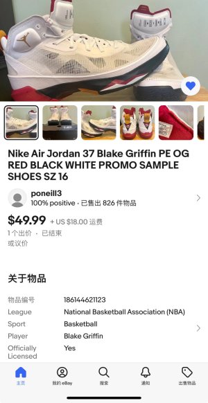
The recent colorway showed like its a rough draft of the Jordan Melos with cheap materials.The shoe is really taken down a notch by the circular ring above the midsole. It's trying to be an angular shoe in a round box and it clashes. It's definitely not as tight of a design as the last few, although there are definitely some touches I like, especially the outsole.
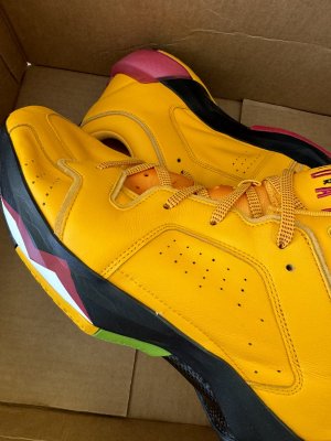
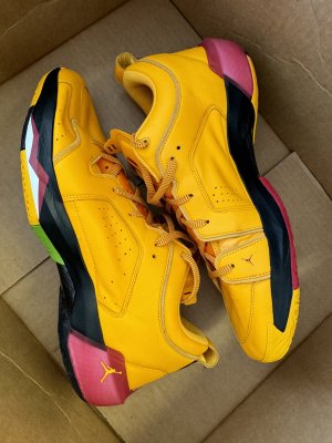
I have to say so far though the weakest thing is the colorways. I like the bone one ok, but the Hare just doesn't work well and those tatums and some of the other PE stuff we have seen is pure fad trash. I really don't get this concept of throw as much **** on a shoe as possible, it really shows a lack of imagination and discipline. Not everything looks good by default.

 .
.yeah, they could have used that time to design and implement the 37 better.As much as I like getting new iterations or seeing them on court, I don't get why they would release the 37's this early while there is still much life left in the 36 and some of the lows' colorways haven't even released yet.
I mean the 36 have been a big success so far and everywhere I look, adults or young ball players around me are looking to either gather enough money to get their 1st pair or buy multiple colorways.
If I were JB, I'd milk the 36 and would push back the 37 to a later date in the Fall...especially since the 37 haven't been acclaimed very well thus far...
Because they are on finishline release calendarWhy do we think these are dropping tomorrow?

Because they are on finishline release calendar
Still on appNot showing on desktop anymore. Dang.


Not @ing anyone but...
"Bootleg And1 logo"?
Well that's a very high crossover!


In my defense, I did say bootleg looking logo. Wasn’t really serious about it. Knew it had to be something official, but hey I’m not gone lie… I had no idea what it was. I thought for a min it was an alternate Lebron logo.
This forum has me legit confused. Things I think are funny or lighthearted get taken seriously.