FOAMPOSITE DISCUSSION Nike Air Foamposite One SWOOSH ALL OVER DEC192019

Best Foamposite Release Of 2017 (Pick Your 3 Could Only List 10 Max.. Omitted Metallic Gold Pros)


  • Total voters
    426
I was around for the Chrome C-Webbs but its not like people see the Chromposites and look away and say "Dada already did that" :lol: I think when the shoe is made to look like something thats sole purpose is to be looked at then it's gonna attract alot more attention than caucasian colored foams. Just my opinion.
 
I was around for the Chrome C-Webbs but its not like people see the Chromposites and look away and say "Dada already did that" :lol: I think when the shoe is made to look like something thats sole purpose is to be looked at then it's gonna attract alot more attention than caucasian colored foams. Just my opinion.

[emoji]128514[/emoji][emoji]128514[/emoji][emoji]128514[/emoji][emoji]128514[/emoji][emoji]128514[/emoji]
 
These beige foams are straight trash in my opinion. This shoes has nothing to do with Basketball anymore! :smh:
 
I was around for the Chrome C-Webbs but its not like people see the Chromposites and look away and say "Dada already did that" :lol: I think when the shoe is made to look like something thats sole purpose is to be looked at then it's gonna attract alot more attention than caucasian colored foams. Just my opinion.
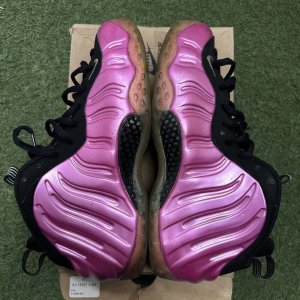
This. Three foams I can't stand looking at are the Chromes(both) and the all Volt pair. Yikes.
 
Last edited:
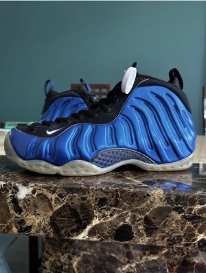
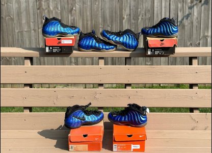
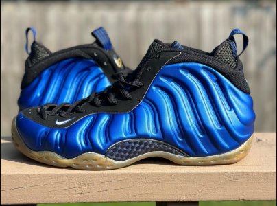
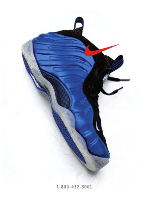
I finally had some time to take photos of the 97 OG, 07 retro, 11 retro and 17 XX retro royals, so here they are:

View media item 2339604

View media item 2339605

View media item 2339606

View media item 2339607

View media item 2339608

View media item 2339609

View media item 2339610

View media item 2339611

Royal blue color: OG > 07 > XX > 11
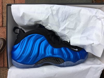
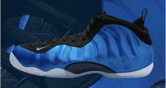
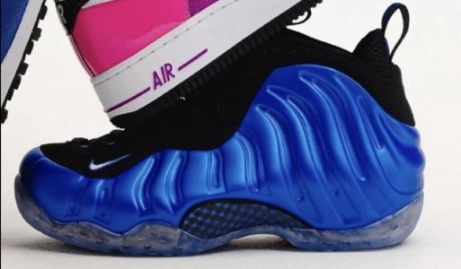
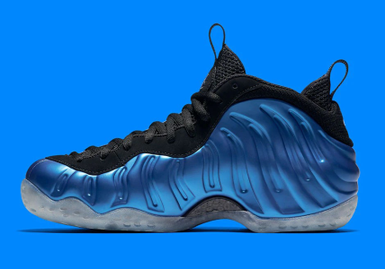
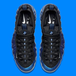
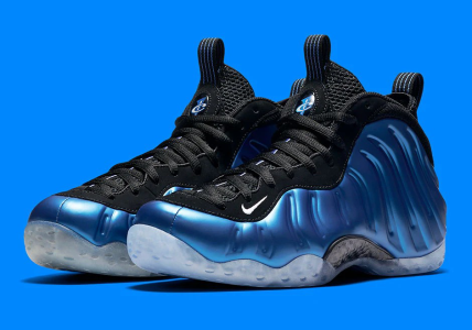
I must say that I do like the royal blue from the XX release a lot, since it is more vibrant than the blue of the remaining ones, despite it not being the true royal blue from the past.

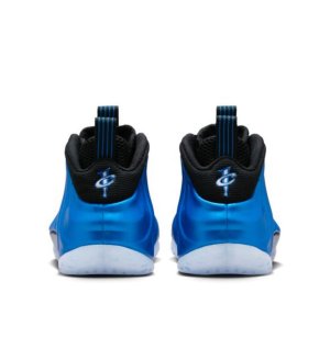
1 Cent logo: OG = XX > 07 > 11
The OG and XX release have a very similar 1 Cent logo design on the heel and sole, so they did try to match the OG here. The 07 release has more blue than white in the heel logo and the 11 release is somewhat in the middle

Shape: OG > XX > 07 > 11
it is sad that they did not 100% remake the original molds, the OG release just looks wider and it does give the shoe a different kind of character. The 07, 11 and XX just look slimmer and longer

Overall quality:

you can not really count in the OG, it is just too old, but for a 20 year old shoe, the quality is still ok, otherwise XX > 07 > 11. The foam feels softer, so after breaking it in, I think that this shoe will be better performance wise than the 07 and 11.

Overall:

again I would not put the OG in here, without the OG there would have been no retros, so it is non competitive.

This leaves the 07, 11 and XX retros.

Last place: 11 Retro: the royal blue is inferior in comparison to the other 2 retros, also the overall finish and the molding is not on the same level.

2nd place: 07 Retro: comes closest to the OG color wise, but overall finish and molding as well as the 1Cent details are not on the same level as the XX retro.

1st place: XX retro: comes closest to the OG in terms of 1Cent design and the overall finish. The Foam quality is great and despite not having a 100% accurate royal blue color, this blue has its own great vibe to it!

Just my personal opinion!
 
Love the comparison. I agree with you how the color on this years pair is more vibrant and looks good. I also like how dark the blue hue is on the OG. But for a shoe like this I think it's better for the blue to pop
 
I finally had some time to take photos of the 97 OG, 07 retro, 11 retro and 17 XX retro royals, so here they are:


Royal blue color: OG > 07 > XX > 11
I must say that I do like the royal blue from the XX release a lot, since it is more vibrant than the blue of the remaining ones, despite it not being the true royal blue from the past.

1 Cent logo: OG = XX > 07 > 11
The OG and XX release have a very similar 1 Cent logo design on the heel and sole, so they did try to match the OG here. The 07 release has more blue than white in the heel logo and the 11 release is somewhat in the middle

Shape: OG > XX > 07 > 11
it is sad that they did not 100% remake the original molds, the OG release just looks wider and it does give the shoe a different kind of character. The 07, 11 and XX just look slimmer and longer

Overall quality:

you can not really count in the OG, it is just too old, but for a 20 year old shoe, the quality is still ok, otherwise XX > 07 > 11. The foam feels softer, so after breaking it in, I think that this shoe will be better performance wise than the 07 and 11.

Overall:

again I would not put the OG in here, without the OG there would have been no retros, so it is non competitive.

This leaves the 07, 11 and XX retros.

Last place: 11 Retro: the royal blue is inferior in comparison to the other 2 retros, also the overall finish and the molding is not on the same level.

2nd place: 07 Retro: comes closest to the OG color wise, but overall finish and molding as well as the 1Cent details are not on the same level as the XX retro.

1st place: XX retro: comes closest to the OG in terms of 1Cent design and the overall finish. The Foam quality is great and despite not having a 100% accurate royal blue color, this blue has its own great vibe to it!

Just my personal opinion!
Thanks for comparing and contrasting them player! You corroborated my reason I'm glad I bypassed the 2011 version. They looked bad out of the gate.

Based on your testimonial, it seems like 2017 is the second best for anything re-released after the original 1997 version. I'm glad I got mine for 15% off too over a week ago!

I guess I didn't miss out too badly on the 2007 version.
 
Back
Top Bottom