- 176
- 581
- Joined
- Dec 13, 2020
Follow along with the video below to see how to install our site as a web app on your home screen.

Note: this_feature_currently_requires_accessing_site_using_safari
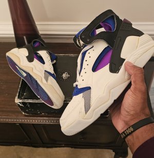
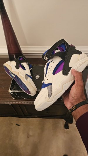
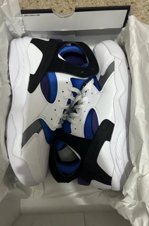
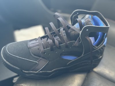
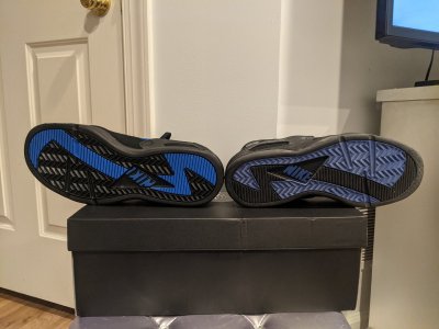
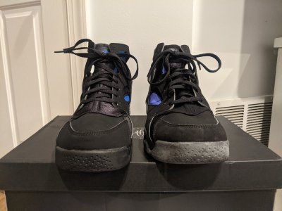
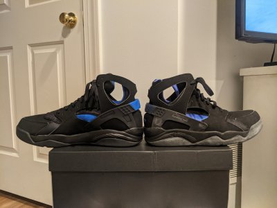
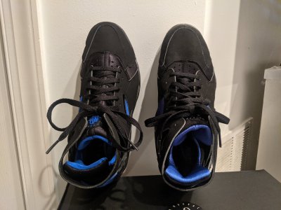
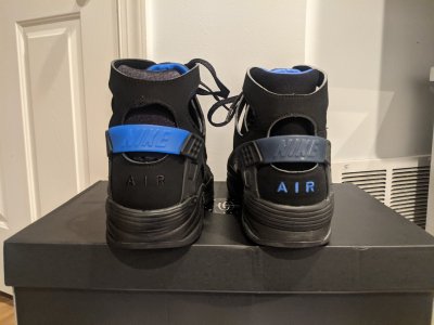
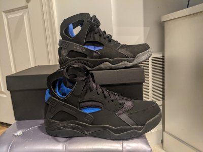
I had hoped that it was the lighting that was making the purple look dull, but that video says otherwise. Almost had it Nike. SMH


Unfortunately, these aren’t samples. They are already out in Japan.Really hoping its just the sample shoe that's circulating and that the final release won't be that shade of purple
Really hoping its just the sample shoe that's circulating and that the final release won't be that shade of purple
Unfortunately, these aren’t samples. They are already out in Japan.

Is this one of those things that because it's not the original, it's bad? Or do y'all actually like the original shade of purple more?
There isn't really a shade of purple I don't like lol. Originals look better IMO but I ain't mad
I think the bigger issue is dude who worked on em tooting his own horn saying they made a perfect retro. I’m in regardless, but that shade of purple makes them far from perfect. We’ve been getting some good retros of OG colorways lately. Considering they’ve gotten the purple close before, it’s disappointing to see em take a step back.Is this one of those things that because it's not the original, it's bad? Or do y'all actually like the original shade of purple more?
There isn't really a shade of purple I don't like lol. Originals look better IMO but I ain't mad
I think the bigger issue is dude who worked on em tooting his own horn saying they made a perfect retro. I’m in regardless, but that shade of purple makes them far from perfect. We’ve been getting some good retros of OG colorways lately. Considering they’ve gotten the purple close before, it’s disappointing to see em take a step back.

It’s like Jordan Brand releasing the UNC 11s with a royal blue Jumpman.Is this one of those things that because it's not the original, it's bad? Or do y'all actually like the original shade of purple more?
There isn't really a shade of purple I don't like lol. Originals look better IMO but I ain't mad
Is this one of those things that because it's not the original, it's bad? Or do y'all actually like the original shade of purple more?
There isn't really a shade of purple I don't like lol. Originals look better IMO but I ain't mad
It's more about how they can't just do something correctly. Likerainking said, if they hadn't been slurping themselves about creating a 1:1 replica of the original and talking about all the time and effort they put into making it correct, then maybe we wouldn't be having this conversation in here.
They probably did it on purpose to give heads a reason to buy them again the next time they drop. The purple will be correct, but the blue will be off
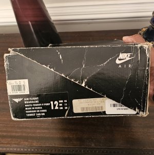
I understand why yall are upset about this, and i dont like it either, but I'm more interested in how these feel on foot. I'm hoping they're at least something close to the 2003 retro. I'm also happy to see they are doing a replica box, that usually is a good sign.
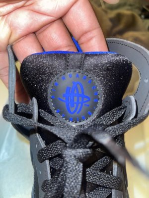
Shade of purple aside, I'm hyped
In my head I was thinking, if the original was darker purple and the retro had brighter purple, would darker purple be considered better simply because it's original? Or is it about actual aesthetics?
This is a meaningless hypothetical I invented for the sake of argument, I know. But I like both the lighter and darker purples and I'm hoping I can use my friend's swoosh to cop these 2023s like I did in 2014 because the difference isn't that meaningful to me.
I had hoped that it was the lighting that was making the purple look dull, but that video says otherwise. Almost had it Nike. SMH
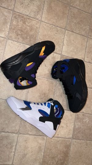
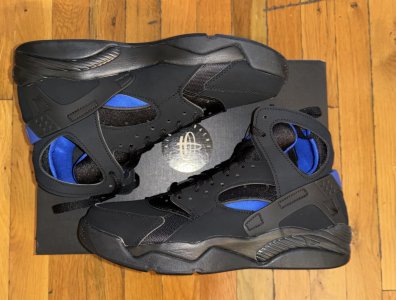
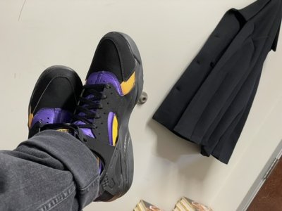
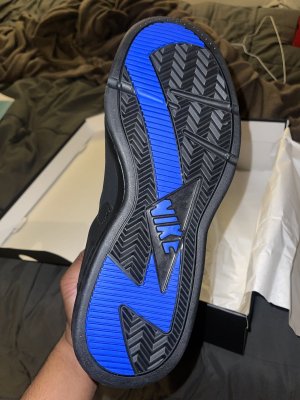
Shape looks good on foot. No stores got these in the states yet? Did a lil TikTok review on my 2014 pair