- 2,884
- 1,539
Dang it $220? Heck nah.
Follow along with the video below to see how to install our site as a web app on your home screen.
Note: This feature may not be available in some browsers.
smart man1 pair and I'm chillin
But my opinion is trash though
smart man

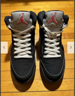
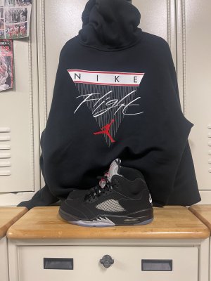
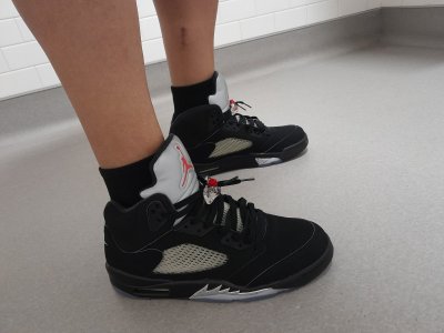
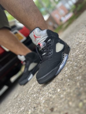
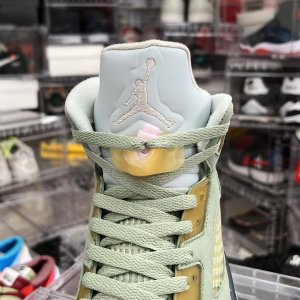
The E on the Nike Air stitching, they're complaining that it looks uneven. People on NT are famous for finding something to complain about on every shoe.what Is Es?
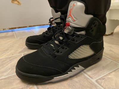
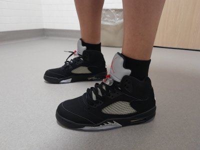
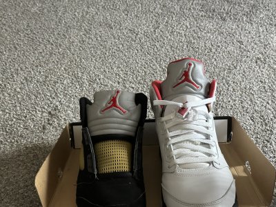
My friend your opinion on the True Black/Metallic Silver/Varsity Red/White Jordan V is less than a savory one.
But my opinion is trash though

single white female? Cmon man

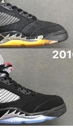
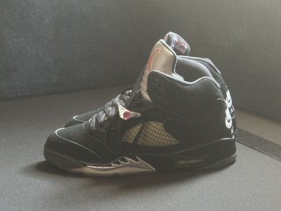
@bashmilk an example of the "E problem" personally I think the angle is giving the perception of it looking like that. @AirThompson has a retail pair so maybe he could tell you if this is a real problem or not.Stadium goods pics
what Is Es?
Bet you don't listen to Megadeth tho
you have no idea man lol I've been listening to metal my whole life...all my parents listened to plus I been playing guitar for 10 years cut me a lil slack lolBet you don't listen to Megadeth tho
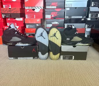
It's Black, Metallic Silver, and Varsity Red (Black, Black, and Metallic Silver for the 1990 and 2000 versions) not True Black, Metallic Silver, Varsity Red, and White. Also you agreed with my opinion on just purchasing one; have a nice day sir.
My friend your opinion on the True Black/Metallic Silver/Varsity Red/White Jordan V is less than a savory one.
NIK is at a 18 font, then the E is at like a 15. Somebody forgot to highlight the whole word during an edit in the design process.Haha thx @AirSakuragiI've never heard anything about the E until now. If yall have pics post I Wana see
Touchéyou have no idea man lol I've been listening to metal my whole life...all my parents listened to plus I been playing guitar for 10 years cut me a lil slack lolBet you don't listen to Megadeth tho
View media item 2089944
NIK is at a 18 font, then the E is at like a 15. Somebody forgot to highlight the whole word during an edit in the design process.
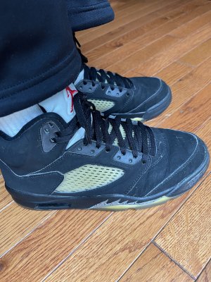
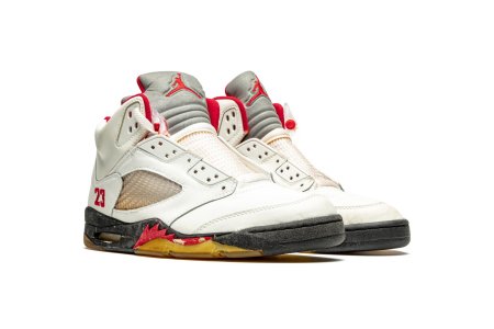
Well if you really wanna nitpick @Pain
, the swoosh isn't crisp either.
On the OG's, it was perfect.
True @AirSakuragi, but the swooshes still don't know what direction they wanna to go in.Originally Posted by AirSakuragi
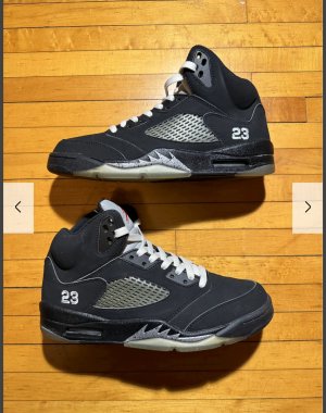
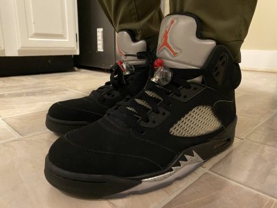
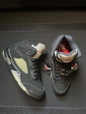
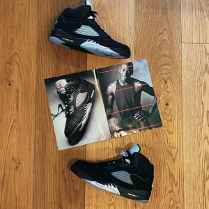
Pair off of the J23app:
As you can see the E is uniform