- 1,560
- 1,185
- Joined
- Jul 8, 2005
I guess I am in the minority, but I think the wolves jersey looks much better. I thought their home/away rev 30 jersey's were one of the worst. The black sleeved wasn't bad though.
Follow along with the video below to see how to install our site as a web app on your home screen.

Note: this_feature_currently_requires_accessing_site_using_safari
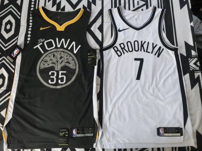
Nah it's the Rockets easilyWolves might have the worst jerseys in the league now
Just curious what you don't like about them?


looks so cheap


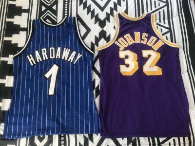
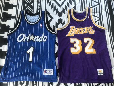
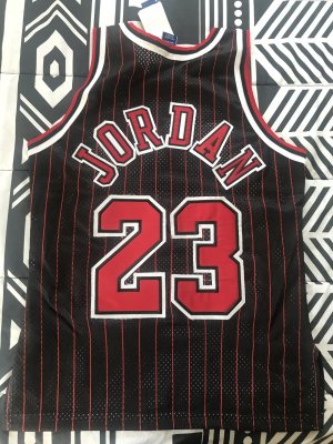
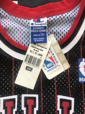
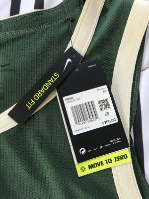
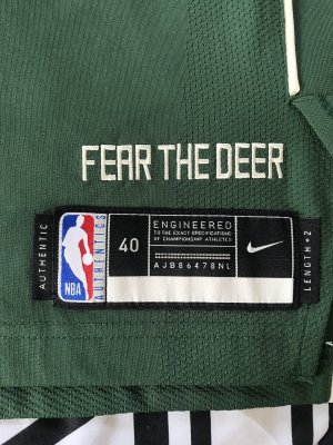
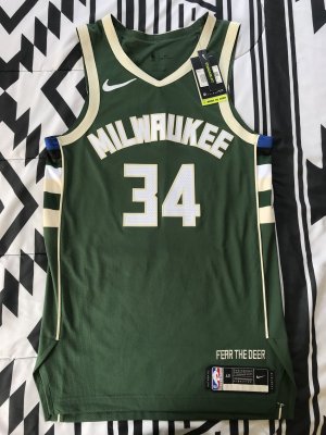
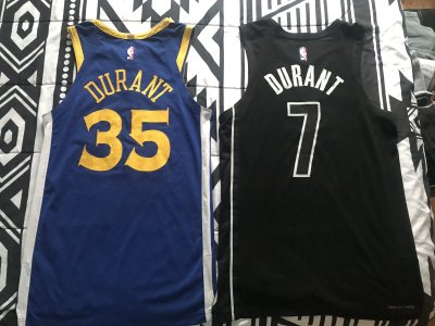
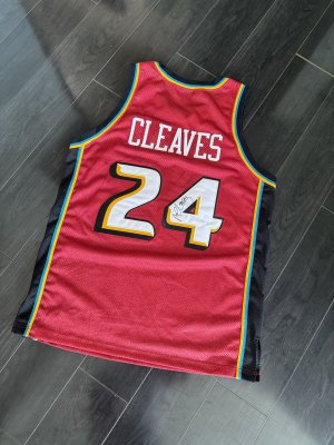
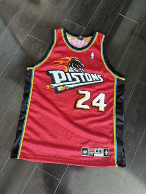
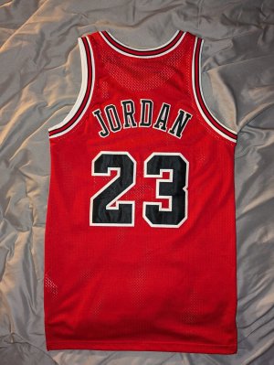
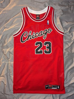
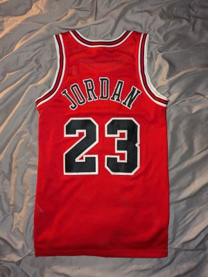
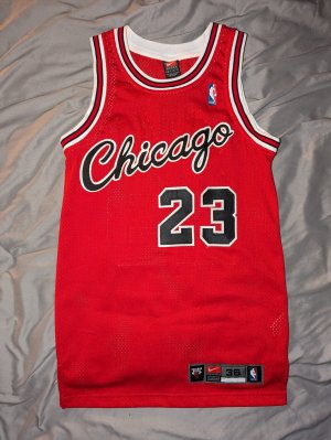
Anyone...?Can I get legit check...?


Nah it's the Rockets easily