DeadsetAce
Supporter
- May 31, 2004
- 107,232
- 53,414
new logo. contracted. either or 
Follow along with the video below to see how to install our site as a web app on your home screen.
Note: This feature may not be available in some browsers.
The new collar is a tad weird with laces but it's the least of my worries.like that they kept the jersey laces on the Boston jerseys
I interviewed several Adidas and NHL execs, all of which was interesting. I hope to be able to tell you more about that later on, but one takeaway was that NHL branding czar Brian Jennings told me flat-out that uniform advertising is not on the table for the NHL. That doesn’t mean it’ll never happen, but he seemed pretty serious about it as we discussed it.
I interviewed several Adidas and NHL execs, all of which was interesting. I hope to be able to tell you more about that later on, but one takeaway was that NHL branding czar Brian Jennings told me flat-out that uniform advertising is not on the table for the NHL. That doesn’t mean it’ll never happen, but he seemed pretty serious about it as we discussed it.
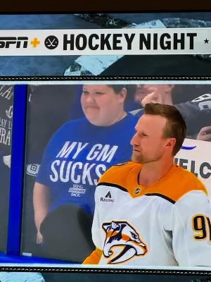
Been saying this about the Caps. Sucks that there won't be any alternates this year as well.The new templates are bad.
Downgrades: New Jersey and Edmonton. Ruined a classic.
Missed opportunities: Calgary and Washington. Should have gone retro full time. Instant revenue generator.
Upgrades: Minnesota's home. The away jersey should have been the same as well, but that's a franchise that hasn't been able to get an identity down since their inception.
wow Vegas gets Jonathan Marchessault...not bad
wow Vegas gets Jonathan Marchessault...not bad