Proposition Joe
formerly rollinwithangel
- 10,215
- 8,048
- Joined
- Oct 5, 2012
I'm complaining about that price 
Follow along with the video below to see how to install our site as a web app on your home screen.

Note: this_feature_currently_requires_accessing_site_using_safari
I'm complaining about that price
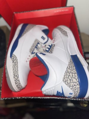
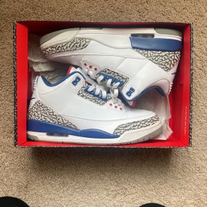
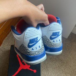
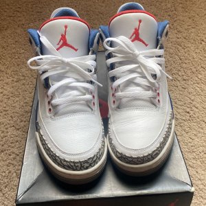
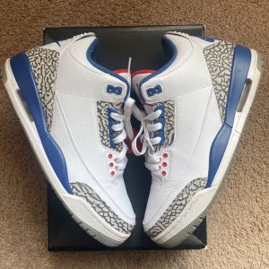
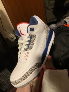
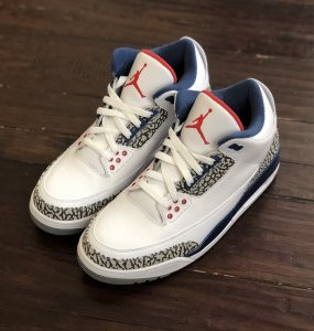
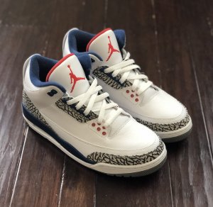
I for one have been excited about this release since it was first announced, red tounge, blue tongue, whatever. Especially since my 01s started to crumble after their last wear.
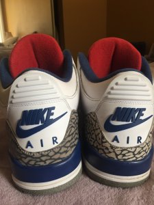
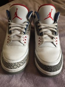
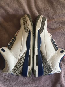
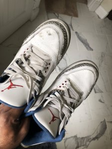
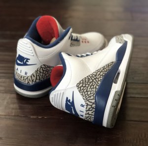
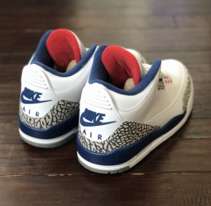
The original didn't have it showing from the front of the shoe. It completely changes the look of the entire damn shoe. There is a reason they changed it to blue when they started doing the "see the liner from the front remake""the red liner makes this release a no go"
but the original had it
"oh, really...are you sure, cause i'm not"
yes
"well it still sucks"
Yeah man what happened to. "We're wearing white gloves and ish and making them as close to the originals as possible"So color of elephant print is gonna look fake like that color wise? Smh

There is a reason they changed it to blue when they started doing the "see the liner from the front remake"
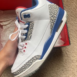
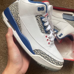
True Blue 3's are my favorite OG colorway of the 3's and I am considering passing. It just doesn't look good with that red tongue liner showing. It looks like they cut the tongue off the WC3 and sewed it onto the TB3's...
If they were going to do the red tongue liner they should have made it just like the OG where you can't see it from the front. It changes the whole look of the shoe.
Needless to say that I am disappointed and may just be purchasing another pair of 2011's in DS condition. Oh well game time decision, just kinda bummed. Congrats and good luck to all of you who like the new look.
Peace and love!
Nah, the blue on the newer tongue looked better with the shoe as a whole (IMO) I assume that change wasn't an accident and they did it for aesthetic reasons (totally an assumption.)too much red for wizards colorways?
but the 94 limited re-releases had the newer tongue too tho
Yeah it does change the whole look (IMO.)"Changes the whole look of the shoe"??? That's quite the exaggeration. Half the 1s in your sig have that mid top look that don't look nothing like the OGs.
Correct me if I'm wrong, but aren't the 94's slight higher than the 84-85's @Bigsykedaddy???Originally Posted by Bigsykedaddy
Yeah it does change the whole look (IMO.)
I MUCH prefer the OG high (94 mold and 2015+ mold) look on the 1's rather than the "mid" cut on the older 1 models, however I didn't have an option back then when I bought those 1's.
If you gave me a choice between '13 AJ1's or 84/94/15 I would choose the latter all day long.
It's just my opinion, nothing more nothing less.

If they were going to do the red tongue liner they should have made it just like the OG where you can't see it from the front. It changes the whole look of the shoe.
Peace and love!
Anyone complaining about the red tongue is a frail boy
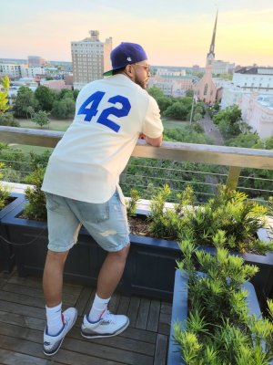
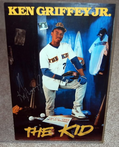
This is the hardest pair to me
View media item 2135683
 :kanyeshrug