- Aug 11, 2015
- 9,535
- 13,834
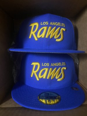
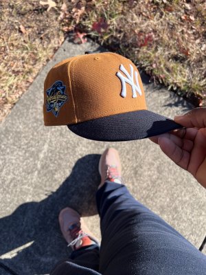
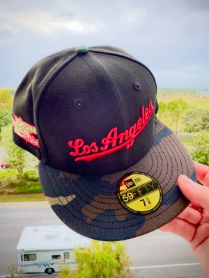
I'm basic I need discount double check on my hats


Follow along with the video below to see how to install our site as a web app on your home screen.
Note: This feature may not be available in some browsers.
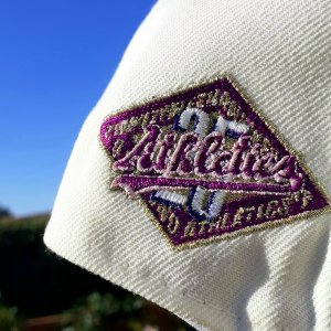
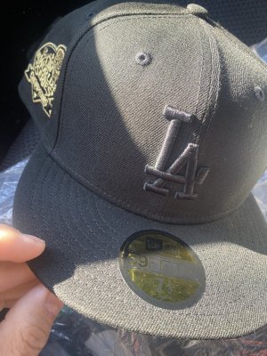
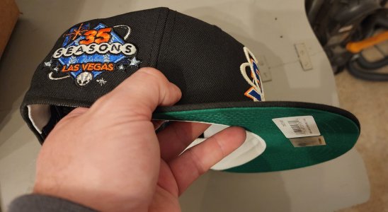
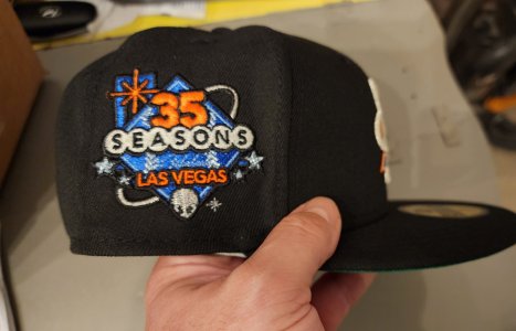
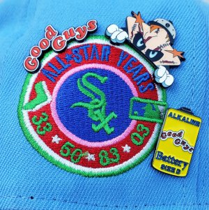
I’ve seen quite a few like this (random assortment of customs from a variety of sellers), which leads me to believe those odd marks are meant to be thereGot one here too, but it's not the two tone. Great hat with the old school new era build. Jacked up batterman too.

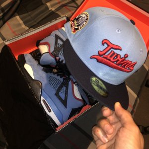
nice, my sneaky 2 tone from stash1250 coming in tomorrow

I’ve seen quite a few like this (random assortment of customs from a variety of sellers), which leads me to believe those odd marks are meant to be there
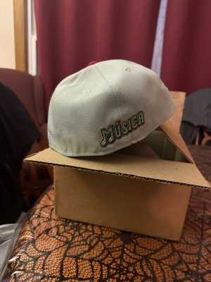
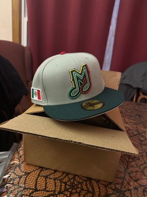
Which hat stretcher is this?It’s so crazy that mad of these hats used to be on the clearance section of Lids and MLB Shop. These crazy color combos y’all love, except they didn’t have the patches.
Can’t say thank you enoughk3stacks for the hat stretcher. **** really works, I’ve done at least 15 hats so far. All of them fit. Some I even stretched too much and are loose on me. It’s a miracle like Ty $

Interesting.That's a Cooperstown batterman. Definitely intentional.
Interesting.
New era does not make things easy
Quick rundown of battermans
the original as seen on a reproduction. This was seen 1992-2006 on their wool on fields

Rounded edges. Visible batterman bill. Nothing too fancy.
2007 to present is this thicker batterman

Thicker border with the batterman also having a raised edge.
This is where things should end. But somewhere along the lines and even recently, they have brought out three other styles
Double border thick batterman


Probably among the most visually repulsive. It’s also been around the longest. At least a decade.
Your cooperstown batterman which many designers either try to hide that weird detail, or show it off


It also comes with an outline stitch design. Not as bad as the thicker one. This ones newish within the past three years
And lastly

Sort of a hybrid mix of the cooperstown and the original 92-07. Still the wrong rigid rectangular shape with a barely visible bill of the battermans hat. I see this the most with HC designs.
The original wins out.
Sadly I have seen three types of batterman on one style of cap before (sold by different websites, so presumably designed by them?). I can’t quite make sense of it. One example is a basic twins M cap. It’s considered an authentic collection retro cap but tends to switch random design elements from release to release.
I have three different swinging tiger hats with three different battermans, so it has to either be random or a design choice.
Fun times for a purist lol
Years back, new era was strict. The 2007-current logos/customs had to have the thicker batterman, and any 1992-2006 custom had to have the rounded batterman. And any design prior to 1991 didn’t have a batterman at all. All of these battermans or no battermans had to fit into their eras. I think that’s all changed now. I see a guardians custom with a rounded batterman, and also the thicker current era design. I try to make sense of it but have given up.

 .
.
Topperz delivery, I still like the Stomper logo.


*insert Alonzo gif*