Post Your New Eras*59-Fiftys*etc... VOL. INFINITY NOW W/ Henz0/Thunderchunk/Icy's FAQ ON PG.1

Even better, buy at mlbshop and apply GLOVE25 for 25% off.

Do it fast before they catch on and exclude those caps.

Edit:
hmm. That code must have expired this morning
FASTBALL seems to work
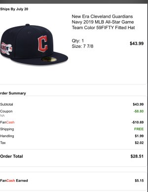
Plus there’s a $10 fanatics fancash promo they’re running. After both coupons and tax/handling, you could get one of these for $50ish.
 
Last edited:
Even better, buy at mlbshop and apply GLOVE25 for 25% off.

Do it fast before they catch on and exclude those caps.

Edit:
hmm. That code must have expired this morning
FASTBALL seems to work
Plus there’s a $10 fanatics fancash promo they’re running. After both coupons and tax/handling, you could get one of these for $50ish.
Appreciate this link
 
New pickup
2002-03 San Diego padres on field authentic collection cap
Made in usa
100% wool
Grey under/ white sweatband/ flat batterman
4D4FEBF3-740D-45E0-81FF-712501CF2192.jpeg
23DDB0B5-8BF6-423E-84DE-B7DC9BADDE35.jpeg


Super elusive cap despite being a regular team on field for many many years. From 91 to about 01 they used dark
Navy and then switched to light navy. Neither the light or dark Navy on fields seem easy to find, let alone new or in this size. Easy scoop up for todays retail price (a bit above my desired range)
In a decades time I think I’ve seen maybe 6 of these pop up.
 
Talk about a triple stack

Fansedge has a 20% off with free shipping code out right now
FE20WELCOME
Combo that with the $10 fan cash, a 2% Rakuten cash back offer, and a 15% fan cash credit for future purchases, and you’re looking at nearly 50% off on hundreds of items.
B20F2077-079C-4A5D-A8A7-25CCEFCBDEF4.jpeg
These side patches caps just released. Kind of a degenerate set considering many of the logos/colors don’t match up with the year on the patch. There’s a new TC twins with the 87 ws logo, a current dbacks color scheme/design with the 01 ws logo, and of course this, a 2019 asg patch when the guardians didn’t officially exist until the 2022 season. But I don’t have the solid navy on field so this is an in between we
 
Last edited:
New pickup
2023 TBTC on field Florida marlins 30th anniversary

For awhile I didn’t think this one was releasing as it seemed to be a in stadium release initially. It looks good initially. It should’ve stayed an in stadium release. The cap is mediocre on a quality front

Made in haiti
Black nasty. 100% poly
D09E3E10-C3A2-4807-B3BB-5019550CF620.jpeg
61D40622-908F-498E-99A6-F003F0C97192.jpeg


This was not a mirror copy of the 25th anniversary tbtc cap or other retros. They actually did something right. They moved the logo more to the left to get closer to the original

The vertical part of the main F is off set on the original and this one inches closer left.
E0CB29B9-05AA-4C56-81A2-92DE5838002D.jpeg


Trash quality alert
Uneven bumpiness right at the forehead area of the sweatband
Also, they seemed to stitch the middle stitch line too far into the sweatband area. It’s quite rigid and uncomfortable. You actually feel the white buckram crown material on your forehead. Beyond bad.
67E701D4-2CB9-4A40-BC56-9DCA69A598C1.jpeg

Machine error or design choice? The middle/lower stitching should sort of run parallel with the lower stitching. At least that’s how it used to be
52A74030-E21E-404C-9C19-A2EA77E5C49C.jpeg


An example of a usa made 2018 tbtc
63526544-630B-444D-85C8-6E382DCBA9E5.jpeg


It’s never perfect but something seems off about the latest. The below is a usa made tbtc2018.
48834DB0-7DAD-4B55-991D-81E134C8ED98.jpeg

The middle stitching is more of a second lower stitch line with usa made caps and many others. Haiti really seemed to mess things up here. If you’re cap ever feels uncomfortable or seems off, this could be why.

Shades of aqua marlins through the years
CD94C5F3-8A30-44DF-A9C6-BE0AA2AA8B7B.jpeg


The original 1993 is on the left. They’ve never gotten it exactly right on a retro or reproduction front. Second from the left is the latest 2023 release.
They either seem to go too dull like the third, 5th, and far right , or too blue like the fourth and sixth over which are the 2028 tbtc on field and lids retro classic.

I think I gotta stay away from new on field releases from here on out. The sizing seems okay, and the logo placement is great. Color is inching closer to the oeiginal status too. So it’s not all bad. I wouldn’t pay retail and I didn’t. It would be best to try these on first.
 
Last edited:
New pickup
2023 TBTC on field Florida marlins 30th anniversary

For awhile I didn’t think this one was releasing as it seemed to be a in stadium release initially. It looks good initially. It should’ve stayed an in stadium release. The cap is mediocre on a quality front

Made in haiti
Black nasty. 100% poly
D09E3E10-C3A2-4807-B3BB-5019550CF620.jpeg
61D40622-908F-498E-99A6-F003F0C97192.jpeg


This was not a mirror copy of the 25th anniversary tbtc cap or other retros. They actually did something right. They moved the logo more to the left to get closer to the original

The vertical part of the main F is off set on the original and this one inches closer left.
E0CB29B9-05AA-4C56-81A2-92DE5838002D.jpeg


Trash quality alert
Uneven bumpiness right at the forehead area of the sweatband
Also, they seemed to stitch the middle stitch line too far into the sweatband area. It’s quite rigid and uncomfortable. You actually feel the white buckram crown material on your forehead. Beyond bad.
67E701D4-2CB9-4A40-BC56-9DCA69A598C1.jpeg

Machine error or design choice? The middle/lower stitching should sort of run parallel with the lower stitching. At least that’s how it used to be
52A74030-E21E-404C-9C19-A2EA77E5C49C.jpeg


An example of a usa made 2018 tbtc
63526544-630B-444D-85C8-6E382DCBA9E5.jpeg


It’s never perfect but something seems off about the latest. The below is a usa made tbtc2018.
48834DB0-7DAD-4B55-991D-81E134C8ED98.jpeg

The middle stitching is more of a second lower stitch line with usa made caps and many others. Haiti really seemed to mess things up here. If you’re cap ever feels uncomfortable or seems off, this could be why.

Shades of aqua marlins through the years
CD94C5F3-8A30-44DF-A9C6-BE0AA2AA8B7B.jpeg


The original 1993 is on the left. They’ve never gotten it exactly right on a retro or reproduction front. Second from the left is the latest 2023 release.
They either seem to go too dull like the third, 5th, and far right , or too blue like the fourth and sixth over which are the 2028 tbtc on field and lids retro classic.

I think I gotta stay away from new on field releases from here on out. The sizing seems okay, and the logo placement is great. Color is inching closer to the oeiginal status too. So it’s not all bad. I wouldn’t pay retail and I didn’t. It would be best to try these on first.
So is the hate worth buying cause I been eyeing this hat on fanatics and what u mean black nasty 🤔
 
Where have you found it on fanatics? I searched all marlins hats.

EDIT - never mind. Found it under cooperstown teams.
 
truenike81 truenike81
Some TBTC on fields have grey unders or even Kelly green. Most have black with a black sweatband hence the term black nasty (as many have called them the black sheep of fitteds since the wool switchover in the mid 2000s).

It’s oddly marked cooperstown hence why they seem to skirt the coupon exclusives. Many see cooperstown marked and assume grey under or white sweatband, but this is a marked on field authentic collection hat. It’s a black nasty through and through.

I’d say it’s easily worth $28-$35 on sale as the logo placement and color are the closest we have ever seen to the original. Overall build of the crown and bill and sweatband leave a lot to be desired but I’m picky like that.

I forgot to mention
The side patch is actually stitched into the cap. That’s the one thing I’ve loved about the custom era. I hate the glued on patches that on fields seem to use.

I don’t own many current on fields. Does anyone know when they started to stitch the logos into the caps? As far I know, they glue in most if not all of them
I have it in cart which came to $39 I'm might wait for some fan cash to build up before I pull the trigger thanks again
 
Check your emails. They randomly throw out $10 fan cash events once every 4-7 weeks

Is that $39 with the current SUMMER code?
Fanatics is trash for having a handling fee attached plus tax (even though they don’t really have a foot print physically in many states).
The best advice I have,
Fanatics/mlbshop/Fansedge/lids all share the same inventory but have different coupon codes. You gotta hustle around and see who is doing what on any given day. I caught a Fansedge code this past week for 20% off plus free shipping

My sights are set on the angels TBTC cap. They sold out of it last year and never really got a restock, so what we see today with fsrs is rare. They’ll dry up soon enough including the marlins. Buy asap.
 
I hate when you can see a little of the white sweatband when you wearing the hat. When it peaks out the corner smh.

Always in white sweat bands too in my case
 
443D5A89-095E-448B-9B3E-6A1961DCBF39.JPG


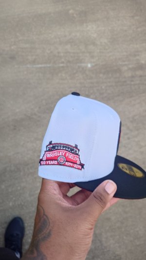
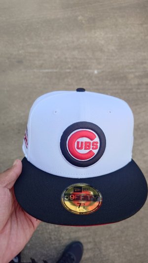
Back again with a heads up about another fitted that I'm dropping with my hometown shop, Hood Hop'rz.

Although it's origins are an American chain, I still managed to tie it back in with my hometown of Winnipeg, Manitoba, where their first Canadian location opened in St. James on Portage Ave near the corner of Kirkfield Street in 1956.

Granted, I wasn't alive then, but I've got pretty fond memories of growing up as an 80's baby and going to the one at St. Vital where my uncle worked one of his first jobs. My favorite menu item growing up as a kid wasn't their signature burgers at all, it was the Malt and the root beer lollipops. Although both of those aren't available anymore, A&W is still one of my favorite spots for a quick burger and a frosty root beer to this day.

7A59742B-A582-4553-90A8-A6F20C9D974E.JPG


Cubs for Rooty, their bear mascot, Rush Orange and Walnut Brown two-tone to reflect their colors, Rust UV for the root beer and a Stone button for a bit of that foamy head. Went with the 100 year Wrigley Field patch because A&W celebrates their 100th year this year.

C007B207-3A8B-40F2-89C7-7F99E4D0B391.JPG


OUT NOW at www.hoodhoprz.com, and if any remain, at 1348 Main St on Wednesday.

Rooty Birthday Blog Header.png


✌🏻
 
Last edited:
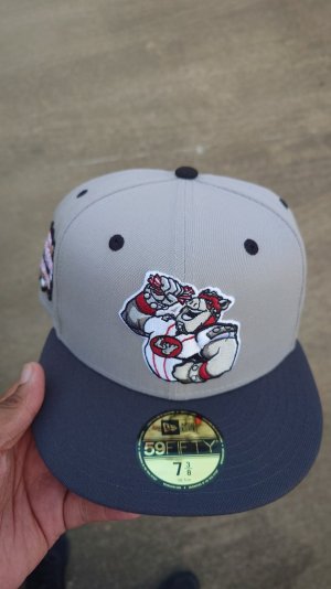
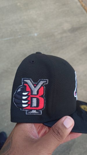
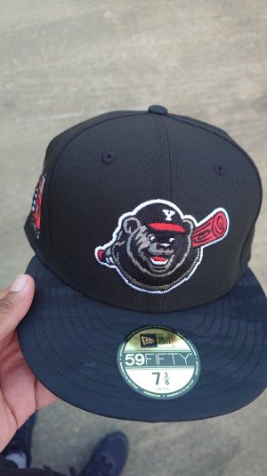
I put together some Negro League fitteds.
These will be in store Friday July 27 @ Stash1250.

First set we have-
Cuban X Giants.
New York Black Yankees.
New Orleans Black Pelicans.

I wanted this set to have a retro to feel them! Chrome crown, black visor/button, throwback dark green satin UV, team color logos with a touch of metallic thread, and the 100th anniversary side patch.
IMG_5216.jpeg

IMG_5220.jpeg

IMG_5221.jpeg
IMG_5222.jpeg
 
Back
Top Bottom