- 5,555
- 3,465
- Joined
- May 8, 2005
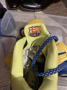
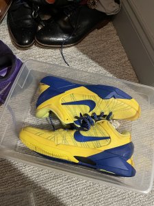
friend called me about the restock while I was out getting the wolves... gave him my info and he was able to copp 2 for me... feels good man.
but anyways Wolves are the best GR so far! 68 bucks after some discounts.

but anyways Wolves are the best GR so far! 68 bucks after some discounts.