- Nov 7, 2014
- 2,718
- 9,079
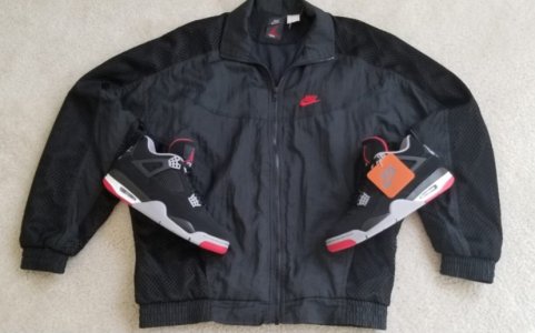
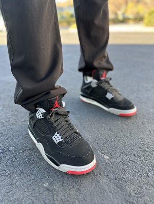
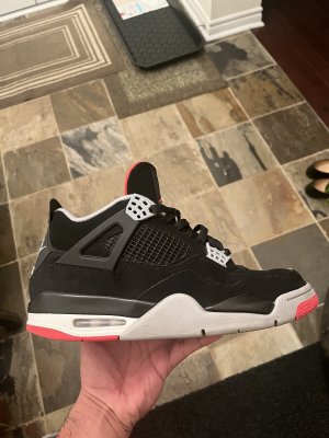
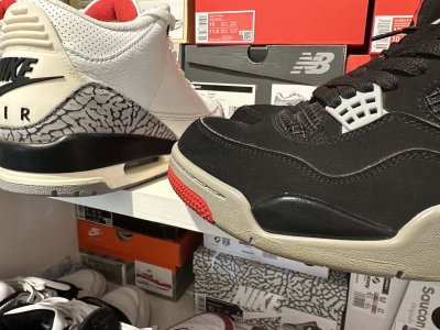
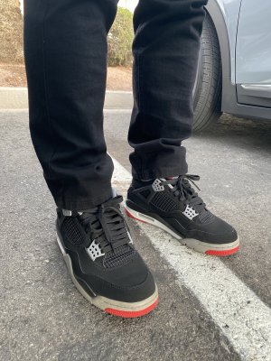
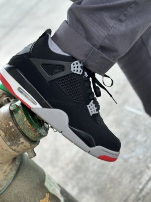
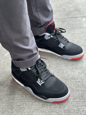
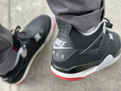
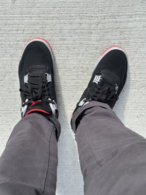
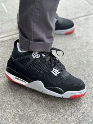
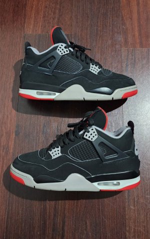
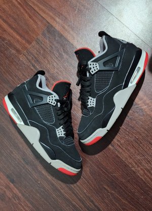
This is actually a pic of a fake pair of 1999's. I know because on fake 99's, the heel bumps are nonexistent. I mean there literally not there at all.
 Also, the overall shape, height, and netting was more OG like. I swear though ALL those jackasses at JB would have to do, is add heel bumps to these fakes, fix the Nike Air heel logos, add the white cut lines, and they'd have a PERFECT Retro. This is all too much like right for those ***holes tho.