- Jan 8, 2013
- 922
- 469
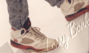
The one part that is subtly sticking out is the diff in the tongue. The OG one does not have the same border as 2013, as in you can see the border of red near the top of the tongue shows more in the new one. Still love the heck out of it, it will go nice next to my black grapes, toro and raging bulls v's, next will be the bel airs and I am done with V's.so basically only 3 noticeable changes ..
the 23 font (which doesnt make a difference)
the upside down Air Jordan (which doesnt make a difference)
The blue icy sole (which is more evident noticeable than the other 2)
well the NA if that matters to you

 plus after this I don't want anything until the Steels in October.... maybe. Might skip those too and hibernate
  until November for the Laneys


