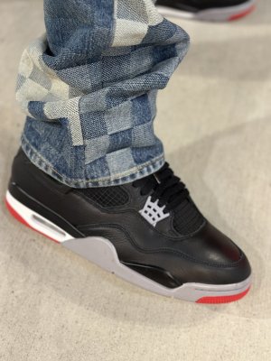
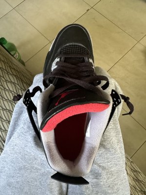
Surprised by the materials - my energy hasn't changed, if it had, I'd admit it - BC4 is my all time favourite.
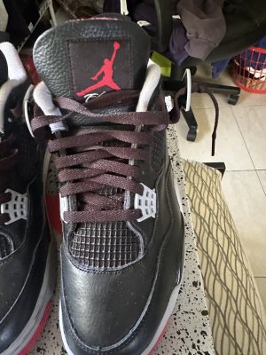
Surprised as I said, as I was absolutely expecting Red and Black Motorsport 4s with a sail midsole. There's differences though, deffo a more matt looking finish.
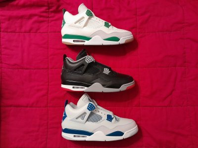
See similarities with the SB4 (heel tab height, collar shape, side-cage width and size). Hopefully we'll get that toe.
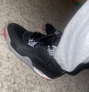
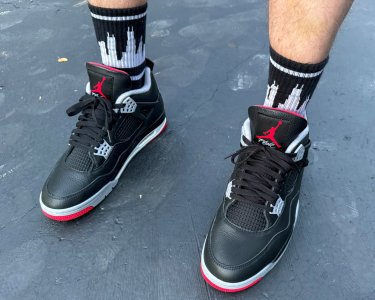
Current Breds about to become daily beaters in prep for these.
No white/grey visible material/panelling cut lines is a bit disappointing. Thas deffo an OG feature that was exacerbated by use and age too.