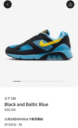
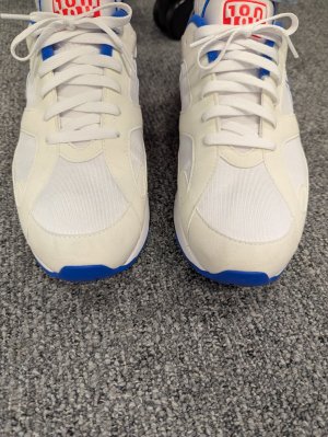
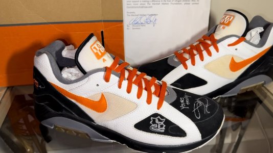
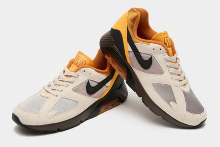
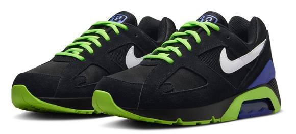
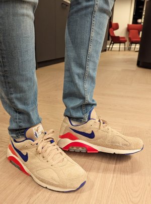
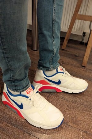
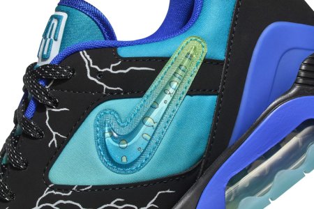
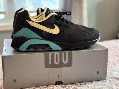
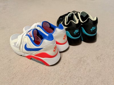
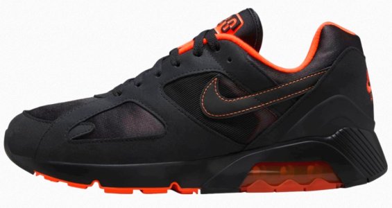
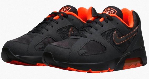
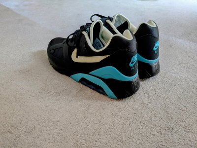
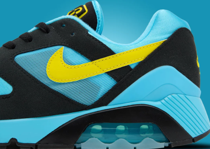
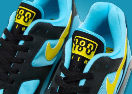
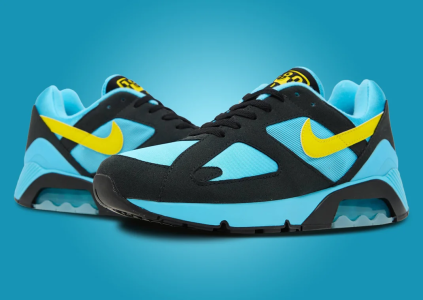
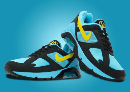
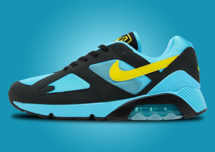
I thought it was common knowledge the angle of the hook and the thickness of the extension line were modified. Overlay og 85’s vs highs. Or even the Mac Attacks. Go down the line and overlay the retro on the OG. And then compare new models vs an OG swoosh. I think of the OG swoosh as having more of a “cursive” look with the hook which may align with changes to the typeface for the rest of the logo.
What you’re really referring to is not a lack of taper but how much is showing and in this case it’s a minimal difference from the OG that is more consistent with how retro swooshes have appeared across models. And that wasn’t even consistent for the first decade+ it was used and changed in implementation based on the logo typeface at times:
“The Davidson design held steady until a 1976 shift when the font moved to Futura and the lettering was officially dropped fully in 1995. The company switched the warm red to orange, the color of the brand today.”
From the original Nike Swoosh debut in 1971 to the modern...

www.complex.com

