27 years

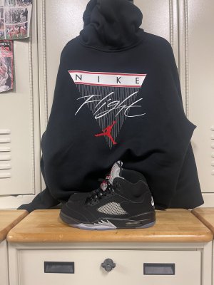
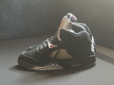
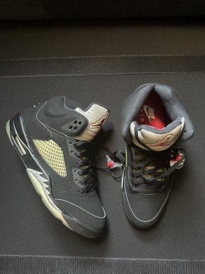
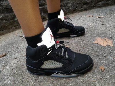
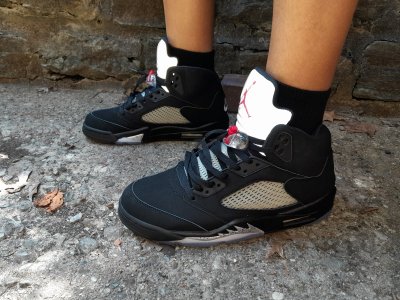
I still remember that time vividly. The best way to describe these shoes my way was absolute chaos. These were literally the status symbol of all symbols back then. Kids even had the white pairs and were spray painting them black. People were glued to TV's watchin Mike rocking these in the playoffs or nerding out when Will Smith had them on his show. We raced to the mailbox to grab S.I. each week hoping they had clear pics. News shows were telling us kids were getting murdered for 'em.
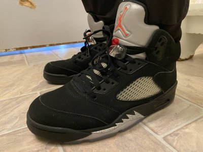
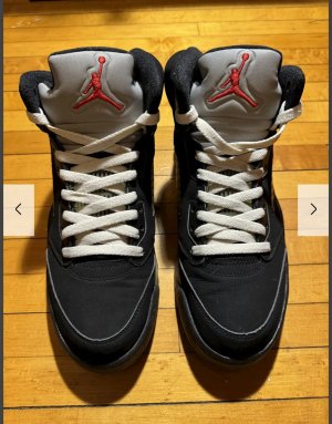
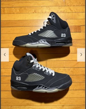
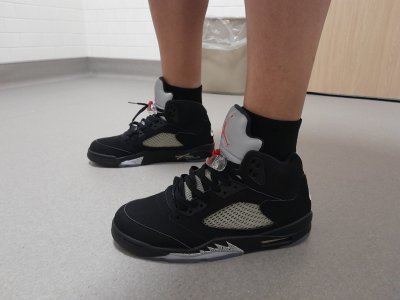
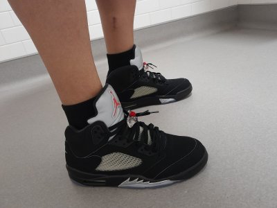
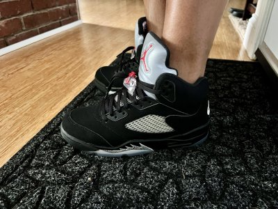
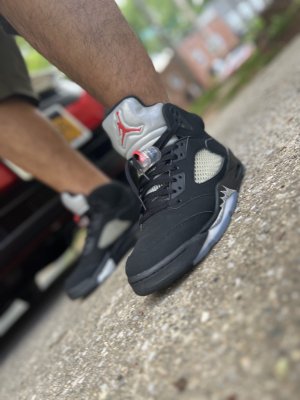
I still remember the Summer of '90 vividly. Rocking these Metallic 5s and hooping outside while the parked Jeeps, Suzuki Samurais, and the Acura Legends would be blasting Big DaddyKane out the trunk. It still takes me back to that Summer every time I throw these on. Damn I miss the '90s.
Here is a trip down memory lane and the summer of '90 Sports Illustrated spreads I was talking about earlier... old guys remember that it was a big deal to get your issue
 View media item 2479402View media item 2479403View media item 2479408View media item 2479411
I had meant to get back to you guys on these nostalgia comments before I got caught up in the craziness around finding the suit the past 2 days. This particular suit is a BIG deal to me. Still don't have one in hand, yet.
Anyway, ahh, the spring/summer of 1990. One of my favorite times in my whole life. I got a taste of things on both coasts in 1990. I spent most of that summer in Baltimore, where I'm originally from. But I had moved to NorCal in late summer '89, and culturally it was a magical time to be in California. We of course had the famous earthquake. The A's and Niners won chips, and most of the CA sports teams were at least good. Arguably the greatest era of pro basketball was being played. The Great One was setting the ice on fire down south. Pretty much all the music was banging. The memories are so vivid. If you guys want to reminisce about 1990, I'm your guy. LOL.
I'll start with the shoes. Since you know SI, RyGuy, do you remember this?
View media item 2481197
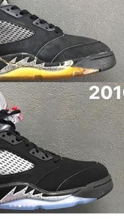
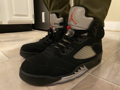
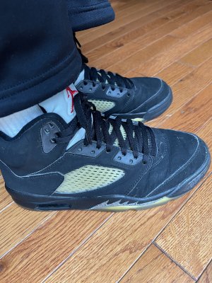
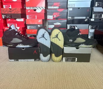
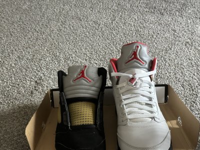
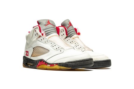
A classmate of mine brought the Buster Douglas issue of SI to school in about mid February of '90, shortly after Iron Mike was rendered mortal, and the whole class freaked when they saw the above pic. This was the VERY FIRST public pic of the Jordan V. Kids broke their damn necks to get to the malls or sports shops when these started rolling out at the end of the month. This shoe was so far ahead of its time, the release was insanity. I was kind of screwed because I had just spent my Christmas money on a pair of Lava Tech Challenge II's literally 2 weekends before I saw this SI. My parents didn't buy me anything more expensive than Chucks or Airwalks, ever, so I had to start saving again from scratch. 4 months later, after the huge disappointment of MJ's Conference Final Game 7 fall, I was able to get the black V's the day after I flew back to Baltimore, and I spent the greatest summer of my life with the greatest V's of all glued to my feet. Even at the beach. LOL.
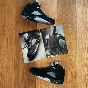
When I opened up that black and silver splattered box, I was surprised to find this inside:
View media item 2481202
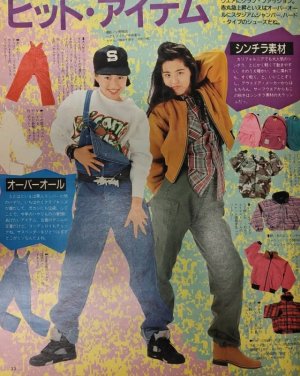
This catalog would forever make me link this specific suit with these shoes, but literally everything in the catalog was a piece of heat. I must've spent countless hours that summer just looking through it, wishing I could afford everything in it. LOL. I never was able to get the suit while it was in stores. I had to settle for watching Will Smith wear it from afar on TV every week in the fall.
Anyway, pop culture from 1990 was pretty fun. Music was a big thing to junior high schoolers. The jeeps in Baltimore were blasting 2 Live Crew and Big Daddy Kane much like I imagine they were in NY, but the Hondas and Mustangs in Cali were bumping NWA, Ice-T, Too $hort, Digital Underground, and even still MC Hammer at that time. Hammer actually lived about a half mile up the hill from where I lived, and I ran into him out and about on occasion. Me and a group of my schoolmates used to play pickup basketball a couple times a week at a local elementary school with a few of his bodyguards. One looked like a really short version of Joe Montana, LOL. Anyway, the old '90 summer playlist had some classics that people tend to forget about. Me So Horny, C'mon Babe, U Can't Touch This, Ain't No Future In Yo Frontin', It Takes Two, Bust A Move, Poison, Pump Up The Jam, The Humpty Dance (and Freaks of the Industry), The Power, Funhouse (Kid 'n Play), My Hooptie, sheesh, I could go on. And how could I neglect to mention that Ice Ice Baby was beginning to explode in the summer of '90? Some of these videos were hilarious too. Baltimore had this channel called the Video Jukebox where you could call in and request your favorite music videos to play for like a buck or two. My friends and I stayed up all night watching it and recording stuff on VHS, LOL.
Hmm, what video games were we playing in 1990? Super Mario 3 was about the hottest thing on the planet at that point, and do you guys remember the kinda heavy handed Fred Savage 100 minute advertisement for SMB 3, a.k.a. The Wizard? LOL. Besides that, I was still playing Dragon Warrior, me and a few other RPG geek friends were grinding through Ultima 3 yet again on the NES, I had just discovered Shadowgate, and Final Fantasy hit the NES that July. The Genesis and Turbo Grafx 16 were also starting to gain momentum as the next generation of gaming, and Altered Beast, Phantasy Star II, The Legendary Axe, Keith Courage, and Blazing Lazers were popular on those platforms.
'90 had some entertaining flicks, too. By the end of that summer I had seen Tremors (several times), Back to the Future II and III, House Party, Total Recall, Gremlins 2, The Wizard, Arachnophobia, Robocop 2, The Exorcist III, and Flatliners (a sequel is actually coming up soon).
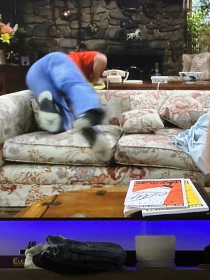
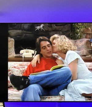
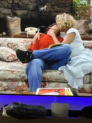
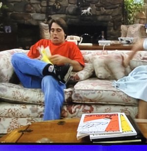
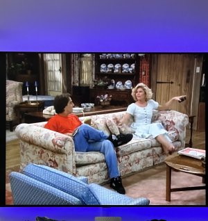
Last but not least, who could forget some of the most notable TV of '90? The Fresh Prince of Bel Air tops the list. I had to go SOMEWHERE to get my Nike and Jordan fix. Besides that, there was also The Cosby Show, A Different World, 21 Jump Street, The Wonder Years, Doogie Howser, and Beverly Hills 90210. Both In Living Color and Twin Peaks started that year. Freddy's Nightmares and Friday the 13th (the show) haunted my screen late at night every weekend after episodes of Saturday Night's Main Event. I bet you guys don't even remember Parker Lewis Can't Lose. And I swear, you guys should've given Cop Rock a chance. LOL, maybe not.
I'm curious about how many of you are going to be burning up Wikipedia after you read this. LOL.
Anyway, that's my nostalgic, big haired, baseball capped, mullet wearing, neon soaked, not so short trip down 1990 memory lane. If that can't get you in a 1990 loving mood, I don't know what will. LOL.