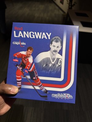
- Dec 29, 2008
- 8,375
- 1,490
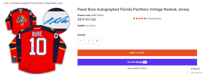
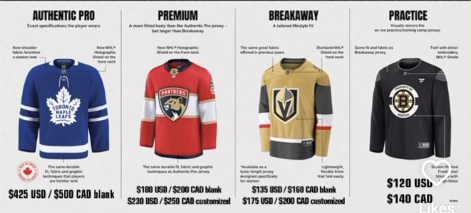
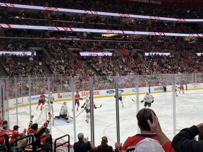
Christ that is way too much orange
Follow along with the video below to see how to install our site as a web app on your home screen.
Note: This feature may not be available in some browsers.

Reminds me of what Nike/Jordan brand does with their retros. They’ll slightly change a detail and make their shoe look goofy. Don’t like how they fattened the font and changed how the outline looks. Also, KINGS should be more at a slant.
the kings part of the logo looks like a graphic from NES or SNES
not a bad thing necessarily. i like the overall logo

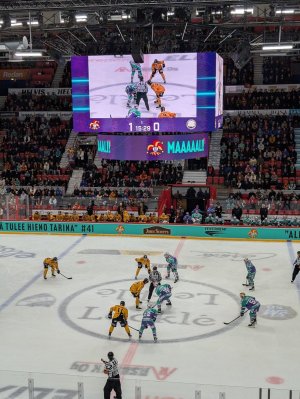
everyone in the city been saying 7 all week so the heartbreak is going to be unreal if they lose today lmaoStill early but yeeaaaa there will probably be a game 7
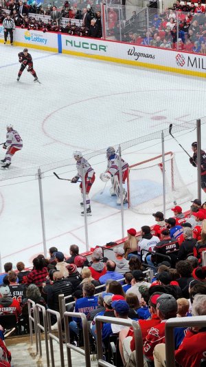
Seriously, they’re broken or somethingPanthers forgot how to hockey after game 3 apparently


FRAUDS.