- 177
- 183
- Joined
- Mar 4, 2014
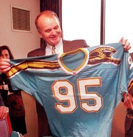
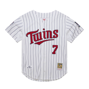
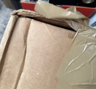
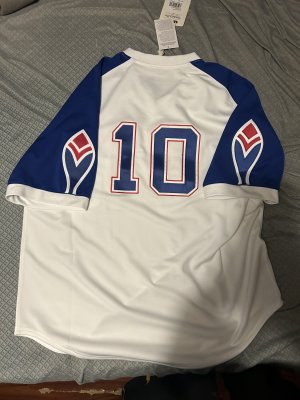
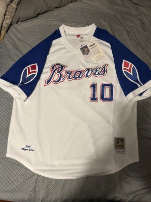
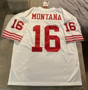
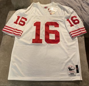
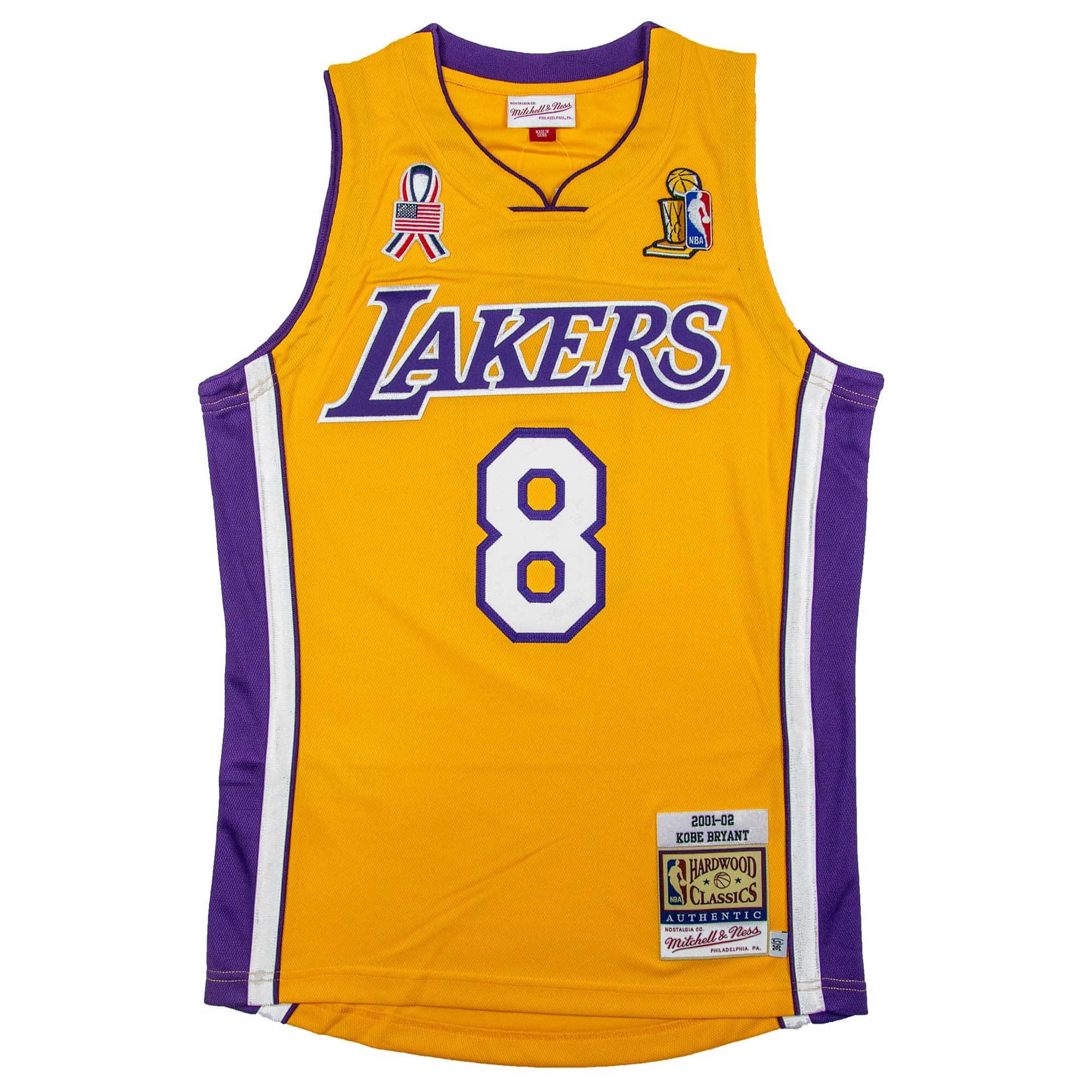
Did ya pick these up at M & N. Never saw the above finals jersey on site. Just the Shaq jersey in that style.Black Friday pick ups

Follow along with the video below to see how to install our site as a web app on your home screen.

Note: this_feature_currently_requires_accessing_site_using_safari
Did ya pick these up at M & N. Never saw the above finals jersey on site. Just the Shaq jersey in that style.Black Friday pick ups
where did you get the finals from?Black Friday pick ups
I'm from germany...a local online shop got em. Don't know if they ship to the USwhere did you get the finals from?
last jersey I need basically
Part of the issue is M&N uses the same font on every size so it looks weird.It's good to see there are a good amount of meticulous MFs who get on here and chime in on discrepancies like wrong material used with a specific jersey, wrong color shade, bad workmanship, poor quality, and cookie cutter shape with jersey manufacturing.
But it's surprising that no one points out some jerseys occasionally have the wrong fonts as I've expounded on that discrepancy myself. The more common error with wrong fonts is sizing. But sometimes the errors can have the wrong font style as well. I noticed that wrong font is a discrepancy that doesn't get pointed out on here.
Anyone know how the baseball jersey fit for M&N?
I want a turn ahead the clock jersey but not sure on sizing
It's good to see there are a good amount of meticulous MFs who get on here and chime in on discrepancies like wrong material used with a specific jersey, wrong color shade, bad workmanship, poor quality, and cookie cutter shape with jersey manufacturing.
But it's surprising that no one points out some jerseys occasionally have the wrong fonts as I've expounded on that discrepancy myself. The more common error with wrong fonts is sizing. But sometimes the errors can have the wrong font style as well. I noticed that wrong font is a discrepancy that doesn't get pointed out on here.
Part of the issue is M&N uses the same font on every size so it looks weird.
Set the example then
It's good to see there are a good amount of meticulous MFs who get on here and chime in on discrepancies like wrong material used with a specific jersey, wrong color shade, bad workmanship, poor quality, and cookie cutter shape with jersey manufacturing.
But it's surprising that no one points out some jerseys occasionally have the wrong fonts as I've expounded on that discrepancy myself. The more common error with wrong fonts is sizing. But sometimes the errors can have the wrong font style as well. I noticed that wrong font is a discrepancy that doesn't get pointed out on here.

Unless you're the real Samuel L. Jackson, I'd say you have exceeded your use of MF for today

"I noticed that wrong font is a discrepancy that doesn't get pointed out on here."
"I actually pointed these discrepancies out on here previously. "
cool story bruh, real cool.
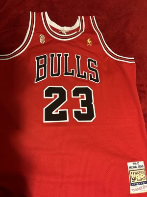
"They're also the reasons I passed on the MPLS Kobe and either of the alternate black Bulls jerseys with the red pinstripes."
"But I do have the alternate solid black Bulls Jordan jersey that I got back in late 2017."
to disregard an item after someone posted their pickups of the said item because of trivial factors that obviously mattered to only you comes off as an elitist. Cool story you passed - you do you. Then you proceed to tell us about your own hypocrisy on picking up the black bulls jersey after writing a paragraph complaining about it.

Maybe you owned a different version than the M&N ones, but I'm too tired to give a damn what you actually mean at this point.
I absolutely get what you mean. I was just saying it’s part of the issue. But I just look at it as most jerseys even other retail brands are not correct. Unless it’s issued. And even then sometimes they are offPerhaps I should see that as a valid reason if they aren't adjusting the font size to correspond with the jersey size.
I meant that some of the reproduced jerseys have the font either larger or smaller than what they're supposed to be.
The font of the letters and number on the MPLS Kobe jersey is too big, basically taller than it should be.
The font of the letters and numbers on the front of the alternate black Bulls with the red pinstripes have the standard font size of their home white and road red jerseys when they should be fatter on that one.
And the font on the front and back of the alternate solid black Bulls jersey have the standard font size of their home white and road red jerseys when they're supposed to be fat on the front and back. I really noticed the font size discrepancy on the back when I compared it to pictures I saw online.
I actually pointed these discrepancies out on here previously. They're also the reasons I passed on the MPLS Kobe and either of the alternate black Bulls jerseys with the red pinstripes.
But I do have the alternate solid black Bulls Jordan jersey that I got back in late 2017.
Set the example then
They actually got the alternate black Bulls 1997-98 jersey right with the colors of the layers for the letters and numbers as you can see in these photos. Now I only wish they replicated the jersey materials accurately. I also wish they did a better job with the letters and numbers by making them fatter.


I got the Griffey one and sent it right back. They run like a smaller, shorter BP jersey.
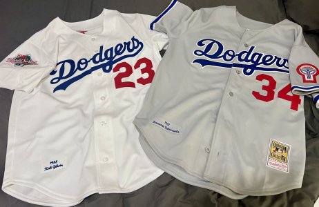
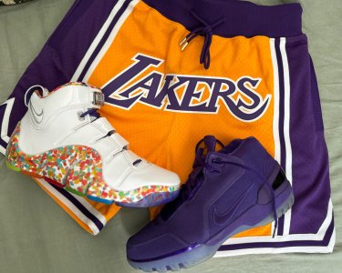
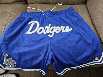
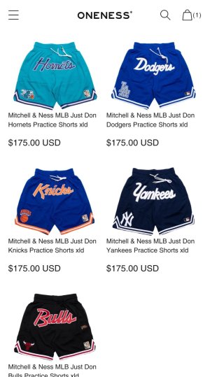
All dope, but whats that light blue pair?


Trucustoms are technically fakes
They're reproductions, no different than M&N "authentics".
It's just that the former is way more accurate than the latter.
I wouldn't even buy an M&N jersey if they had another $100 sale, they're just a shorts company to me now,