- 24,441
- 22,115
- Joined
- Nov 26, 2015
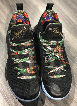
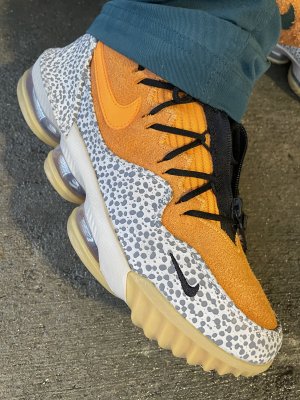
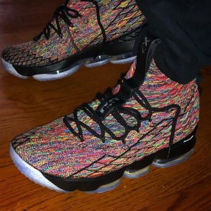
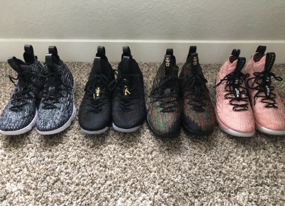
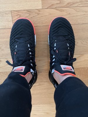
Who cares about stupid stories? If a shoe looks good, it looks good. The leopard print is fire.
Follow along with the video below to see how to install our site as a web app on your home screen.

Note: this_feature_currently_requires_accessing_site_using_safari
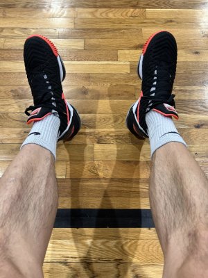
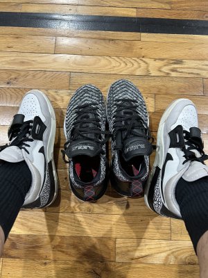
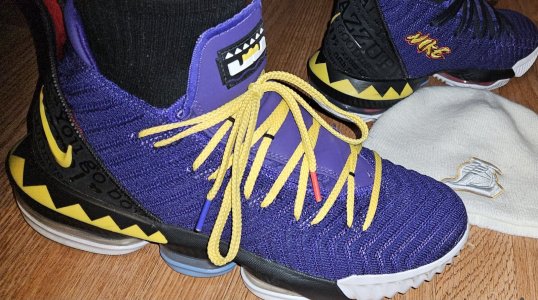
They will be LA only. He’s wearing them opening night

Gold knitting in between the stripes would've set these off - how did they miss that opportunity
Who cares about stupid stories? If a shoe looks good, it looks good. The leopard print is fire.
This would've made it perfect. A little gold flaking that you only really notice when the light hits them.Ehhh, that might have been OD, unless they subtly added some gold flaking.. Gold stripes/lining underneath would have been terrible.

No capThis would've made it perfect. A little gold flaking that you only really notice when the light hits them.
idc about the stories but the more i look at the King's the more i hate the leopard print bcuz it just doesn't make sense and as crazy as it sounds for me to turn away form these, the leopard print looks akward in that one spot and in bad taste when everything about the player is leopard, it's like if they gave jordan a retro 11 with leopard print like this where the jumpman and 23 are put at in the back, ish would look horible on the fact that it doesn't make sense(unless it was black leapord/panther) and doesn't flow with the design, it's just out of place, they should've done the tongue too or something
This would've made it perfect. A little gold flaking that you only really notice when the light hits them.
Ehhh, that might have been OD, unless they subtly added some gold flaking.. Gold stripes/lining underneath would have been terrible.
not a fan of the animal print
Looks so random to me

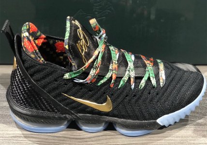
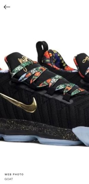
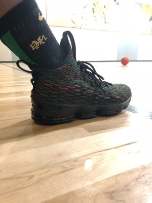
 . You can see the Burgundy color in the title, you can see the Cheetah print on the sash, you can see clearly the King:

That's because it is random
I know they say the inspiration came from that picture of him in his Rookie year sitting on the throne, but there's no cheetah in sight in that picture.
I honestly think the inspiration came from this

except your wrong, you see "The Prince of Zumanda" the king wore velvet lion again an even more reason why the leopard doesn't make sense
What does a cheetah have to do with anything lol
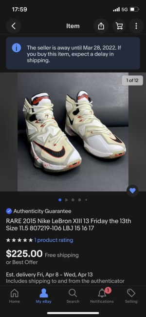
Says to go all the way out to Venice I’m done. Hope these see a wider release.
At venice. A crazy zoo right now. Ftl crazy for this