- 4,412
- 2,001
- Joined
- Jul 10, 2013
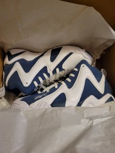
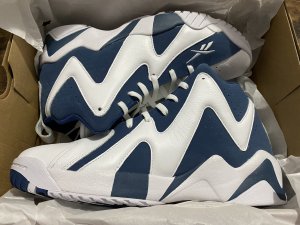
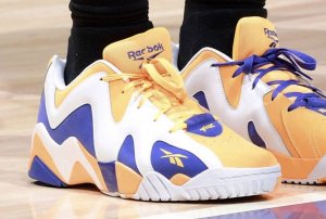
No joke, Kemp name on the toe box was a a must, like Shaq Attaq without the Shaq logo, its not the same.damn they got bruce lee name on the shoe??? couldnt even get kemp name on the shoe
Follow along with the video below to see how to install our site as a web app on your home screen.

Note: this_feature_currently_requires_accessing_site_using_safari
No joke, Kemp name on the toe box was a a must, like Shaq Attaq without the Shaq logo, its not the same.damn they got bruce lee name on the shoe??? couldnt even get kemp name on the shoe
damn they got bruce lee name on the shoe??? couldnt even get kemp name on the shoe
No joke, Kemp name on the toe box was a a must, like Shaq Attaq without the Shaq logo, its not the same.
Anybody have the link for the bait kamikaze???
If somehow you didn't win the raffle, you can purchase here
http://www.baitme.com/bait-x-reebok-men-kamikaze-ii-bruce-lee-black-yellow-rbcn5794-60


Agreednoblekane , easy pass on the OG colourways if they don't have the Kemp logo.
They ought to pay Kemp though, man's selling his crib and looks like he's not on the coaching or analyst scene. He was instrumental for them moving Reebok kicks in the 90s.
https://www.realtor.com/news/celebrity-real-estate/shawn-kemp-selling-washington-home/
Apologies if I somehow missed it, but did anyone ever clarify why the black K2s that dropped recently were called "ATL-LAX"? Are they somehow related to airports? Anyone? Bueller?

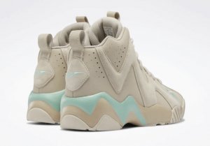
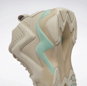
 Via SC
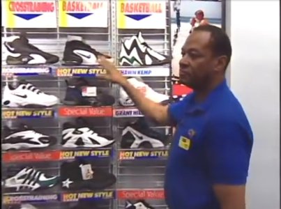
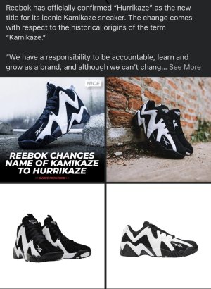
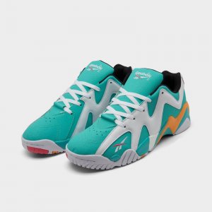
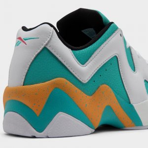
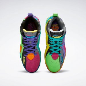
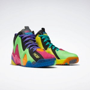
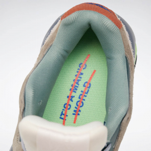
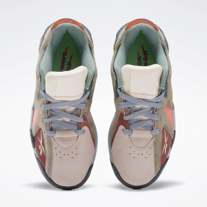
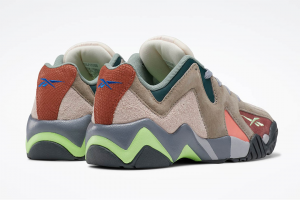
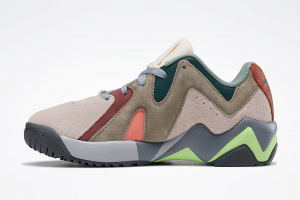
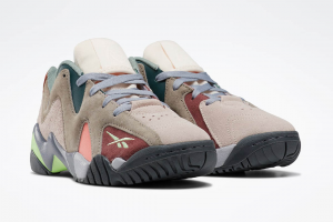
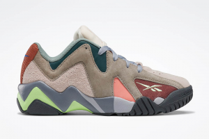
This pair's colorway takes inspiration from Lee's Game of Death jumpsuit. It utilizes a yellow leather upper with black accents on the silhouette's signature jagged stripe pattern, tongue, branding, and outsole. Special Bruce Lee hits come in the form of 'Bruce Lee' written on the lateral toe area, his signature flying kick pose in yellow on the heel, red slash marks on the tongue's pull tab, and graphic insoles that display a photo of the man himself. Matching mesh basketball shorts will also be releasing alongside this pair of the Shawn Kemp signature model.

STONEGATEDRIVE great to see a post from you my G. I appreciate the Kemp colourway homage but the 'KEMP' branding should be on the kicks - otherwise I'm good with my '13 pair. Only wore 'em twice in any case.
Can you shed some light on what's keeping the official Kemp branding off the shoes though? Reebok had him doing some promotions for the retros so they had to have been paying him. Is this a royalty dispute as opposed to a single appearance fee?