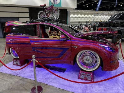
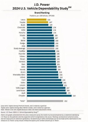
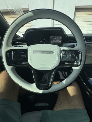
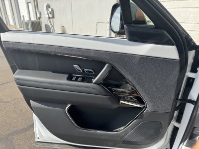
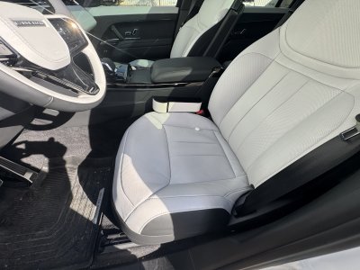
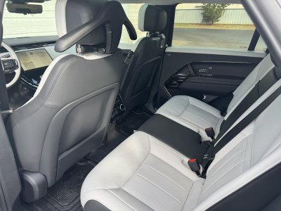
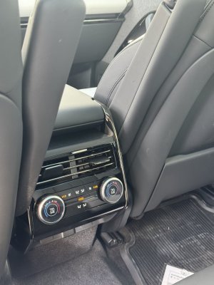
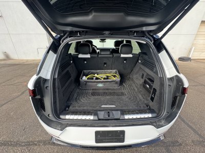
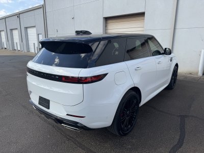
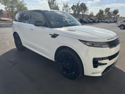
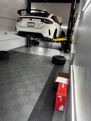
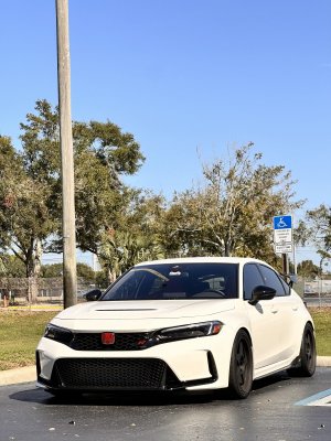
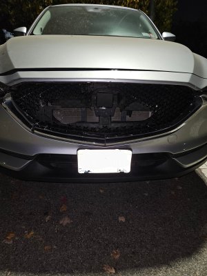
\\ Post Your Car vol. Been a minute //

i'd suggest the AA EL MP first, see if you like it, and then maybe an AB. if money isnt an issue, get the titanium MPE. personally, i wouldnt spend $6k on an exhaust, so i'm just going with the mid pipes and carbon exhaust tips. you wouldn't have a CEL issue, unless you went with a catless DP.


Just checked and see this is going for ~$5k.

Changing to the AA EL MP and adding carbon tips really would change the tone? How about the actual exhaust? Why is it so expensive? Sorry, I don't understand this stuff.
 

Just checked and see this is going for ~$5k.

Changing to the AA EL MP and adding carbon tips really would change the tone? How about the actual exhaust? Why is it so expensive? Sorry, I don't understand this stuff.

yeah once you add in exhaust tips, that exhaust package is around $5k.

the carbon tips are just aesthetic. the EL MP will give the car a deeper tone though. i've read tons of great reviews on it, and i believe its around $1300? sounds clips are promising too. if you get it and you're satisfied, awesome. if not, you can sell it and buy a full exhaust or add on an axle back to the EL MP.

like fluid hips fluid hips said, the BMW tax. just charging out the *** just because.

Thanks, for the advice! I really appreciate it.

I'm going to go with the AA EL MP to start. See how it goes, and if I want more sound, I'll go with the Remus Axelback.

If I do go with the MPE, would my OEM tips fit? I suppose, I can get CF tips from some other manufacturer.
 
A friend at Porsche sent me this.. paint to sample “Nato Olive” SportTurismo”….
A0AE8341-AF34-46C6-84E3-2D147191068F.jpeg
67F75253-102E-4689-B275-FA5DF70A29CC.jpeg
 
if i had to buy an EV car, the Taycan cross turismo is at the top of my list, followed by the RS e-tron GT.

Thanks, for the advice! I really appreciate it.

I'm going to go with the AA EL MP to start. See how it goes, and if I want more sound, I'll go with the Remus Axelback.

If I do go with the MPE, would my OEM tips fit? I suppose, I can get CF tips from some other manufacturer.

yeah, your stock tips should work, but i would confirm fitment to be sure.
 
I kinda feel that all these digital dashes and digital center console has kinda made some interior designs boring

design design what do you think?
Well for background I do know:

Up until the VW Group figured out that it could emphasize automotive interiors around 1996 (i.e. spend a few hundred more-see generation Audi A4 reference) and share parts/de-content cars mechanically (Ferdinand Piech doesn't get the credit he deserves here) most OEMs didn't really have a focus on interiors outside of the instruments. Let's look at the Honda Civic, the leading 'B' segment from 1990 to today in 15 year(ish) segments:

preview-928x522.jpg
Honda-Civic-2008-interior.jpg
46 2022 Honda Civic Sedan Touring - Copy.jpg

1990/ 2005/ 2021

Maybe 'simplicity' = 'boring' from your POV but let's assume its more 'traditional' thinking to frame this discussion (i.e visual excitement/engagement = not boring)

While the crisp, large, perfectly lit gauges from the 1990 Civic is a revelation even today and makes even the new generation IP look a bit narrow in comparison, the 2005/2021 have far more interesting shapes, textures and materials, along with variating radii on various surface axis along mostly every part in the interior.

New interiors are far more ‘fussy' visually - which I'm not advocating by any means to be a great thing - again I'm a big fan of the sight lines of the Model 3 chassis cars which remind me of the 1990 Civic (no hood in view, slim dashboard) but removing my bias aside, I think while there is some inevitable standardization amongst manufactures for the pads mounted on the dashboard, the other thousands of parts that make up and interior is now rendered with much more design thought and detail it would be extremely difficult for me to call new car interiors boring.

Here is a D class segment car, Mercedes S Class again for comparison:
5587bd8cf4084edfaa14d13916207a5d.jpg
maxresdefault.jpg
mercedes-benz-s-class-interior-review-1.jpg

1990/ 2005/ 2021/

Ironically, the S Class has returned to simplicity in its latest iteration vs. the Civic. IMHO, the 'starkness' that the 1990s Civic and S Class have here is more 'timeless'-while the mid 2000s versions, while interesting, hasn't aged well. How artfully OEMs integrate screens was the key going back to the early 2010s.
 
Last edited:
if i had to buy an EV car, the Taycan cross turismo is at the top of my list, followed by the RS e-tron GT.


yeah, your stock tips should work, but i would confirm fitment to be sure.

I love the E-Tron RS GT. But if we're talking TCTTS I might take that over the audi.

Although...I need autopilot in my life. I've seen too much now that i've had a taste. Can't go back to normal commuting unless i'm in a sports car.

Sold my Y LR last week. Model Y Performance gets delivered tomorrow. Crazy to think it's my 5th Tesla. Grey with white interior., but have an appt for wrap on July 15th.


Screen Shot 2022-06-28 at 6.07.16 PM.png
Nice spec! My MSLR was delayed out until Sept-Oct. Autopilot, flawless phone key operation & OTA updates-Tesla just has the software/hardware thing nailed.

I think I want to add that color combo MYP along with some track ready mods. The crazy thing is I think that the MYP pulls harder after 20 mph than the M3P.
 
Last edited:
This thing is a HOOT. Holy ****! The Mcmurtry Speirling. This thing is just SCARY fast, I would not wanna be behind the wheel lol.

The 2nd fastest car for the hillclimb this year was a Porsche 718 GT4 eperformance, which completed the run in 45.50 seconds...

Just watch the final run to see how fast the Mcmurtry did it in (video starts from it)

 
Well for background I do know:

Up until the VW Group figured out that it could emphasize automotive interiors around 1996 (i.e. spend a few hundred more-see generation Audi A4 reference) and share parts/de-content cars mechanically (Ferdinand Piech doesn't get the credit he deserves here) most OEMs didn't really have a focus on interiors outside of the instruments. Let's look at the Honda Civic, the leading 'B' segment from 1990 to today in 15 year(ish) segments:

preview-928x522.jpg
Honda-Civic-2008-interior.jpg
46 2022 Honda Civic Sedan Touring - Copy.jpg

1990/ 2005/ 2021

Maybe 'simplicity' = 'boring' from your POV but let's assume its more 'traditional' thinking to frame this discussion (i.e visual excitement/engagement = not boring)

While the crisp, large, perfectly lit gauges from the 1990 Civic is a revelation even today and makes even the new generation IP look a bit narrow in comparison, the 2005/2021 have far more interesting shapes, textures and materials, along with variating radii on various surface axis along mostly every part in the interior.

New interiors are far mire 'fussy' visually - which I'm not advocating by any means to be a great thing - again I'm a big fan of the sight lines of the Model 3 chassis cars which remind me of the 1990 Civic (no hood in view, slim dashboard) but removing my bias aside, I think while there is some inevitable standardization amongst manufactures for the pads mounted on the dashboard, the other thousands of parts that make up and interior is now rendered with much more design thought and detail it would be extremely difficult for me to call new car interior boring.

Here is a D class segment car, Mercedes S Class again for comparison:
5587bd8cf4084edfaa14d13916207a5d.jpg
maxresdefault.jpg
mercedes-benz-s-class-interior-review-1.jpg

1990/ 2005/ 2021/

Ironically, the S Class has returned to simplicity in its latest iteration vs. the Civic. IMHO, the 'starkness' that the 1990s Civic and S Class have here is more 'timeless'-while the mid 2000s version, while interesting, hasn't aged well. How artfully OEMs integrate screens was the key going back to the early 2010s.

I saw this today.. the new Caddy lyriq inspired by their past.. pretty cool…

Car design used to have nicely integrated screens until tesla slapped ipads in and realized all people care about is screen size. Now screens are just slapped in with so many brands and they look ridiculous.

Ironically the larger the screen the more safe it is for the driver.
EE8D0A98-3CD7-4CC2-8F6E-15A13A261944.jpeg
 
Nice spec! My MSLR was delayed out until Sept-Oct. Autopilot, flawless phone key operation & OTA updates-Tesla just has the software/hardware thing nailed.

I think I want to add that color combo MYP along with some track ready mods. The crazy think is I think that the MYP pulls harder after 20 mph than the M3P.

Definitely do it. It's just very modern looking and fits the car perfectly. I haven't had enough seat time in either, but I must say I LOVE the M3P. I think it's the best driving experience in that bracket. Absolutely wonderful car, but I will update tomorrow after that 20mph+ pull.

As for the MSLR. It's so much faster than the M3P that it is bewildering. It makes the M3P feel like a 10 year old car and i'm not making that up. My friend with an M3P didn't believe me because of the tesla website stats (3.1s 0-60) being the same. Then he drove my car and lost his mind. Way way faster, but I do miss the way the Model 3 handles like a go kart. If I am just going to grab something down the street I would take the M3P. Id be in and out much quicker. if i'm going on a nice long drive the MSLR is my choice, the power is exhilarating. I need an SUV so I got the MYP, otherwise i'd get a M3P daily 100%.
 
I saw this today.. the new Caddy lyriq inspired by their past.. pretty cool…

Car design used to have nicely integrated screens until tesla slapped ipads in and realized all people care about is screen size. Now screens are just slapped in with so many brands and they look ridiculous.

Ironically the larger the screen the more safe it is for the driver.
EE8D0A98-3CD7-4CC2-8F6E-15A13A261944.jpeg
More irony? GM is particularly proud of the fact that its screens are the largest in the industry.

Regarding Tesla, as always, I tend to look at the 30K foot POV:

One of the biggest expenses in auto interiors are the-dashboard airbags! Looking at that GM Design sketch, notice how the lower part of the dash is so bulky? Head on, the 3/Y are much slimmer. Those airbag modules are pricey to slim down (Our team at then FCA attempted to get such a proposal to production..nope$$$) so as a trade off I can more than live with a 'floating' screen on a dashboard if everything else is minimal visually. I don't really care for the visual drama in interior in most cars for under $125K, and even at that price point some of the VW Group stuff can be jarring, because I recognize parts from $20K cars in them along with most of the common supplier parts. I am very jaded admittedly in that aspect, so that is definitely a bias on my part-it just begins to become pointless to me.

Some designers prefer a slimmer profile to add to a sense of 'airiness' to cabin. Others, as you've noted, prefer more visual theater. Interesting to note is when viewing the 1990s (simple) vs early 2000s interiors (no so much) I personally prefer some of the 1990s stuff, especially when combined with the low front sight lines that were on trend during that time-but some prefer seeing a large swath of metal/IP out there.

1-5.jpg
VS
1_Use-Muted-Colors-Minimalist-Living-Room-Design.jpg


Some prefer the top pictured living space over the bottom, and vice versa. As I've always stated about consumer focused design, such is objectivity, different approaches and consumer choice.

The larger screens were a natural transition as more buttons have been taken out of interiors (cost and er, 'tech') and more adjustability has been added. The increased sub menus within those larger screens have actually increases driver distraction statistically as an unfortunate byproduct.
 
Last edited:
Well for background I do know:

Up until the VW Group figured out that it could emphasize automotive interiors around 1996 (i.e. spend a few hundred more-see generation Audi A4 reference) and share parts/de-content cars mechanically (Ferdinand Piech doesn't get the credit he deserves here) most OEMs didn't really have a focus on interiors outside of the instruments. Let's look at the Honda Civic, the leading 'B' segment from 1990 to today in 15 year(ish) segments:

preview-928x522.jpg
Honda-Civic-2008-interior.jpg
46 2022 Honda Civic Sedan Touring - Copy.jpg

1990/ 2005/ 2021

Maybe 'simplicity' = 'boring' from your POV but let's assume its more 'traditional' thinking to frame this discussion (i.e visual excitement/engagement = not boring)

While the crisp, large, perfectly lit gauges from the 1990 Civic is a revelation even today and makes even the new generation IP look a bit narrow in comparison, the 2005/2021 have far more interesting shapes, textures and materials, along with variating radii on various surface axis along mostly every part in the interior.

New interiors are far more ‘fussy' visually - which I'm not advocating by any means to be a great thing - again I'm a big fan of the sight lines of the Model 3 chassis cars which remind me of the 1990 Civic (no hood in view, slim dashboard) but removing my bias aside, I think while there is some inevitable standardization amongst manufactures for the pads mounted on the dashboard, the other thousands of parts that make up and interior is now rendered with much more design thought and detail it would be extremely difficult for me to call new car interiors boring.

Here is a D class segment car, Mercedes S Class again for comparison:
5587bd8cf4084edfaa14d13916207a5d.jpg
maxresdefault.jpg
mercedes-benz-s-class-interior-review-1.jpg

1990/ 2005/ 2021/

Ironically, the S Class has returned to simplicity in its latest iteration vs. the Civic. IMHO, the 'starkness' that the 1990s Civic and S Class have here is more 'timeless'-while the mid 2000s versions, while interesting, hasn't aged well. How artfully OEMs integrate screens was the key going back to the early 2010s.
as always i appreciate ur perspective
More irony? GM is particularly proud of the fact that its screens are the largest in the industry.

Regarding Tesla, as always, I tend to look at the 30K foot POV:

One of the biggest expenses in auto interiors are the-dashboard airbags! Looking at that GM Design sketch, notice how the lower part of the dash is so bulky? Head on, the 3/Y are much slimmer. Those airbag modules are pricey, and I can more than live with a 'floating' screen on a dashboard if everything else is minimal visually. I don't really care for the visual drama in interior in most cars for under $125K, and even at that price point some of the VW Group stuff can be jarring, because I recognize parts from $20K cars in them along with most of the common supplier parts. I am very jaded admittedly in that aspect, so that is definitely a bias on my part-it just begins to become pointless to me.

Some designers prefer a slimmer profile to add to a sense of 'airiness' to cabin. Others, as you've noted, prefer more visual theater. Interesting to note is when viewing the 1990s (simple) vs early 2000s interiors (no so much) I personally prefer some of the 1990s stuff, especially when combined with the low front sight lines that were on trend during that time-but some prefer seeing a large swath of metal out there.

1-5.jpg
VS
1_Use-Muted-Colors-Minimalist-Living-Room-Design.jpg


Some prefer the left living space over the right, and vice versa. As I've always stated about design, such is objectivity, different approaches and consumer choice.

The larger screens were a natural transition as more buttons have been taken out of interiors (cost and er, 'tech') and more adjustability has been added. The increased sub menus within those larger screens have actually increases driver distraction statistically as an unfortunate byproduct.
i also think the screen is more dangerous to operate compared to a knob or button

even on ur gauge cluster, you can now change views which i guess might be handy, but as someone whos day job is to look at a screen i kinda don't like having to look at one in the car too

i like that porsche kept the rpm gauge in the new gt3 analog and not digital, its really a nice touch that i plan on appreciating 8o
 
I like prev gen interiors where its a little busier than current gen. Example the S class.

F048DAF8-E592-4A7E-B5BA-844108651A7E.jpeg

6C1CEB72-DD5E-4393-AFEA-E0EFF25F7195.jpeg


I guess one trend is the more minimal the better, which does work in some cases (not just cars but interior spaces like mentioned). Sometimes too minimal is just...well not boring but doesnt bring a sense of occasion to me. I dont wanna feel like im in my minimalistic living room in my car. I wanna feel like im in a luxury whip. New S class is too “techy” for my taste. Now its not bad, but I prefer the former.

Teslas interior, obviously the king of minimal, is done tastefully but super bland at the same time. Feels like im in a robot.
the new s class is probably the most comfortable car i've ever been in tbh

I like the interior compared to the previous model interior tbh
 
Back
Top Bottom