Post Your New Eras*59-Fiftys*etc... VOL. INFINITY NOW W/ Henz0/Thunderchunk/Icy's FAQ ON PG.1

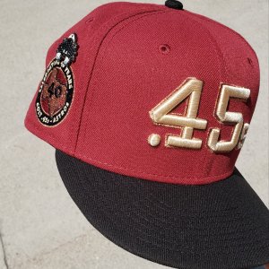
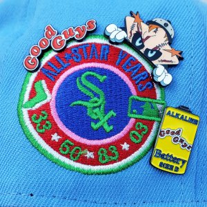
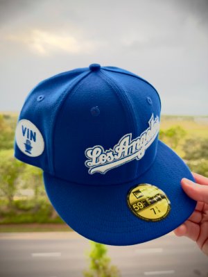
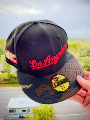
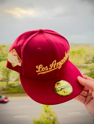
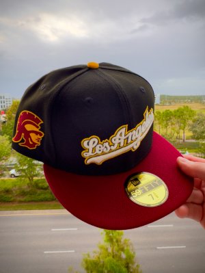
My bespoke cut and sew order came through. Backups for days.

2012 New York Mets on field alternate (last year for black). Made in USA
2014 Cleveland Indians on field ( last year for the lighter navy). Made in USA.
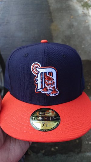
2010 era Milwaukee Brewers on field. Cool base. Made in USA.
2010 Minnesota Twins on field. Cool base. Made in USA.
IMG_3868.JPG


Sorta pissed though. The Brewers hat fits 2-3 sizes small. Should be an 8, fits like a legit 7 5/8. One fights a bit tight, while two of them fit as I would expect an 8 to fit. We talk about how sizing is just getting bad. It may as well as been bad this entire time since polys have been around.
-------

I talk about how bad the lids retro classic line is and describe issues. I want to show yall some examples in photo form.

Arizona Diamondbacks are one of the worst examples
2ep6mfp.jpg


From basically 1995 when the team was announced, to 1997, a year prior to their first season, they had an oversized A and the following colors
s-l500.jpg

s-l500.jpg

s-l500.jpg

Except for a missing purple button, the white retro classic isn't too far off. And that's where things fall flat.

They basically took the 1995 white A logo, which was never worn on field, and added it to a purple cap and a teal cap. The teal example is one of the worst I have ever seen.
This:
s-l500.jpg

somehow turned into this for lids/NE:
hwl

Here's a consolation. They did make generic snapbacks in that era of a teal A on teal crown
s-l500.jpg


In 1998, the A got smaller to its current size
This is the purple cap that should have been created by LIDs
s-l500.jpg

not this:
hwl


Here is the on field white crowned cap that they should've made
s-l500.jpg

Not this:
hwl


The black crown and teal crown also got produced with the smaller A for one season in 1998. Pretty much, the bigger A was never worn on field in any capacity. So whatever Lids is trying here, they are mixing eras and getting it way wrong.

A year later in 1999, they introduced the D snake.
s-l500.jpg

s-l500.jpg

It shouldn't be this logo:
hwl

The OG had a black raised stitched border, and a black tongue. They went flat for the sake of going flat. TRAVESTY. The purple tongue element is also wrong.

And now some random "customs" from various websites
25-Arizona-Diamondbacks-MLB-Retro-On-Field-Collection-1999-2000-With-White-Sweatband-And-Gray-Under-5950-59fifty-New-Era-Cap-3.jpg

26-Arizona-Diamondbacks-MLB-Retro-On-Field-Collection-1999-With-White-Sweatband-And-Gray-Under-5950-59fifty-New-Era-Cap-2.jpg

18-Arizona-Diamondbacks-MLB-On-Field-Collection-1998-2006-With-White-Sweatband-And-Gray-Under-5950-59fifty-New-Era-Cap-2.jpg


A 2013 hat club exclusive
DSC_6219.jpg


Some 2017 HC exclusives
2i9gt5k.jpg

Probably the most accurate of everything I've seen

Here is what lids/NE is pawning off as cooperstown collection
Oversized As, but at least the dbacks logo is right
5mgwhc.jpg


There are a couple instances where some customs can be a bit off, like a the A being big when it shouldnt, but nothing close to the mistakes that Lids made with their retro classic lineup. Abosolutely the worst mistakes I have ever seen.
 
Oakland Athletics are another team that had questionable retro classic hats
Here's a side by side from another internet photo
n5mzw8.jpg

Top three show the 1981-current common era of dark green crowns.
Botton shows the retro classic lineup.
You would have to go back to 1981 to find the last kelly green/yellow As's on field cap, so to see that one pop up is quite nice. It's the other two that I question what they actually are.

For one season only in 1993, Oakland had the dark green with white A's (top row,/middle cap from above). I'm not sure what Lids is thinking with their kelly green crown here. Same with the yellow As on a kelly green crown. The dark green and golden yellow As cap (top row/right cap) has been an alternate over the years. All three should have featured green under brims, but instead feature grey unders.

In 2013, they had a TBTC cap that featured this logo
Oakland-Athletics-TBTC-New-Era1.jpg

That design goes back to the late '60s. There has never been a kelly green./white As cap, just a kelly green/white A.

So it becomes a lot like many of the other hats, just a total meshing of years and styles, creating what is pretty much a one off design. Pretty cool if you dont care about total accuracy. But I dont't think they are really going for that, they just so happen to be THAT far off from designs. They are so badly done that they dont even know what they really created.

In 2016, the As wore this for a game or two, TBTC:
hwl

The kelly green look has been done before, but never a flat A and grey under, so if anything one of the three retro classics is accurate to around a 1995 on field cap.

TL;DR.. Of the three lids caps, only the typical kelly green/yellow white A's color matches anything on field. The other two, you would have to create your own story for.
-----------------------------
@el bro Yep, that's the seller. Having female in the title confused me. I asked for that one photo of the Royals and got it, and then totally went blind with the others. For the Seattle hat, there were two photos, with the navy/PNW showing up for 7 3/4, so I pretty much got the wrong item. But I can't complain as they were all wool. I want to say they had a royals, twins, and angels in the bigger sizes left. Haven't checked lately.

One thing to note, when I got my shipping invoice, it came from hats.com. So I went there and browsed and saw they had a promo email for 15% off purchases of $70 or more. I explained my situation to them and they helped me out after the fact. Buying 7 from them probably helped my situation.
 
Last edited:
Alright guys. Before these caps get used and abused, I thought I would visually compare these wool on fields with their polyester counterparts.

As we all know the texture of wool is way more defined. The line texture detail pops more. This applies to every single cap. Nothing compares to wool except wool. Wool also seems to have a sheen to it when looking at it in natural lightning. Made in China wool as well as the wool used for the retro classic share this same trait.

Mets vs Mets.

Black matches on all fronts. Colors are the same as well as logo size and logo stitch detail.

Interesting note on the royal blue Mets. The wool being shown here is a 2006 example. It seems to have a more pronounced raised NY logo than the poly. Yet a comparison of a 1998 and a 2000 Mets wools show a lesser raised Ny logo. So the polys match up more with those. It seems like for one or two years around 2006, the NY was raised. Blue and orange seem to match almost perfectly here.
IMG_3938.JPG


Wool navy on the Brewers quite a bit darker and just more saturated. Love that look. Phillies match up perfect on all fronts.
IMG_3942.JPG


Logo detail of the wool a touch less detailed and defined on the wool. The white M is raised quite a bit more than other details too.
image.jpg


This leads to the white M looking just s touch smaller. The navy border elements much more defined and detailed here though.
image.jpg


Astros match up perfect on all fronts. Darker navy blue a couple shades difference as you'll see below on the twins
IMG_3944.JPG


Logos look spot on.
IMG_3946.JPG

-color is a big one with the darker navy blue. It's been mentioned before. Now you can see it.


Wool on the right here. Wool is closer to black here. Poly defnitely more hues of blue popping up
IMG_3947.JPG


Twins TC comparison. Wool on top. Poly on bottom
IMG_3948.JPG


You can also see how the lighting affects the different fabrics. Wools seem brighter and more detailed.

Here's a old shade of blue wool vs. new shade of blue poly Cubs comparison
image.jpg


And just for fun, wide spectrum of blues

Old shade wool Cubs, rangers wool, royals wool, Mets wool, Cubs new shade poly.
image.jpg

At a certain point you start to go crazy with trying to compare. From my perspective, Old shade Cubs and rangers are the closest match together. Royals all alone and then your Mets and new shade of blue Cubs together.

I'm surprised they get half as much right as they do do.
 
I wouldn't exactly call them super heavy weight wool. Your over exaggerating how nice these are.

i got hundreds of new era fitteds, these are automatically top 3 quality wise ive ever encountered on da modern era, and its not even close.
 
wally ill preface my opinion with da disclosure that im nowhere near da stickler you are for reproduction accuracy :lol:

but as far as construction? absolutely no problem with em, they "feel" alot more premium than whats usually out here.

i can look past a botched color here and there as long as da spirit of da reproduction is there, this ain't nike retros we're talking about.

and custom shop fitteds have always got something wrong here and there, so im already accustomed to cutting a lil slack here & there with fitteds, since for years its basically all we had to go by before there was even a "Cooperstown" or "hardwood" classic official program at New Era. i remember shops doing most of their own leg work to get obscure logos remade and color reproduced.
 
Not sure the variety and styles you have of your 300 plus but of the ones I personally have, the retro classic are par for the course. On par with the custom made in China retros and slightly lower quality than the real deal on field pre 2006 wools. So in that regard, yes they are likely top three or four styles/releases (as a group) of the past 10-15 years. I'll give you that much. I see four levels.

2006 wool. Best
2007-2015 poly.
Made in China retro wool, heritage series, & retro classic
Everything else, which is like 95% of everything else


The Cooperstown collection is generally trash quality and high crowns. Generally anything with a weird patch is trash and any of your hundreds of random street fashion caps are trash quality. I have a few obscure fashion caps but I generally gravitate toward the custom retros and your older wools. So in general, I'm a bit more picky for quality.

Now if one has 150 plus fashion caps, these retro classics are a god send. For a person who only tends to go for the on field look, they are par. It's hard for these to excite me.

Sweatband is a touch thicker on the retro classic than the China retros. More in line with a mix between the 2006 wool and the current era polys. So there are some positives no doubt.

That's where my line of thought is on the retro classic line.

Hatclub has been doing some big things lately. Swinging wahoo. Some Astro mockups. Three sets of braves customs. I personally can't see myself dropping $45 for a cap so I went the eBay route and found some wools for half that cost.


With that said, of the 95% of whats out there, the retro classics are in your top 5%. Your fashion caps take up so much of the majority that it's sometimes hard to get past that.

Retro classics are great for the genre but not the best. Step in right direction so I'll give them that. Can't hate quality materials, design and color flaws aside. It's a top 5%er for sure but among what I own and see daily, it's nothing special. That's not to say others can't be giddy over the retro classics. I just wouldn't put it in a class of its own.
 
Last edited:
that's cuz you're a conneisuer, so you're not moved as much when you see a return to quality...i am too, but ive never been that picky wit fitteds outside certain logos matching my jerseys.

high crowns i actually love cuz i wear my fitteds big so da high crown makes it so that da fitted sits low on your eyes.
 
The most positive effect is newcomers liking the fit and feel and look of the wool that they don't buy anything else, and DEMAND retro classics be the norm. So I am all for people liking what they like.

What I dont like

Lids is at it again. These CGI hats have got to hurt sales. I saw this with some black MLB fitteds as well as some NCAA caps. They look like the chrome side patches/4th of july caps.

Anyone gonna take a chance on these?
hwl

hwl

hwl

hwl

hwl

Love the two tone reds on the CA angels.

It's sad because Ive been eying a proper grey under MB navy/green for years and I just cant trust that CGI looking photo. Each one of the logos is severely undersized.

Just when I want to give them credit, it happens again.

My sizes have already dried up on a lot of the older releases. The twins M is completely sold out. So despite many oddities, most people don't care. The care for quality materials is what I do like to see. Giving lids the perception their designs are acceptable, I can't get behind that.
 
Last edited:
Listed as retro classic. I'm guessing the cgi look won't match what real life looks like but I don't think I'll be the guinea pig to find out. I give them weeks to a month to get real photos up. My size will be gone by then. And they wonder why hat sales are down.

Lids has a reverse c-dub line that has all the hats looking this way. They also had a black series where they looked this way. Now just a few of them look this way.
https://www.lids.com/new-era/style_mlb-black-series-59fifty-cap?page=1
Logo size and colors changed from the cgi to real life. So who the heck knows what these will look like. The logos went from slightly undersized to badly oversized. Yikes. It'll be fun to see how those end up.
 
Been on the lookout for a regular ol tigers home wool for years. Just so happened to find a '06 ws patched version.

IMG_4047.JPG
IMG_4048.JPG


Easy pass on the retro classics. Just got this for half that. Can't beat bargain hunting.

Interesting note. Obviously in 2007, polyester took over. I guess during the 2006 World Series, each player got to choose which style they wanted. So you will see some patched hats with black unders and poly, and some grey under wools. Even more interesting, not all World Series caps of this 2006 year featured the blue NE tags, which was synonymous with 2006 last year wools. So you're seeing some older stock from 2003-2005 having a patch placed on them. Some people pass on hats like this because they think they're fake. They don't know the full story.

Same goes for other years where the tags had a change. Some 2012 ws hats still have the 2009-2011 era cool base tags on them. I know the Cubs caps were so popular they were patching up years worth of old stock. Sadly they had to go into the made in China vaults. So many of those first run ws caps are crap quality. But that's for another day.
 
I’m taking a chance on the navy/red Angels. Either way I’m still putting it on and flapping my angel wings.
 
This Is how you do a retro classic set

Some new finds. Would've been dumb to pass these up.

DBE31FA4-F24E-4AFC-AC66-81E3FE3DE696.jpeg

All made in USA. 100% wool. 1 green under. 8 grey under.
1997-1998 Philadelphia Phillies alternate on field
2001-2003 Milwaukee Brewers on field.
1992-1993 Boston Red Sox on field
2003-2005 Cleveland Indians road on field
1995-1996 Oakland Atheltics road on field
1995 Seattle Mariners home on field
2003-2005 Cleveland Indians alternate I on field
1996-1997 Pittsburgh Pirates home on field
2003-2005 Cleveland Indoand home on field.
80CCC153-A529-41A8-8E0E-C8E89025D2CB.jpeg


Up close Boston
83B21071-89EF-45A1-897D-4138B0D402AF.jpeg

F6083771-F6B0-4B09-9A51-C79DD05D5B88.jpeg


Up close Oakland
image.jpg


Up close Phillies
image.jpg


Up close Pirates
image.jpg


Indians set
image.jpg

Always found it interesting that when the I released, it never released in the lighter navy until the caps went Poly. So for a solid 4 years, they had quite the variety in shades of navy.


Amazing wool quality on the '93-'98 era stuff. Nappy wool cannot be replicated. This older era of hats, at least these few, have a sort of trucker hat high crown quality to them. Interesting to compare to right around 2000-2002, when that all changed.
 
Heads up.

Mlbshop.com has $20 off on fitteds.

Don't know exactly when it ends.

I believe it's for tmobile customers only.
 
No idea, sir.

My boy just told me about it on my way to buy breakfast.

Maybe it tells you on mlbshop.com
 
Eastbay has 25% off select non flagged mlb on fields. They were already priced at $14.99. Now $11.24 with free shipping. Ebates has 2.5% off at this time. I'll take a $11 on field all day, every day.
 
Mickeysplace.com may be your best bet. Are you wanting exact replicas? Like green under and no batterman?Or grey unders and not the black unders?

The Astro's wore grey unders in that '88 Ryan photo. Those ones may be harder to find than the green under replicas.
https://www.mickeysplace.com/houston-astros-19711982-p-1854.html
https://www.mickeysplace.com/houston-astros-19801993-p-1855.html

Here's a Pirates gold/black with green under.
http://www.craniumfitteds.com/Pitts...nd-And-Green-Under-Visor-New-Era-59fifty.html
The one you posted is actually a 2012 era on field that pretty much has the same shade of yellow as the originals. The golden yellow option you see above in retro form is actually wrong. So take your pick on accuracy. I think Eastbay has the one you posted about too.

Heres some Tigers (not exactly that road Orange cap, but they are green and grey unders)
https://www.mickeysplace.com/detroit-tigers-19721982-p-1853.html
https://www.mickeysplace.com/detroit-tigers-1994-alternate-p-2063.html

Brewers
https://www.mickeysplace.com/milwaukee-brewers-19781985-p-1863.html
They recently had a Diamond Era BP cap in this color that may be cheaper
black under
http://www.fanatics.com/MLB_Milwauk...d_Diamond_Era_59FIFTY_Fitted_Hat_-_Gold_Royal

Ebay may also be your best bet. Seeing some solid vintage Tigers options for $30 or so, green under.

It looks like eastbay raised the price on the on fields that I had spotted. We'll see if they honor my order. Maybe I shouldnt have posted about it here. Price went from $11.24 to $18.74. Their regular deal prior to this was Two hats for $35, or $17.50 each. So they actually raised prices to 2014 levels. Pathetic if you ask me

http://shiekhshoes.com has a couple new era on fields for $10-$20.
http://Craniumfitteds.com is having 60% off clearance items
 
yeah, as close as possible to those pics, the exact years of those throwbacks.

thank you! wanted to get those hats before I put the jerseys away for the year.
 
Back
Top Bottom