- 12,326
- 6,680
- Joined
- Nov 18, 2000
Follow along with the video below to see how to install our site as a web app on your home screen.

Note: this_feature_currently_requires_accessing_site_using_safari

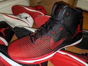
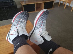
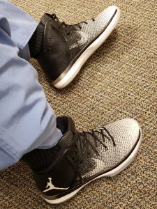
This new angle of using "inspiration" of OG models starting with the AJ1 does seem to have a little bit of a lazy vibe...I'm sure Tinker and Co. will try to spin it differently though. Unless it goes like the unveiling of the XXX....didn't it seem like they weren't very excited about the XXX? I guess this shouldn't be a huge shock, for a brand that relies on its past for its present to say F it and implement it into its future. I personally haven't been inspired by a design from the sig line since the XX8. It is hard for me to get hype for this since the concept has been done over and over from JB. I guess if you want original, you shouldn't look to JB. The shoe isn't bad, or good....it is just there. The flagship shouldn't be blah, hate it or love it, it should evoke SOMETHING, and for me it doesn't.
They should've wrapped a leather swoosh around the heel and put the Wings logo under it at the back. Maybe have it embossed under the leather. Maybe an embossed swoosh would've been dope too. It kind of would've started to appear after a number of wears that way. Like this :
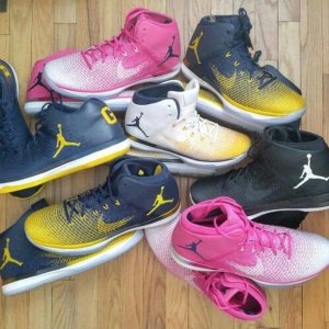
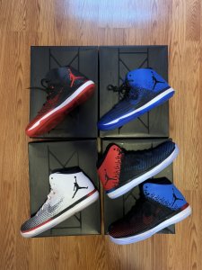
View media item 2104517
+
View media item 2104531
+
View media item 2104533
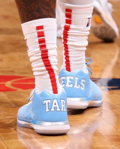
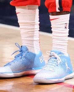
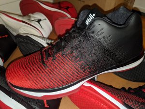
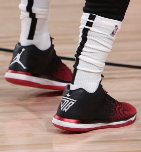
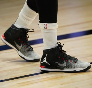
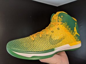
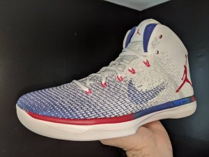
The Jumpman on the tongue is plenty. The Jumpman on the side ruins everything. It should be on the tongue.
I also kind of hate the curve on the collar but whatever.
But by far the big Jumpman completely destroys any potential for this shoe. Then they went and reversed it on the other shoe. It reminds me of my Husky when she destroyed my garden, put it into a pile, then promptly took a huge dump on top of it. I know its not quite the same but still
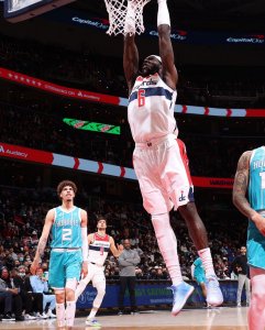
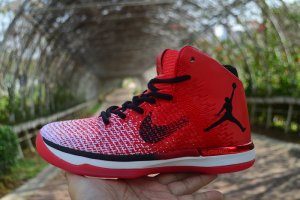
Wow these are trash ...that jumpan placement is soooooo tackyView media item 2104495
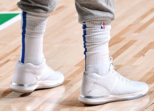
Via Twitter
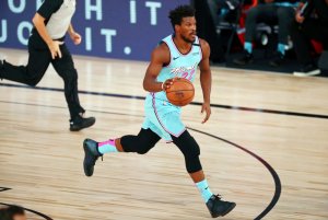
Its almost like they took their cue from the new uniforms with ads on themit has a soccer jersey advertisement type feel if that makes any sense.
i dunno maybe ill get used to it but i think one or the other would have looked better. Its DEFINITELY way more noticeable when its a 3rd color, unlike the black and reds.

it has a soccer jersey advertisement type feel if that makes any sense.