- 2,439
- 6,160
- Joined
- Jul 1, 2012
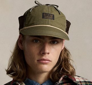
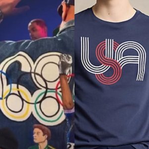
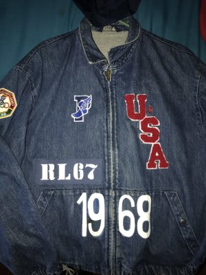
That polo jumper is hard 
Follow along with the video below to see how to install our site as a web app on your home screen.

Note: this_feature_currently_requires_accessing_site_using_safari

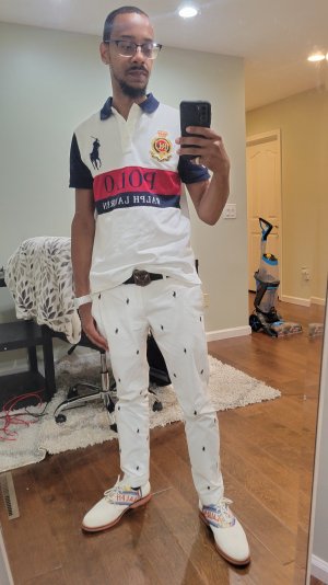
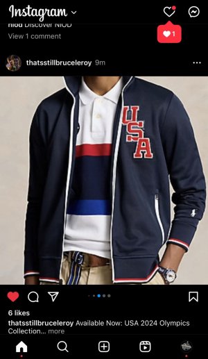
Yes, The materials and construction quality of these 2018 Olympic Team Boots is far better than the new Polo version of the boot.Not sure what size you guys are wearing but these are all over eBay for the Lo...just make sure to go a half size up.


This has been the longest stretch of RL not putting out anything I am remotely interested in in a long time, which at the very least is affording me extra money to spend on camera gear. Too much branding, not enough pattern for me. RRL is much more my speed these days (though Ill never act too good for Polo) but it guts me to spend $350 on a plain flannel.


Same here. He is making clothes for the young. He is bringing back the older styles but making them just gaudy enough so only a teen would look good in it. Only a teen would look good with a cartoon race car or cartoon ski man on the front of the coat.
Grown men wear graphics on the backs of coats. Look at any corporate or business uniform. Logo and graphics on back of coat.
I mean jackets not shirts or sweatshirts or sweaters.
Allot of the designs look childish. The hotwheels sweatshirt looks like its for the kids dept.
To each his own though. I will wait til the summer.


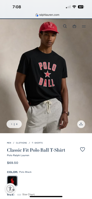
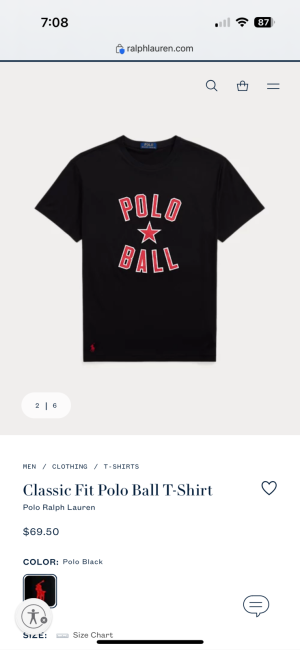
Usually classic fitAnyone own a polo rugby in here and how is the quality and fit thinking about get one soon
Super dope jacketJacket and shirt came in... joggers should be here by 8pm... loving this Royal blue


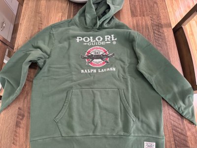
I hope I dont see anyone over 19 in this hoodie.

 or
or


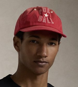
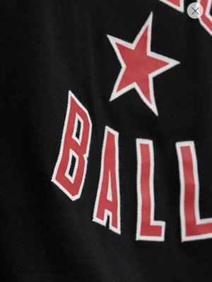
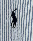
The tennis image already tells the person it is tennis.what about just tennis 84 ?
Id rock that hoodie with the bred 11s, the toro 14s, bred 4s or black cement 3s10 to 1 rico copping that sweat shirt... don't fall for the fake outs... counter punch back...proper counter is other hand (left to his right and V V ) opposite punch (hook to his straight and V V )
makes me want to rent a Ferrari just to put that hoodie on !!

The tennis image already tells the person it is tennis.
The sport branding ties it into Polo Sport and Sports in general.
You want to say as much as possible without overbranding or being redundant.
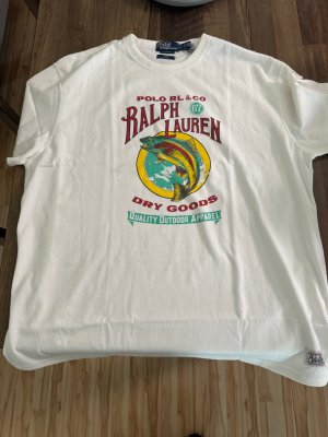
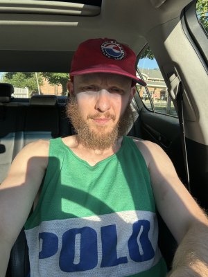
Thats why the back does not say Polo. The horse symbol already says that.
I made it into an anniversary piece.
Now I dont want the original version. This one is tied to super Saturday.
I wanted the white color background, but I'm afraid of pit stains.
The blue will age better. Hide any aging or discoloration better.