- 36,573
- 48,787
- Joined
- May 12, 2008
Follow along with the video below to see how to install our site as a web app on your home screen.

Note: this_feature_currently_requires_accessing_site_using_safari
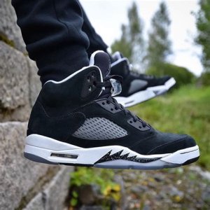
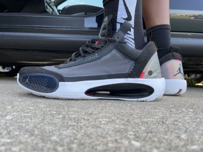
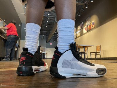
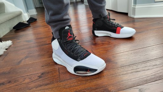
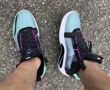
What year? Not last yearThe same sh*t every year:
"I hate them, trash, kill the brand, kill the designer, it's a wrap, who approve those, MJ must be blind".
30 minutes later:
"I need to see different colorways, I need to see them on feet, I need to see them on the court, I need to see someone jumping in them"!
6 months after the release date:
I can't believe I have 8 pairs of these.


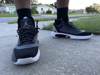
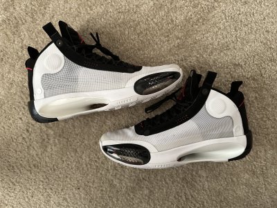
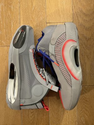
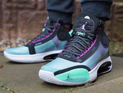
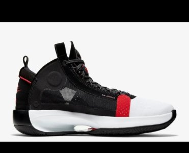
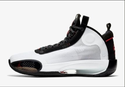
Shouldnt the NIKE in nike air be more pushed to the left? These are inspired by 4s right?
What year? Not last year
it was Tate and like 20 other dudes...Say what you think but Tate has been killing it the last 4 sigs IMO. All 4 were better than the last 4 that Tinker designed.

The same crap will be said for the 35 next year.Most new designs get the same treatment. If we go to the 33 thread, I’m sure we’ll see the same statements.
Look at the first page of the “Zoom Freak” thread. Notice the negative comments when they first see the shoe. Now it’s one of the best sig models out design-wise.
https://niketalk.com/threads/nike-“zoom-freak”-1’s-giannis-antetokounmpo-roses-8-30.675280/


The same crap will be said for the 35 next year.
-grainy fuzzy pics are shown, has no facts
"I don't like it trash, Nike air logo off-centered"
***24 hrs later after official pics****
"Oh Chicago theme colorway...day 1 cop Son!!"
So redundant and predictable with these NT folks.