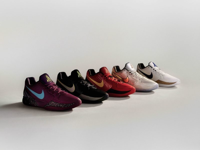
Introducing the XX3 Limited eddition (1 pic)

What's up i guess thse aren't what we expected to be the 23s but they are pretty well made and these pics make them look GREAT!

anyway here are a couple of PS's i did to contribute to this thread
d191535f5d14ecf4467492e1b756f2946bf11a9.jpg

6ce253d5145bf151e16fe40fd46452ec79f4038.jpg

tongue.gif
 
[yo all things jordan , thanks for the DMPS a week ago they are tight ], back to the post, i love the new xx3s they all look good but that back fin is got togo imean why is it there , what is it for, take that off and the shoe would be 123% better imo
 
despite the color and blah blah, these are still gonna sell like crazy just because these are limited jordans.
 
Stitching is definitely a so-so design. People will be wearing these shoes with flannel shirts, they could make an Al Borlain XX3 from Home Improvement.
 
The price and the design on the side turns me off to these, but they sure look pretty interesting.
 
The photography really enhanced them. Would've been a decent shoe for any other than the 23. Too safe.
 
these look better then the others.
still not liking the 230 price tag.
 
Originally Posted by 23ska909red02

I like this colorway more than the othres I've seen so far, but not enough to buy.

I hate... hate, hate, HATE all-over print. I can not IMAGINE the columbia XIVs or XIs (my two favorite Jordans) with print all over the freaking uppers.

And all this crap on that huge leather piece is killing the shoe for me. We've seen that 'MJ' stitching on the white/red/black mids, argyle print on the black/gray mids, some stitched pattern on the black/gold lows (though the stitching on these is black, so you can't see it as much), and now some weird squiggly-diamond pattern on these.

I really... REALLY wish that leather panel right there was just plain on all of the models I've seen so far.

That first colorway, the white/black/red... man, those would so clean if that 'MJ print' wasn't all over that panel. Maybe one little 'MJ' on the heel?

The black/gray (stealths) would look so much better without that argyle print.

And these blue/gray mids would look incredible with just a gray panel right there.

Like I said, maybe just have that 'MJ' pattern ONE TIME on the back of the heel.

Exactly what I was going to say. If that gray panel was just a simple gray, or if the panel on the white/black/reds was just plain white leather, theywould look AWESOME. I guess they were afraid of making another simple clean shoe like the XXI.
 
23ska909red02 wrote:
I like this colorway more than the othres I've seen so far, but not enough to buy.

I hate... hate, hate, HATE all-over print. I can not IMAGINE the columbia XIVs or XIs (my two favorite Jordans) with print all over the freaking uppers.

And all this crap on that huge leather piece is killing the shoe for me. We've seen that 'MJ' stitching on the white/red/black mids, argyle print on the black/gray mids, some stitched pattern on the black/gold lows (though the stitching on these is black, so you can't see it as much), and now some weird squiggly-diamond pattern on these.

I really... REALLY wish that leather panel right there was just plain on all of the models I've seen so far.

That first colorway, the white/black/red... man, those would so clean if that 'MJ print' wasn't all over that panel. Maybe one little 'MJ' on the heel?

The black/gray (stealths) would look so much better without that argyle print.

And these blue/gray mids would look incredible with just a gray panel right there.

Like I said, maybe just have that 'MJ' pattern ONE TIME on the back of the heel.
heat23 wrote:
Agreed. Especially with what you stated about the stealth
fretmarks wrote:
you guys mean like these?

xx3rm9.jpg


i think they are better with the patterns. without them, they are just too tad plain. the patterns are what define the xx3's IMHO. because the patterns are hand-stitched, they give the shoes that uniqueness common to most, if not, all of the air jordans. the patterns give them "soul" figuratively speaking.


YYYYYEEEESSSS!!!!!!


I'm not kidding, those are four hundred THOUSAND times better in my opinion.
 
the blue on these looks darker than they really are because of lighting...they look more like university blue, the way it should be...
 
i really like the shoe, but i dont like all that stitching, the ps of the three colorways are so much better!
 
Originally Posted by 23ska909red02

23ska909red02 wrote:
I like this colorway more than the othres I've seen so far, but not enough to buy.

I hate... hate, hate, HATE all-over print. I can not IMAGINE the columbia XIVs or XIs (my two favorite Jordans) with print all over the freaking uppers.

And all this crap on that huge leather piece is killing the shoe for me. We've seen that 'MJ' stitching on the white/red/black mids, argyle print on the black/gray mids, some stitched pattern on the black/gold lows (though the stitching on these is black, so you can't see it as much), and now some weird squiggly-diamond pattern on these.

I really... REALLY wish that leather panel right there was just plain on all of the models I've seen so far.

That first colorway, the white/black/red... man, those would so clean if that 'MJ print' wasn't all over that panel. Maybe one little 'MJ' on the heel?

The black/gray (stealths) would look so much better without that argyle print.

And these blue/gray mids would look incredible with just a gray panel right there.

Like I said, maybe just have that 'MJ' pattern ONE TIME on the back of the heel.
heat23 wrote:
Agreed. Especially with what you stated about the stealth
fretmarks wrote:
you guys mean like these?

xx3rm9.jpg


i think they are better with the patterns. without them, they are just too tad plain. the patterns are what define the xx3's IMHO. because the patterns are hand-stitched, they give the shoes that uniqueness common to most, if not, all of the air jordans. the patterns give them "soul" figuratively speaking.


YYYYYEEEESSSS!!!!!!


I'm not kidding, those are four hundred THOUSAND times better in my opinion.


CLASSIC! This is why Ska is one of my favorite Mods! I'm gonna add you to my five ska. It was either

between you or D.Wade!
 
Not bad but not disappointed that I'm missing out on this release, especially for 230. Wht/blk/red n blacks are copped tho. BTW nice renderings 1and12. Thewht/yellow/blu look like Chris Paul PEs. Nice black n gold too.
 
Back
Top Bottom