- Jan 11, 2014
- 8,768
- 17,496
Is there any way to change the amount of posts you see per page?
Follow along with the video below to see how to install our site as a web app on your home screen.
Note: This feature may not be available in some browsers.
Dudes acting like a bunch of kids that have never used a computer. Remind me to never do some free **** for anyone, bunch of whiny, needy children.

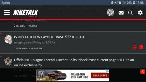
is the new theme laggy on ios for anyone else?
Try changing it to OG theme - works better.
Y’all *****s ain’t goin nowhere bruh
Ninja just shut the **** up already
it does click on the direct right of the last letterI wish when you click on a thread it would take you to the last page
damn


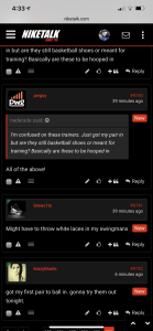
can't say wit a straight face that mobile looks better now... this small avi, stacked on top of eachother formatting looks bad..
it does click on the direct right of the last letter
of the thread title
cats ain't leave when the site was crashing, barely working, and getting wizard'd every day but ready to dip cuz it looks different
It's currently real quiet right now..cats ain't leave when the site was crashing, barely working, and getting wizard'd every day but ready to dip cuz it looks different

I never look at that but you're probably rightwho told u that lie? we lose folks by attrition all da time..and how often u see "join date 2019, 2018"...
think about that for a sec.
Join date means nothingwho told u that lie? we lose folks by attrition all da time..and how often u see "join date 2019, 2018"...
think about that for a sec.
He's saying, you aren't seeing new people join which is tech an issueJoin date means nothing
u missed his point ENTIRELYJoin date means nothing
who told u that lie? we lose folks by attrition all da time..and how often u see "join date 2019, 2018"...
think about that for a sec.
how often u see "join date 2019, 2018"