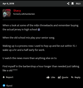
- May 23, 2005
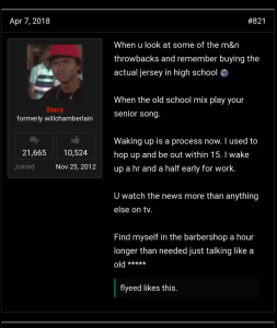
- 63,607
- 50,745
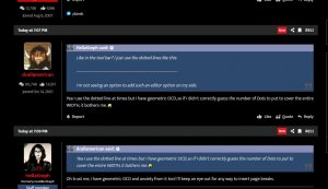
i got ursNo you missed my point BA
but ur point is trash
Follow along with the video below to see how to install our site as a web app on your home screen.
Note: This feature may not be available in some browsers.
i got ursNo you missed my point BA
Fairly often in the Jordan Brand section and Yeezy thread, actually.
Yea but everyone that contributes is the old headsBruh I was on here with yall complaining about it
I see new join dates but not often. But it's been like that for like 5+ years. This like the biggest sneaker based forum on earth, I feel like you already here if you been into sneakers like that.


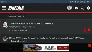
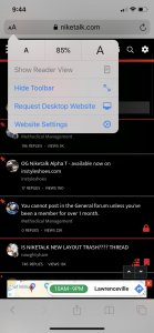
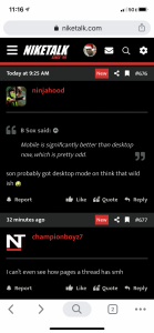
can't say wit a straight face that mobile looks better now... this small avi, stacked on top of eachother formatting looks bad..
Only your mobile looks like this, fix your damn browser settings .
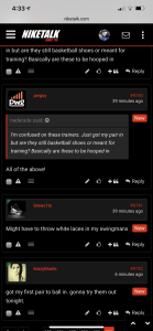
p was that good huh???I’m conforming slowly. But it’s still not as good as the last layout. This is chunky and boxy like my ex after she left me. My ex is a *****. I miss her.

It even cleaned up the white bars on your avi
 Can we get a thumbs down and then the GAMES will really begin.
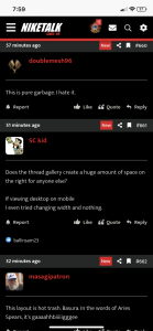
Desktop on mobile with the last version was perfect.
For me
Are you on a iPad?That’s mobile. You guys have your **** zoomed in or resolution set too low or something.
already askedI just tripped they calling thumbs up “reaction score” like it’s a game.
Yeah it’s perfect on an iPad, but I see folks gripes on a phone in portrait mode. If you rotate to landscape it looks better but that’s not optimal. Again that doesn’t really bother me though.Are you on a iPad?
It's gonna look that(your screenshot) cause your on a formatted tablet/iPad with different screen resolution then a iPhone/android smartphone, not all types of Devices scale the same way. Most individuals don't even use their phone in landscape besides watching a video or taking pictures.Yeah it’s perfect on an iPad, but I see folks gripes on a phone in portrait mode. If you rotate to landscape it looks better but that’s not optimal. Again that doesn’t really bother me though.

I can rock with this, I just wish there was a flat black layout vs this two-tone grey, I may make one myself.
A more familiar black theme is available. You need only select it from the style selector at the bottom of the screen:

I'm guessing you haven't caught this?
You can change it back to og. Bottom of the page.White text on a grey background ain't it chief
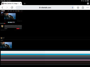
Site needs to go back to a black background ASAP. Making my eyes hurt