- Nov 20, 2007
- 90,656
- 55,296
I figured the page # thing would be fixed on mobile cuz it was definitely showing at first. Same with the last post link option.
Follow along with the video below to see how to install our site as a web app on your home screen.
Note: This feature may not be available in some browsers.
Btw the lag on mobile is due to the Ads, once you pay up, the site is MUCH better to browse on mobile
No, they don’t. If you view the ads, you are supporting our community.Any NT regular without the “supporter” banner, needs to be clowned and shamed....?
No, they don’t. If you view the ads, you are supporting our community.
In fact, we deliberately priced the subscription low in honor of the upcoming 20th anniversary and to make the option accessible. If you’re someone who views 25,000 ads a year (which, if you let some people tell it, is like ten threads’ worth), those ad views may actually help us generate more money than the supporter option, depending on the going rates. (Ad blockers, of course, are another matter...)
Bottom line: whether you’re a “supporter” or an ad viewer, you’re helping us to maintain and improve our community and we appreciate you.
So why make badges? It’s not for the sake of elitism, but to raise awareness for the option. There’s an “upgrade” option available in user preferences and we reference it when users attempt to visit with an ad blocker enabled, but that’s about it. We’re not going to spam the site to advertise a feature for people who dislike advertising. The badges help get he point across more naturally.
Shaming those who choose to contribute in a different way than you does not help NikeTalk. If you have a badge and you want to help, just politely explain what it is if you’re asked, and don’t pressure anyone into it on our behalf. We created it so that each of you would have a choice. So let them choose for themselves as you have.
Yea I like the old layout.
it really doesn't...and da lag is real bad between when i type and when da letter appears...u can change ur layout style
i changed it to the og
so it looks like it kinda did before
 most folks here were asking for minor tweaks, to a existing game... Street Fighter II to Street Fighter II Championship Edition.
it really doesn't...and da lag is real bad between when i type and when da letter appears...

da letter font on this whole site is stringy and skinny, it isn't bold and clear anymore....
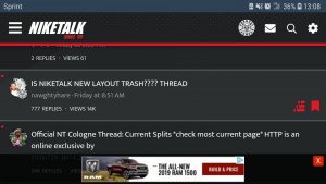
I concurAt first I wanted to give it a chance but nah it’s garbage
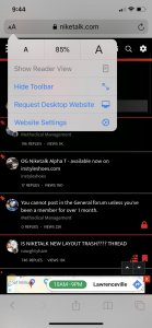
Bottom right, change widthHow do I make the layout bigger on my desktop? It's mad small and narrow.
Who still has an AOL account? LOLWhy do i have a million notifications killing my aol account.
1000 steps backward. Might rescind my membership and request a total refund of my time.