D
Deleted member 129301
Guest
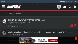
trash especially on mobile its too much going on smh only good feature is gallery couldve left everything the same
Follow along with the video below to see how to install our site as a web app on your home screen.
Note: This feature may not be available in some browsers.

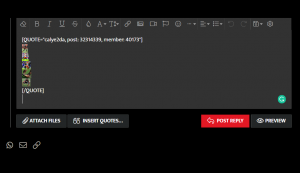
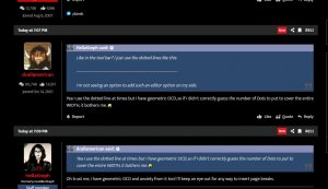
Yea I use the dotted line at times but I have geometric OCD, so if I didn't correctly guess the number of Dots to put to cover the entire WIDTH, it bothers me.Like in the tool bar? I just use the dotted lines like this:
-------------------------------------------------------------------------------
I'm not seeing an option to add such an editor option on my side.

Yea I use the dotted line at times but I have geometric OCD, so if I didn't correctly guess the number of Dots to put to cover the entire WIDTH, it bothers me.

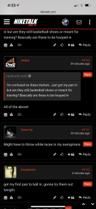
After trying to give this a shot with an open mind, I have come to the conclusion that I absolutely hate how the quotes are done on this new platform. Its an eyesore, and is very difficult to follow. I dont think it is jumping the gun to say that this is easily the worst quote system I have seen on any NT platform, or other message board platform I have been on.
I sincerely hope this is a test. Because its just awful.
Ended up adding some CSS to the page and quotes are far easier to pick out.
Just writing something to vanish the gallery now.. lol.
Y’all gotta give these admins a chance
the quotes were one of the first things mentioned in this thread, and not just once either.. it was bugging me, and it took about 2 minutes to find and add some color codes in.
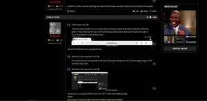
The Thread gallery would be much better if it was a pop-over that only showed up when you click on a side tab (like galaxy edge stuff), but adding the js to do that is probably a bit longer fix that just a simple hide/unhide option in the prefs.
I'm just asking for a chance to understand what I need to fix, and I can't do that if comments aren't offering details or giving me insight as to why or what can be improved.
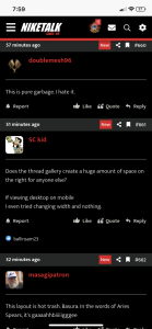
If i use desktop on a mobile device there is a massive space to the right of the screen because of the thread gallery.
I can basically scroll to the right endlessly and it also makes it so I have to manually zoom in.
I tried the width change thing but nothing.
Honestly that is my only problem.
yeah, it's a question of separation.. Quotes always stood out and you could scan through a pile of text and skip to the replies that poster had added without any trouble. It's far less easy at the moment and particularly so on multi-quotes
I'd like to be able to see the gallery, but not as the default option on every page. The ability to hide it until you want to see it would declutter the page a lot. It's a cool feature and all that, but it's just a bit extra to have it take up that much space on desktop.
The other thing is the avatar/name/messages/reaction box.
It's just an extra thing that's really not needed when there's an avatar pic right above it where that info could be easily added.
Actually staying on cool grey now, my eyes prefer it. I don't understand some of the complaints but I guess it comes with change.
Fair enough. I've seen XF boards where it's not there, so if it's not something in the admin controls then it was either a mod or edits done to the theme.Got it. We'll work on making it visually distinguishable from replies.
At this time, we only have it on the right sidebar on desktop. That right sidebar is there regardless if you don't see the gallery. The purpose is to show you content, and it's not like we fill that space with anything additional like posts or threads. We may consider adding other content, but at the current time, the thread gallery is to be present on every thread. If you wish not to see the thread gallery (throughout the entire site), we're still looking at a possible solution to opt-out but it's not user-selectable.
This is core to the forum software and not something that we added ourselves.
You may select the "OG" theme if you wish to defer back to a similar style that we had before.
what makes NT great is the CONTENT, not the format
listen Duke, format is like flow content is like lyrics no one is going to listen to you rap if you got horrible flow regardless of how well you write your verses.
wish the threads u frequent were like greyed outGood thing we have different tastes.
You are absolutely free to keep your default theme as OG. I’ll keep rappin’ on Cool Grey.