IS NIKETALK NEW LAYOUT TRASH???? THREAD

IS THE LAYOUT TRASH


  • Total voters
    351
How do I get rid of this "NT would like your permission to enable push notifications" on the bottom of my screen? I can't even click on the damn thing to "x" it out.
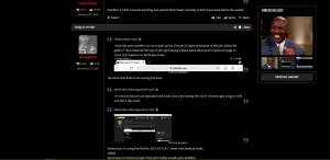
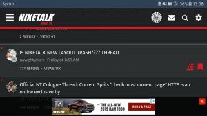
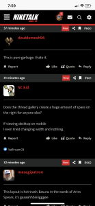
Click on "never show again" or whatever and it'll never show again.
 
Before this update, if I uploaded a picture (file) n the default was an ATTACHED thumbNail.

It wasn't a full image

yeah, its called a 2 step process.... being in da attached thumbnail is like a unopened attachment in a email.. you're supposed to full size it after that. or else when you're on mobile you gotta scroll all da way up to see a damn pic that was in a post damn near a page down.
 
After trying to give this a shot with an open mind, I have come to the conclusion that I absolutely hate how the quotes are done on this new platform. Its an eyesore, and is very difficult to follow. I dont think it is jumping the gun to say that this is easily the worst quote system I have seen on any NT platform, or other message board platform I have been on.

I sincerely hope this is a test. Because its just awful.
 
Feels like there's been a lot less posting since the changes, but yeah.. Thread notifications are spotty at best.
it's made post less tbh
the site is just an eye sore now on mobile
 
I love how this was released in conjunction with ios13 so now it feels like I have a new phone but it’s all just new software praise be to meth

It looks HD on my iOS 13.1 iPhone Xs. My cousin has the new iPhone 11 Pro and it looks super crisp. ?‍♀️
 
Anybody having issues with the search. I’m unable to text in the box. The keyboard won’t launch for iPhone.
 
If we could get quotes to look like they used to and for links to not look like ads, I'd be cool with the update.
 
List of recommendations after reading most complaints...

-fix quotes as right now it just looks like a blob of text when scrolling
-go back to original font/size
-fix search engine
-put thread gallery somewhere else or option to hide it for a more widescreen interface
-have peoples screennames fit 1 line
-ability to minimize poll question since its so damn big and right in your face
-ability to remove push notification bar on the bottom
-overall there are too many red blocks everywhere (polls, supporter banner, etc)
 
yeah, its called a 2 step process.... being in da attached thumbnail is like a unopened attachment in a email.. you're supposed to full size it after that. or else when you're on mobile you gotta scroll all da way up to see a damn pic that was in a post damn near a page down.

You do understand you are agreeing with what I said right?

My INITIAL question was, WHY does a uploaded photo, now, AUTOMATICALLY show up as FULL image. (Instead of ThumbNail as it was before).
 
You do understand you are agreeing with what I said right?

My INITIAL question was, WHY does a uploaded photo, now, AUTOMATICALLY show up as FULL image. (Instead of ThumbNail as it was before).

Because the issue becomes that if it only defaults as thumbnails, no one on mobile can see it if it's quoted. When I upload an image by clicking "Attach Files" it doesn't upload a thumbnail or full image until I select which one I want. Maybe you could try that option so that it gives you the power to select which one you want to do.
 
Anybody having issues with the search. I’m unable to text in the box. The keyboard won’t launch for iPhone.

This is being fixed right now. The website is rather large so it may take about 24 hours before the entire website is fully indexed again. Sorry for the inconvenience and we hope you'll like how search works after the fix is done.
 
Because the issue becomes that if it only defaults as thumbnails, no one on mobile can see it if it's quoted. When I upload an image by clicking "Attach Files" it doesn't upload a thumbnail or full image until I select which one I want. Maybe you could try that option so that it gives you the power to select which one you want to do.
If I select, "Full Image" now I have the picture showing up TWICE in my post.

Since that has been happening, I don't even CLICK "Full Image" because it is already posted as a "Full Image."


Also, while you are here, can you add a "Horizontal Bar" that stretches across the width of a post viewing box. Sometimes I want to post separate things in one post and I want a clear/defined separator to distinguish between my two "posts." Almost like a defined/visual PAGE break.


Like in the tool bar? I just use the dotted lines like this:

-------------------------------------------------------------------------------

I'm not seeing an option to add such an editor option on my side.
 
Back
Top Bottom