- May 23, 2005
- 63,607
- 50,745

Follow along with the video below to see how to install our site as a web app on your home screen.
Note: This feature may not be available in some browsers.
Same issue here on iPad via safari, when viewing landscape. Not an issue when viewing whilst in portrait.Well, the website is responsive so it's likely that the site couldn't detect your screen sizes to display the right breakpoints. But I digress, what kind of mobile device are you using?
Agreed, I hunt for preferences, others probably do not.OG theme should be default]
Agreed, hope my “Watched” threads list would push the “Read” threads down like before or greyed out.wish the threads u frequent were like greyed out
like on the old platform
it kinda hard to differentiate threads i already looked in
or replied in
that lil dot to the left is so small

My question about fixing the search function got ignored
yeah thats how i find posts and threadsain't even speak on it...it went from "works but finikie" to "utterly useless"
google really is da defacto search bar.
yeah thats how i find posts and threads
Same issue here on iPad via safari, when viewing landscape. Not an issue when viewing whilst in portrait.
The last 3 pages to the thread is added to mobile #thankyoubasedmods
My question about fixing the search function got ignored
Give them a chance to fix yall. If you knew the admins irl you'd never give feedback the same way yall doing.
My biggest gripe has nothing to do with the layout. It's the brutal ad banner at the bottom
everytime you guys see a link posted or attached,in a underlined red color, do you get the feeling it looks like a google ad or something?
Works in regular, non landscape on my iPhoneonly in landscape mode....
Of course. We don't write the software itself, we just license it and commission minor modifications where possible.Methodical Management
do u have any things u wished were better on the new platform
i know u dont wanna say anything to disparage the site
or anyone working on the site
but what do u wish it had or
want for the site
that it currently doesnt have
or feature u miss
Send me a PM or send an email to [email protected] and let us know what preferences you're using (a screen shot works if you don't want to manually list everything) and we'll try and figure out why your alerts aren't behaving the way you expect.The alerts system seems to be broken as I'm not getting alerted at all.
Are you using an ad blocker? Thus far, everyone who's reported this issue has been using an ad blocker, and it's preventing them from accessing buttons at the bottom of the page. Disable ad block or upgrade your account to remove ads: https://niketalk.com/account/upgradesHow do I get rid of this "NT would like your permission to enable push notifications" on the bottom of my screen? I can't even click on the damn thing to "x" it out.
We're working on changing the way quotes look. The "OG" theme has red links. The primary theme is designed to meet modern WCAG accessibility standards so we can't use red text against a dark background.If we could get quotes to look like they used to and for links to not look like ads, I'd be cool with the update.
List of recommendations after reading most complaints...
-fix quotes as right now it just looks like a blob of text when scrolling
-go back to original font/size
-fix search engine
-put thread gallery somewhere else or option to hide it for a more widescreen interface
-have peoples screennames fit 1 line
-ability to minimize poll question since its so damn big and right in your face
-ability to remove push notification bar on the bottom
-overall there are too many red blocks everywhere (polls, supporter banner, etc)
This is an iOS 13 issue. If you tap in the search text box a few times it eventually works. The issue has already been reported to the software developers and I expect it to be fixed in a future update.Anybody having issues with the search. I’m unable to text in the box. The keyboard won’t launch for iPhone.
No version of NikeTalk had red primary text. You're thinking of red links. Most screen shots of the original site are of the front page. Post text has always been white.also is there a way to make it TRUE og and have red text
for those that want it
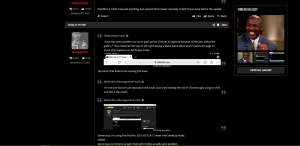
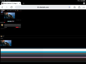
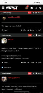
I’m not sure how we can reproduce this issue. I just tried visiting the site in Chrome (ugh) using an iPad and this is the result:i have the same problem too on an ipad and on Chrome. It might be because of the bars below the gallery? They extend all the way to the right leaving a blank space above and it causes the page to move. Only happens on landscape mode.

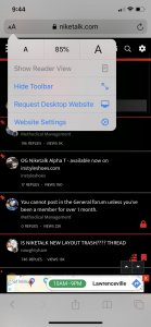
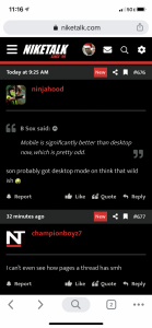
What gen/year iPad are you using? Are you trying to “request desktop mode?” That should be unnecessary. The site is responsive and automatically adapts to your display resolution. Forcing it to behave otherwise may cause undesired operation.
Yep same, that looks to be causing the issue.i have the same problem too on an ipad and on Chrome. It might be because of the bars below the gallery? They extend all the way to the right leaving a blank space above and it causes the page to move. Only happens on landscape mode.

I’m not sure how we can reproduce this issue. I just tried visiting the site in Chrome (ugh) using an iPad and this is the result:
Same issue, I’m using the iPad Pro 2017, iOS 12.4.1. I never tried desktop mode.
What gen/year iPad are you using? Are you trying to “request desktop mode?” That should be unnecessary. The site is responsive and automatically adapts to your display resolution. Forcing it to behave otherwise may cause undesired operation.
My question about fixing the search function got ignored
We're addressing the issue with search at the moment. Thanks!
Dudes just complaining now just to complain, must be some government workers in here the way they are fighting change.This is being fixed right now. The website is rather large so it may take about 24 hours before the entire website is fully indexed again. Sorry for the inconvenience and we hope you'll like how search works after the fix is done.

If you don't find it useful to have the content centered, you can click the "change width" button at the bottom of the page to switch between centered and full screen modes.Any plans to do something with the blank space off on the left side of the screen?
Possibly... Really trying to come up with something useful or cool to put their but coming up empty.
Possibly related posts or threads, to the thread you are viewing. You can click on to open in a new window. Possibly social media links you can click on to take you to your own page to share something?