Official Air Jordan 1 Retro High Thread Vol: Best Model/Thread

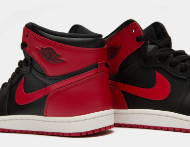
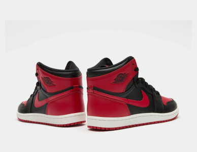
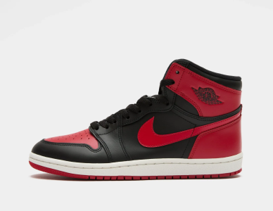
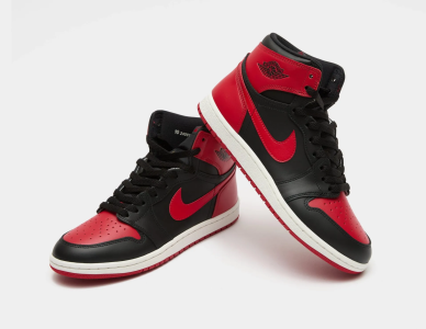
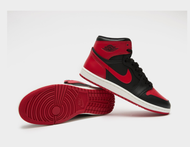
Best colorway?

  • Black/Red

    Votes: 1,044 44.1%
  • Royal

    Votes: 322 13.6%
  • Chicago

    Votes: 460 19.4%
  • Shadow

    Votes: 176 7.4%
  • Black Toe

    Votes: 238 10.1%
  • UNC

    Votes: 77 3.3%
  • Kentucky

    Votes: 19 0.8%
  • Neutral Grey

    Votes: 32 1.4%

  • Total voters
    2,368
I will always see the Top3s as a failed attempt at being edgy no matter how high resell is or what celeb wears them.

But you're correct, NT Denim and the Off White 1s are a NO NO lol. I cringe whenever I see NT denim and yeezys
How? The Top 3s are more based of a "what the" concept which has been around for a while. Even when they first surfaced that's what people assumed they were. 
 
How? The Top 3s are more based of a "what the" concept which has been around for a while. Even when they first surfaced that's what people assumed they were. 
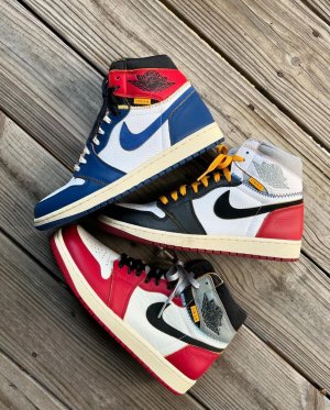
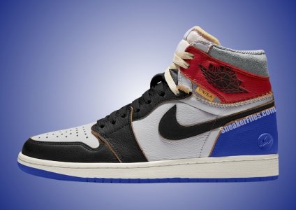
When I think of "What the" shoes, I see a shoe comprised up of different colors, styles, and inspirations coming together on a canvas or vision board(the shoes). The top 3 is basic, and uninspired. By uninspired, I mean that the shoe looks like a Black Toe and Fragmeant with the medial as a Bred and royal 1. It was weak In my opinion.

Outside of NT I consider myself a creative that is driven by visuals, the Top 3 was not a good visual to me
 
Last edited:
When I think of "What the" shoes, I see a shoe comprised up of different colors, styles, and inspirations coming together on a canvas or vision board(the shoes). The top 3 is basic, and uninspired. By uninspired, I mean that the shoe looks like a Black Toe and Fragmeant with the medial as a Bred and royal 1. It was weak In my opinion
It's still comprised of different colors (color blocking), styles (medial and toe), and inspirations (iconic colorways that Jordan wore).
 
When I think of "What the" shoes, I see a shoe comprised up of different colors, styles, and inspirations coming together on a canvas or vision board(the shoes). The top 3 is basic, and uninspired. By uninspired, I mean that the shoe looks like a Black Toe and Fragmeant with the medial as a Bred and royal 1. It was weak In my opinion.

Outside of NT I consider myself a creative that is driven by visuals, the Top 3 was not a good visual to me
Outside of NT I'm a licensed architect and by no means is the Top 3s "uninspired", when you look at the shoe it's made to be a bridge of reiterations of Old and Young sneakerheads. The piece is meant to not be defined by a single generation of shoes, the way the shoe looks almost like a Fragment gives it meaning that it contains an entire lifetime of History (1985-2014) for the iconic Jordan 1 silhouette. Royal, Black toe, and Breds are what most people see. But you can easily tell it can pass off the "Chicago" and "Fragment" models in it. Albeit I wish the shoe did have more pieces such as the iconic bits of the shadows, assorted metallics, and even the Black/Gold 1s. Calling it "uninspired" is just an insult however. The reason the Off-white is "bad" is not just cause it's different, it's because it doesn't follow the original mold and presents itself as unwearable which is the main purpose of a shoe after all. 
 
Outside of NT I'm a licensed architect and by no means is the Top 3s "uninspired", when you look at the shoe it's made to be a bridge of reiterations of Old and Young sneakerheads. The piece is meant to not be defined by a single generation of shoes, the way the shoe looks almost like a Fragment gives it meaning that it contains an entire lifetime of History (1985-2014) for the iconic Jordan 1 silhouette. Royal, Black toe, and Breds are what most people see. But you can easily tell it can pass off the "Chicago" and "Fragment" models in it. Albeit I wish the shoe did have more pieces such as the iconic bits of the shadows, assorted metallics, and even the Black/Gold 1s. Calling it "uninspired" is just an insult however. The reason the Off-white is "bad" is not just cause it's different, it's because it doesn't follow the original mold and presents itself as unwearable which is the main purpose of a shoe after all. 
I explained what I meant by uninspired, it was weak. I wanted something louder with more color. The shoe only has red and blue. But let's be real here, could jb not have done something else? And are we all expected to like every gimmick they push? No. It was a boring no matter how iconic the shoes that inspired it are.
 
I would say the the Top 3 falls in the "greedy" category imo but still look absolutely horrible. Royal Blue and Varsity Red do not look good together no matter how you spin it. The What the Dunks and What the Lebrons are the best when it comes to the mash up concept.
 
I think I hate the top 3s because I only started to like the royals which I never cared for
 
Most of y'all just mad JB didn't do a top 3 t shirt that's why y'all ain't cop...

[emoji]128514[/emoji][emoji]128514[/emoji][emoji]128514[/emoji][emoji]128514[/emoji]

I was hating on em heavy but once in my hand damn they nice.
 
Top 3's [emoji]128293[/emoji]

Off-white's [emoji]128293[/emoji][emoji]128293[/emoji][emoji]128293[/emoji]
 
Last edited:
Back
Top Bottom