Post Your New Eras*59-Fiftys*etc... VOL. INFINITY NOW W/ Henz0/Thunderchunk/Icy's FAQ ON PG.1

Tigers going with the bigger “D” on their hats


Feel like it’s not gonna look good
 
They are quoted as saying the logo will now be more in line with other MLB caps. That's a lie. That thing is huge.

It looks like what's on one of their crappy ultimate patch caps. Total Chinese quality.

Although they have had the larger logo before on their road cap back in the 70s-90s. This appears thicker and more raised than ever before. Travesty.
 
^close. Even though they were one of the smallest logos, they have now gone up to being one of the largest. That's why it's such a crazy contrast.

Was bored and overlayed some other mlbshop cap
2vnfkmp.jpg


They basically increased the logo size 50%.. The middle logo is a more subtle 25% increase.

And the 25% increase on a fitted alone
ndoav8.jpg


I put the new D along side a NY and redsox B
mhcdbp.jpg


Say what you will. It's now the largest logo in the league. It covers more of the front crown and uses more stitching than any other cap in the league.Yankees is close. I guess from a basic eye test, they are the same. But I beg to differ.

It actually makes this larger ultimate patch collection cap look normal in comparison
hwl


It's ugly. But I guess thats just my opinion
 
the red sox b would look sloppy if bigger
the sox are pretty strict with their logos & unis tho so i would hope they never botch it like those detroit caps


nice vintage pick ups wally!

personally i like the older twin cities logo for the twins caps...you think you'll ever want a vintage one of those?
maybe you have one already?


vdvd.png
 
green rhino123 green rhino123

Wow. The one on the right looks like a caricature of a normal on field.

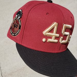
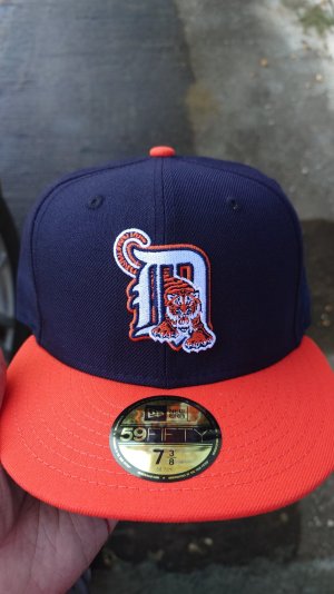
I took measurements and the Tigers logo is/was the smallest logo in the league. But not by much. I'm talking 1/8 of an inch here or there. Now it will be the largest. The 25% increase would have been more in line with 80% of the league.

I'm always looking for vintage caps in my size. I have each of those in the 2003 on field wool variety. What do you know about the 2001-2005 era of Cooperstown collection on fields. I see a red TC with green under on eBay.

Some side by side action of three different era of caps.

87 braves up top. 2001 left. Retro classic right
716B10F1-D5DD-42D1-A3E4-1F6930B1C9D1.jpeg

The retro classic is a bit sloppy on the left crossing A element on the logo. Size of logos and colors a near 100% match. Original logo looks so much sharper. Even the crown and fit. Definitely more boxy.

87 twins top. 2010 poly left. 2005 wool right.
BBD4A90E-AC89-4B9C-9A67-DF0D22E07AD7.jpeg

Kind of tough to see in photo form. The original 1987 has more Navy blue showing than current era materials, which almost feel black. Also the flat M red stitching is a brighter shade of red than the standard deeper red color. Combine those two together and you cannot top that era of cap. I think the red Sox are in the same light here. So it's definitely a small material change through the years. Love the bluer Navy blue and brighter red accents. Logo sizing has stayed the same this entire time.


87 Cubs top. 2012 era poly left. 2005 era right.
E253E87A-BB4B-446D-8849-6E54CEEE1AF6.jpeg
A2D59EE0-63B8-4B4B-89D7-94E94BA7E542.jpeg

87 bottom/ 05 middle/ 12 top.

This one's a trip. First photo makes it seem like the 2012 era is just this crazy bright blue and the 87 is closer to the 05. But the bottom photo makes it seem like the 87 and 2012 are closer, which they are.

2012 New era poly is definitely the bluest of the bunch.
05 wool is the darkest of the bunch and almost seems like it's purple.
87 definitely not as a bright blue as current era but still blue. Dare I say it's a perfect color.

Logo size has stayed the same since.

You don't always hear about these changes. Or a compare and contrast photo. So I thought I'd share what I have.

Overall, the older era has softer materials all around but could be perceived as flimsy. Lightest of the bunch too. The 2001-2005 wool era are the sturdiest of the bunch. Even with a thicker sweatband. Poly era may be perfect as far as wearability. At least the 2007-2015 poly caps.
 
Last edited:
Just the way the world is. You have to be drastic for it to matter. Had they gone up to 25%, it may not have been worth a press release.


I do laugh at some of the twitter comments. Had they spent as much time and money and effort doing what they did (against better judgement to keep it as is), they would have a lot more funds to focus on actually getting their team to be better.

Indians went from lighter navy back to darker navy without a press release a couple years back. Cubs have shifted colors often enough for people to wonder what's next. No real press releases then. There are probably another 10-15 changes that don't really make the headlines over the past 5 years. The Tigers went all out, and are deservedly so, getting backlash.

They definitely couldve gone the subtle route and said nothing. But anymore, causing a stir is 'worth it'.

Not to me though
 
wallyhopp wallyhopp

The main reason for the variation in the Cubs hats is b/c they were "Dark Royal" (Dodger Blue) until 2012 when they switched to "Light Royal" (same color royal as KC Royals, Mets, Brewers alternate, etc).
 
Well, Indians losing their logo next season

Sad. And yes I know most of you will be happy but I thought they had one of the betters logos for god knows how long
 
Sad. And yes I know most of you will be

who u think is most? :lol: they're doing this against their majority fan base who loves da logo...

newflash, New Era aint gonna EVER stop making da Indians fitted...its basically instant Cooperstown classic status.

better rack up w/e you see out there just in case.
 
We had a discussion in here months ago and everyone jumped at me because I thought it was dumb to get rid of it
 
Yeah. Never knew anyone that hated it. Instantly recognizable. I wear my block C cap and cursive I from time to time and it takes a true MLB fan to know what they are. Wahoo=Indians. It's like taking away the Yankees NY.

Wondering if MLB will put a stop to using or allowing the logo to be used on any of its licensed merchandise. Although the screaming brave and yellow wahoo have been put on licensed caps. The custom market just got very interesting.
 
^ Most likely the Wahoo will get banned w/ the logos that can't be used (including customs).

The Braves Chief has been on and off the last few years as far as being able to be used on customs.

Safe to say if the Indians are scrapping it, it's gonna be locked away for awhile.
 
Read an article that they'll still sell some merch with the logo regionally just to keep the license for it or something like that
 
Doing my random google searches for older on fields, I came across http://wrigleyvillesports.com/ They seem pretty legit. I guess I can be the guinea pig.

Anyways. It appears almost every team out there has preflag MLB on fields for $10. Some FSRs. Most seem to be either too small or too large for the majority of people. We all know where I lie. Already put my tax return to heavy usage.
They have a promo. Buy one, get one 40% off, which does work for these caps. Code is 40BOGO18

This link links right to the MLB AUTHENTIC CAPs starting from cheapest to most expensive

So youd be looking at $21 shipped for two on fields. Get it up to 11 caps, and with free shipping after $100, and the $4 off promo, you're looking at $106 for 11 caps. You may occasionally beat that on ebay with $4 auction style with $4 shipping. I saw some 2014 and 2015 patch caps and styles, so I want to be hopeful most of these will be all made in usa with 100% usa poly.

I left a Twins M 7 7/8 if someone needs it. I already scooped up two others. We'll see what actually ships and processes
 
Wrigleyvillesports package arrived today.
A85D0907-B496-4B4A-BAC2-CDB5D0AEAF52.jpeg


Super impressed. Steal of a lifetime (although that minorleagues.com closeout was nice).

All made in USA. None of that imported crap. I want to say 2 are 2007 first year poly with blue labels, 5 are cool base era, and the rest 2012-2015 fly your own flag.

Guinea pig test passed with flying colors. Tempted to scoop up the ones I left on cutting room floor. Believe it or not, there could've been more lol.
 
Back
Top Bottom