Under Armour = flabby & sick VOL. NY times

I actually think they have a good logo, I saw it for at least a year on sitcoms I believe it was & was always intrigued. finally saw the name of the company and my first thought was underwear.
 
I wonder how much Durant/Nike landing in the Bay Area impacted the momentum Curry/UA had.

Not much. It’s not like the KD 9-11 were moving. They barely made any Warriors colorways to cater to that fan base. Mind you the Curry 3 came out during KD’s first season and the Curry 3 did not sell that great at all.
 
UA was definitely poppin back in my high school days when i ran track and Field. Everyone had at least a long sleeve ua compression shirt.

But i know better now, not to buy that maga brand.

Nike gear does me fine for my needs, and some Adidas stuff too.
 
Last edited:
I like the reebok classic logo a lot more than the current one
good news...


Share ›
New Logo and Identity for Reebok done In-house with Darrin Crescenzi
Reviewed


’Bok to the Future
New Logo and Identity for Reebok done In-house with Darrin Crescenzi


BEFORE
AFTER

Reviewed Nov. 12, 2019 by ArminComments (92)
INDUSTRY / CONSUMER PRODUCTSTAGS / #APPAREL#BLUE#RED#SPORTS#STENCIL
Established in 1895 in the small England village of Holcombe as J.W. Foster and Sons, Reebok, as it was renamed in 1958 (after “rhebok”, a type of African gazelle) is a “worldwide designer, marketer and distributor of fitness and lifestyle footwear, apparel and equipment.” With headquarters in Boston, MA, and a subsidiary of Adidas since 2005, Reebok has transitioned over the years “from a traditional sports brand to a brand focused on fitness” which means that instead of doing shoes and apparel for specific sports like basketball, soccer, or baseball they do so for more general fitness like functional training, running, combat training, walking, dance, yoga, or aerobics — to wit, they are the official footwear and apparel sponsor for UFC, CrossFit, and Spartan Race. Last week, Reebok re-introduced its “vector” logo and new identity designed in collaboration by their in-house team and New York, NY-based Darrin Crescenzi.
Today, Reebok announced that beginning in 2020, it will unify under one brand logo and wordmark, leveraging its most recognizable and distinguished assets - the Vector logo and “drop-R” wordmark.

The wordmark and logo will be fully integrated across all Reebok sport and lifestyle products, including footwear and apparel, while an exclusive early release of sport styles featuring the Vector logo will be available this month. This evolution shines a spotlight on Reebok’s proud heritage, connecting its rich legacy to its exciting future.
REEBOK PRESS RELEASE
The Vector logo was first introduced in 1992 and has been used in various forms since, most recently on Reebok heritage and lifestyle products. The new Vector logo is an updated, subtle modern evolution of the original. The Reebok Delta logo, which was first introduced on product in 2011, will continue to be used on select product, including CrossFit and UFC-branded Reebok apparel.
REEBOK PRESS RELEASE
New Logo and Identity for Reebok done In-house with Darrin Crescenzi
Logo.
New Logo and Identity for Reebok done In-house with Darrin Crescenzi
Comparison with 1992 version (left).
Icon evolution.
New Logo and Identity for Reebok done In-house with Darrin Crescenzi
Logo configurations.
New Logo and Identity for Reebok done In-house with Darrin Crescenzi
Wordmark.
The previous logo was a reflection of the change of Reebok’s focus as the “Delta” icon had started as the identifier for the company’s CrossFit products and evolved into the company logo. Its more “hardcore” look helped signal a new personality for the brand and establish some distance with Nike and even parent brand Adidas. As in my 2014 review of that change, five years later, I still don’t find the Delta icon particularly great but I think it worked well to propel Reebok forward. The old wordmark was fine and had some subtle personality to it but nothing that will be missed.
The new logo is a return to the 1990s logo and the closest Reebok has had to an equivalent of Nike’s swoosh or Adidas’ three stripes. The dynamic “Vector” icon has been cleaned up for another go-round and the changes are all improvements, especially making the top and bottom flat for crisper placement and alignment with other elements or simply for being on its own. To me, the most exciting part is the return of the wordmark in one of the most 1980s-tastic fonts of all, Motter Tektura. I know I speak more from nostalgia than any other relevant cognitive function but I really like that wordmark and the opening up of its spacing makes a huge, positive difference. I also like the return of the blue to replace the black as it provides a softer look and a color palette that supports Reebok’s “American-inspired” positioning.
New Logo and Identity for Reebok done In-house with Darrin Crescenzi
Shoe boxes.
New Logo and Identity for Reebok done In-house with Darrin Crescenzi
Hang tags.
New Logo and Identity for Reebok done In-house with Darrin Crescenzi
Shopping bags.
The few applications shown above are pretty nice, with a hint of retro-ness to them that can potentially have the effect of older consumers falling back in love with Reebok and maybe young consumers finding it as curious as vinyl records to give it a go.
New Logo and Identity for Reebok done In-house with Darrin Crescenzi
Various apparel applications.
On the products, the logo looks great whether the icon is on its own or with the wordmark. Both are easy to reproduce and work well in the different production methods. The embroidered wordmark at the top of the image set above is particularly good in how the simple strokes of the character adapt to the limitations of embroidery.
New Logo and Identity for Reebok done In-house with Darrin Crescenzi
Cool apparel shots.
The two images above, not gonna lie, they are cool as ****. There is something very bad-*** and confident about them that really transforms the way I think about Reebok… so at least with this potential consumer, dear Reebok, you won.

Sizzle reel.
On the flipside, they kind of lost me with the video above. It’s just a bunch of random ENERGY! stuff with bad typography. But, to its credit, that probably triggers, in a good way, another segment of the audience that’s not me.

Headquarters sign drone view. Somebody reallylikes their new sign.
Overall, I think this is a very positive change that reasserts Reebok’s legacy and history in a way that is contemporary and engaging in a way that makes it different not just from Nike and Adidas but from other closer competitors like Under Armour or even Lululemon.
Your opinion…
On Return to Vector Logo
 
Haven’t worn Reebok in a very long time but the old logo is far better than the newer one. What’s Reebok’s story anyway? How come they’re not at Nike or Adidas level? Feel like I’m the 90s every single brand was getting top tier shine.
 
Didn't even know that they had changed the logo until the other day when I was watching a video on YT about how the brand is falling off.
 
Didn't even know that they had changed the logo until the other day when I was watching a video on YT about how the brand is falling off.

doofs jumped on that CrossFit bandwagon wit that polygonal looking vag logo...

glad da vector & og workmark font is back.
 
Yea, it was pretty much a copy of the Osiris D3. Had some hype because it was limited and that was it. Rocky rarely wore it and didn't wear or promote anything else UA.
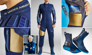
He wore/wears them, but not he’s trying to promote a sneaker. One of my favourite releases last year, and a very well put together sneaker:
1581833459882.jpeg
 
Just look at how Nike treats Converse's back catalogue, smdh. With that being said, Nike buying Reebok would've been a disaster.
 
Just look at how Nike treats Converse's back catalogue, smdh

there's really nothing there IMO.

Nike IMO would've had Reebok's cylinders clickin' like JB.

think about it like this.... let's pretend Reebok instead of being a company, was a Signature line...da amount of money Reebok could've generated in strategically released retros & better managed, they'ed knock it outta da park.
 
Someone should really look to acquire Reebok from Adidas like Gene Yoon acquired Fila and came up

there's really nothing there IMO.

Nike IMO would've had Reebok's cylinders clickin' like JB.

think about it like this.... let's pretend Reebok instead of being a company, was a Signature line...da amount of money Reebok could've generated in strategically released retros & better managed, they'ed knock it outta da park.
 
Back
Top Bottom